Light Force Productions
client work
client work
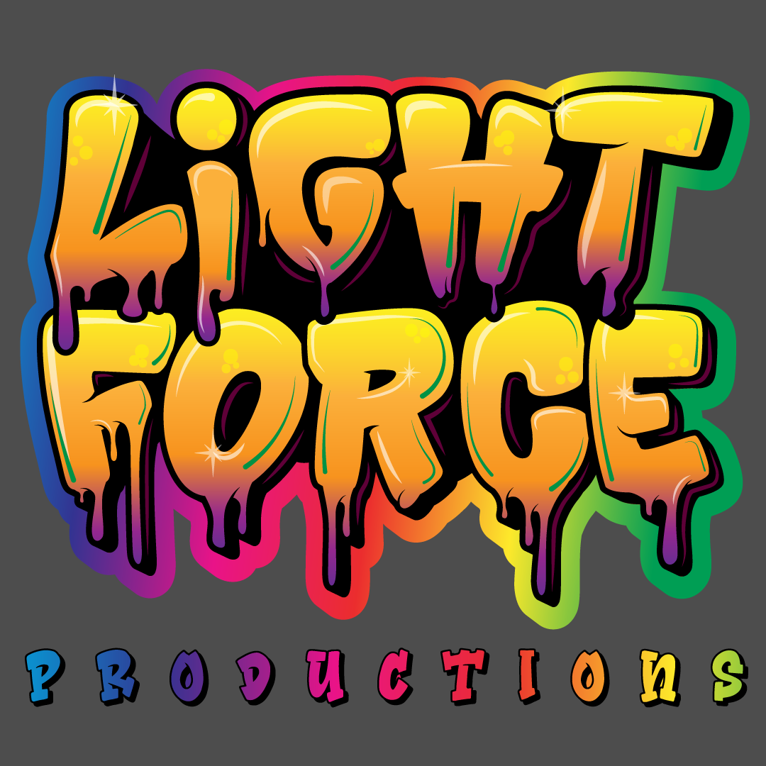
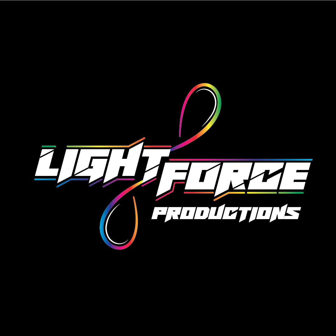
Light Force Productions is an entertainment and mentorship company focused on performance arts in the Nightlife and Entertainment Sector. They came to me to give their branding a huge lift. Initially, they wanted "Gold and Violet, Melty Rainbow Graffiti with Glitter" as their description for their art direction. Which is what the concept on the top left came out as, and they -loved- it. They were blown away that I could take all their abstract ideas and put them into a cohesive and vivid form. They were all ready to sign off on this...however...their marketing team came back and said that design was a no-go. I asked why, and it's because they had recently wanted to start targeting corporate and professional events as well.
It's worth noting I created this graffiti lettering from scratch. This was NOT a font.
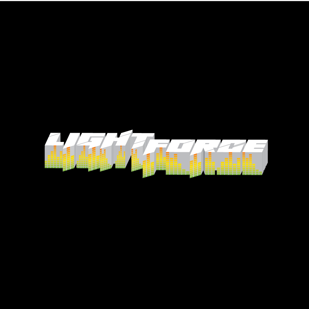
They felt that the graffiti effect was not professional enough. During the qualifying questions and initial intake round, this had never come up, however as a returning client, I decided to help them out and go back to the drawing board.
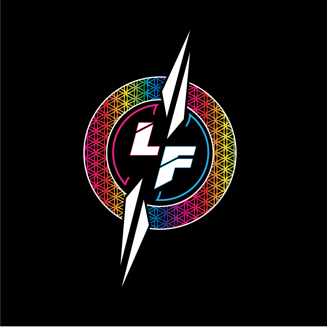
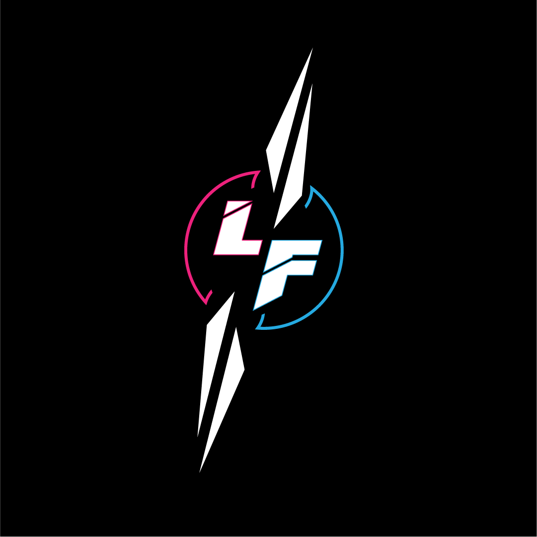
The sharper, more edgy, futuristic branding is what came out the other side. The final concept has two swoops, to represent the formation of poi spinning called "the anti-spin" which is a shape created during this performance art, which is at the center of their brand. There are a couple of variations of this concept such as the curvy-blade-like touches, as abstractions to represent this motion as well, but the client opted for the gentler swoops in the end.
It's worth noting I created this graffiti lettering from scratch. This was NOT a font.
They felt that the graffiti effect was not professional enough. During the qualifying questions and initial intake round, this had never come up, however as a returning client, I decided to help them out and go back to the drawing board.
The sharper, more edgy, futuristic branding is what came out the other side. The final concept has two swoops, to represent the formation of poi spinning called "the anti-spin" which is a shape created during this performance art, which is at the center of their brand. There are a couple of variations of this concept such as the curvy-blade-like touches, as abstractions to represent this motion as well, but the client opted for the gentler swoops in the end.
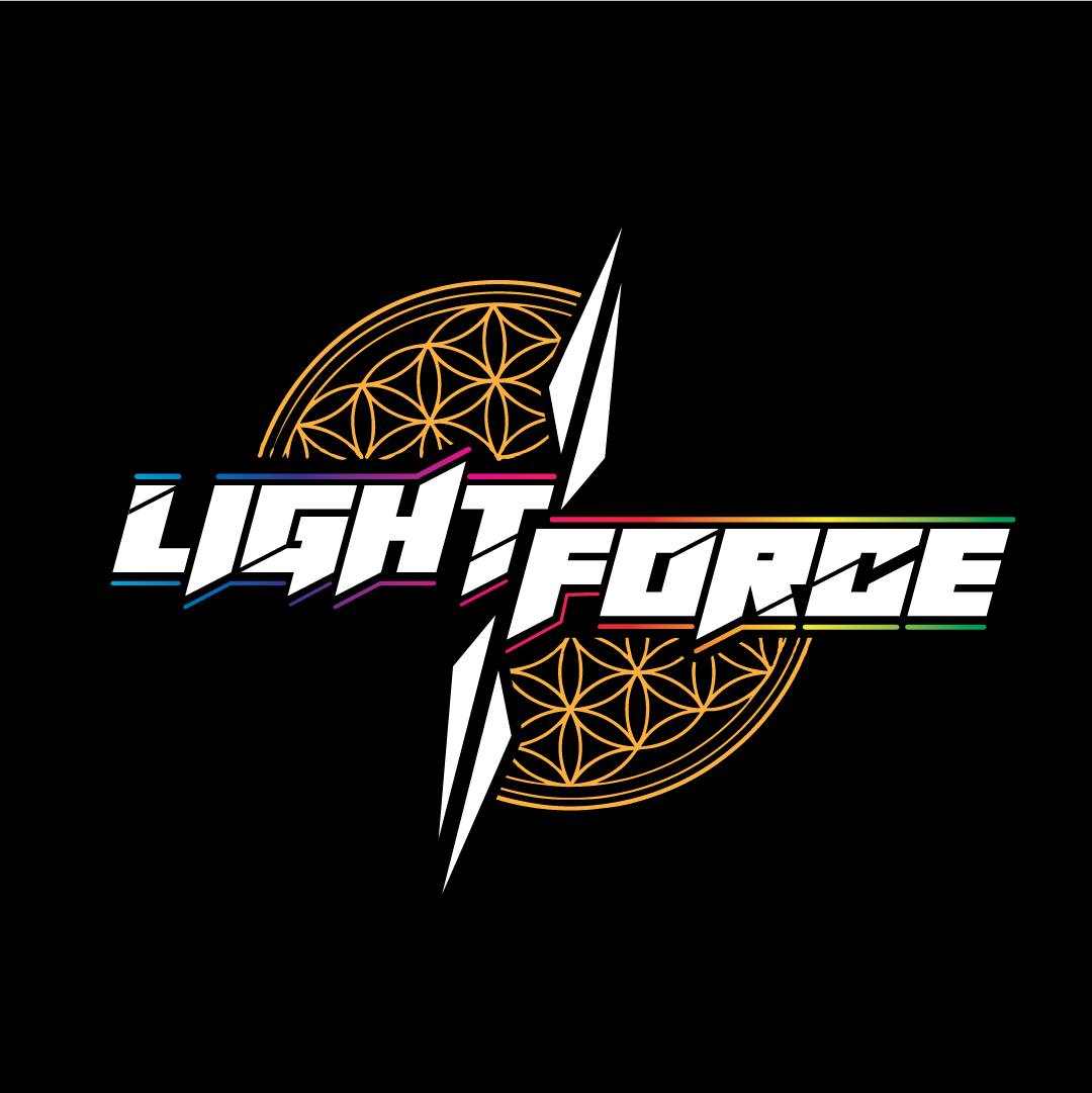
Previous Concept
Rough Candidate
Rough Candidate
Refined Candidate
Refined Candidate
Refined Candidate
Refined Candidate
Rough Candidate
Their mentorship division
Rough Candidate
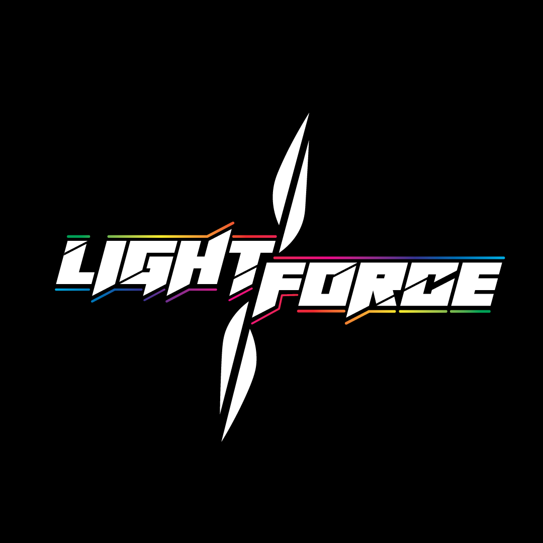
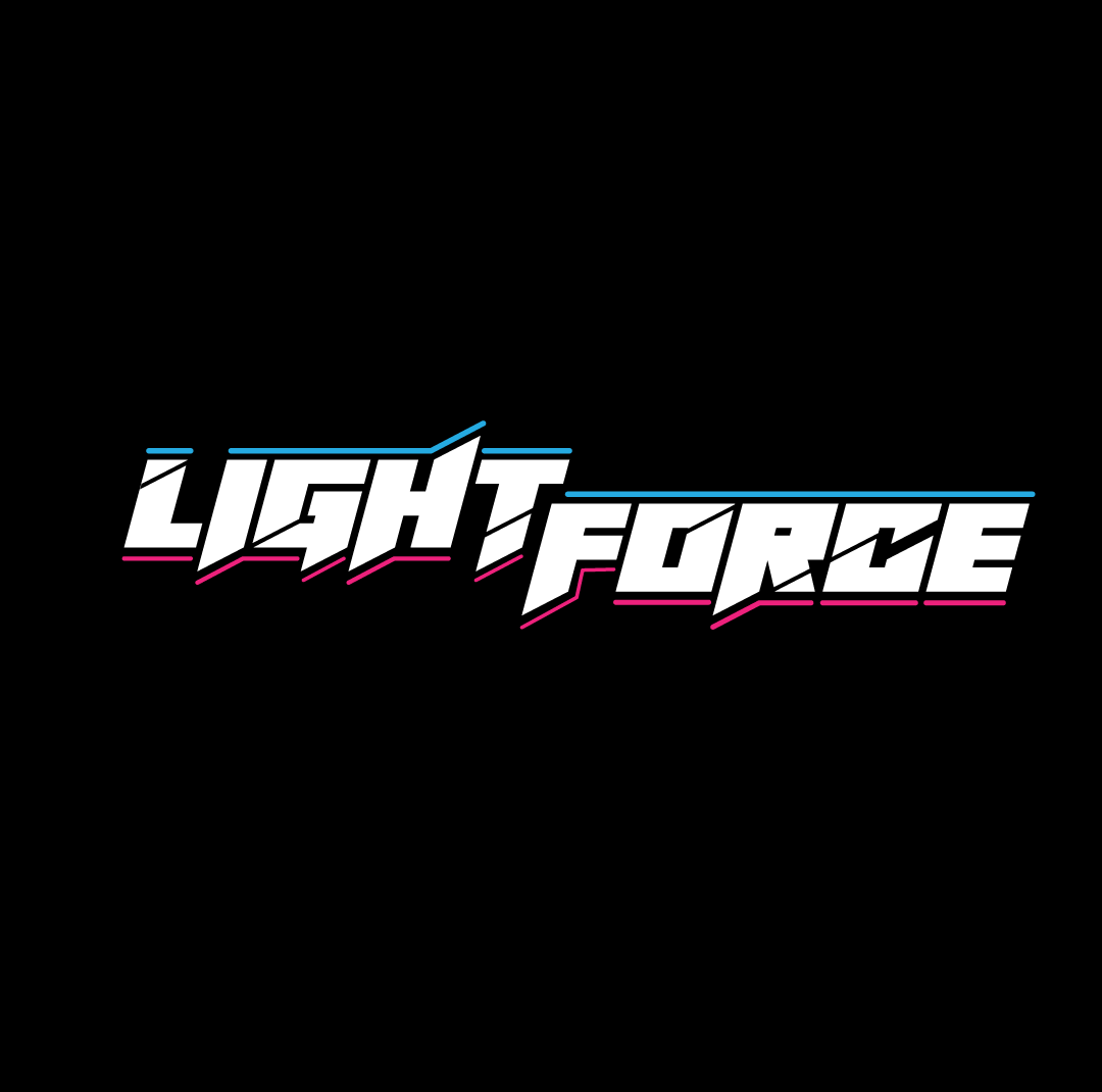
Final Concept - Full Word Mark
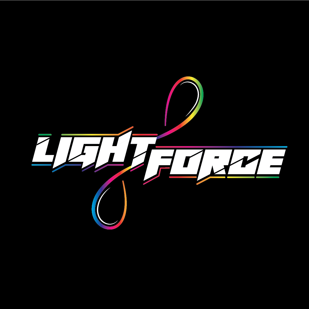
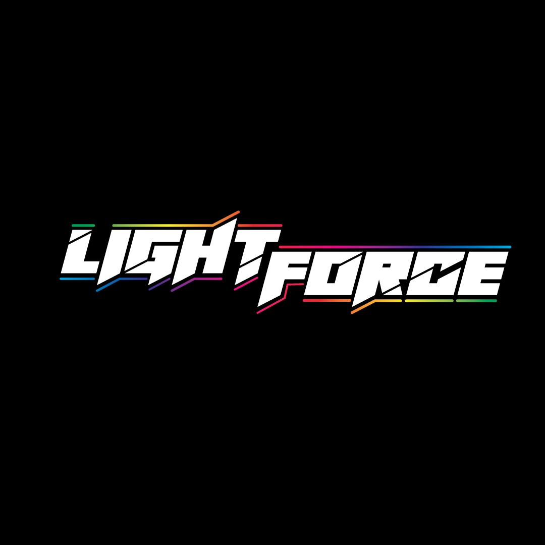
Final Concept
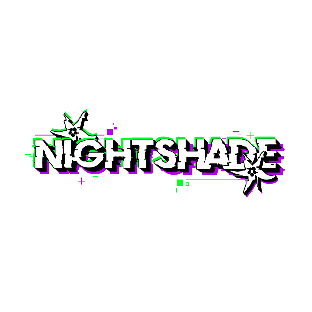
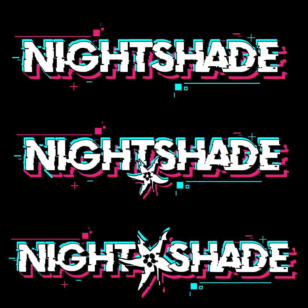
Nightshade - DJ Logo Design
client work
DJ logo made for EDM Producer, "Nightshade" who specializes in glitchy, psytrance-meets-glitch hop bass music. Initially, I went for the more traditional, red and cyan stereoscopic glitchy colours, as I felt that added a lot of contrast and went along with the electronic and tech vibe, but the client asked to change it to something a little more organic, so we ended up going the purple and green route, and we had changed up the placement of the Nightshade flowers seen in the logo.
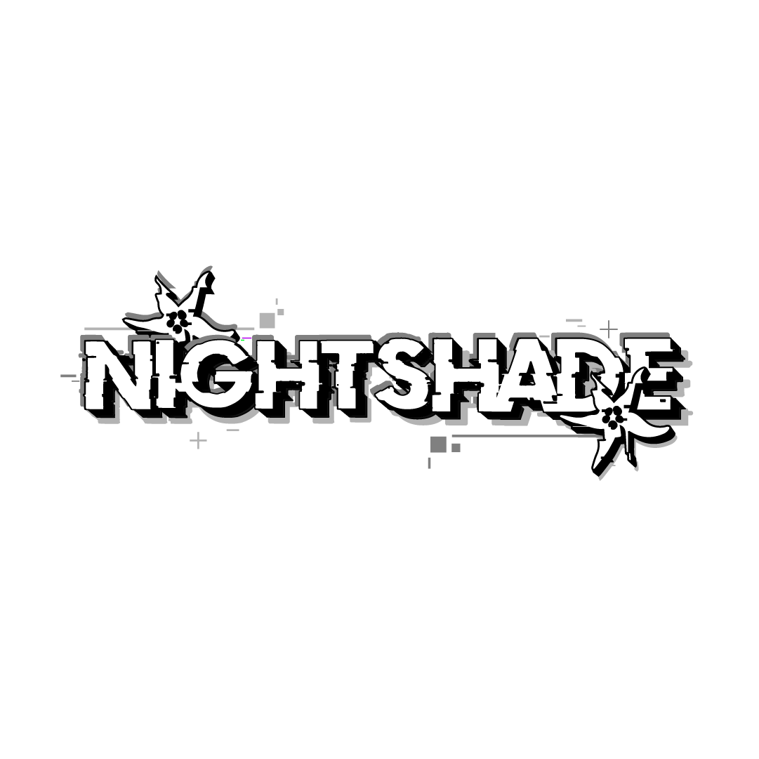
Final Concept - Grayscale (for event posters)
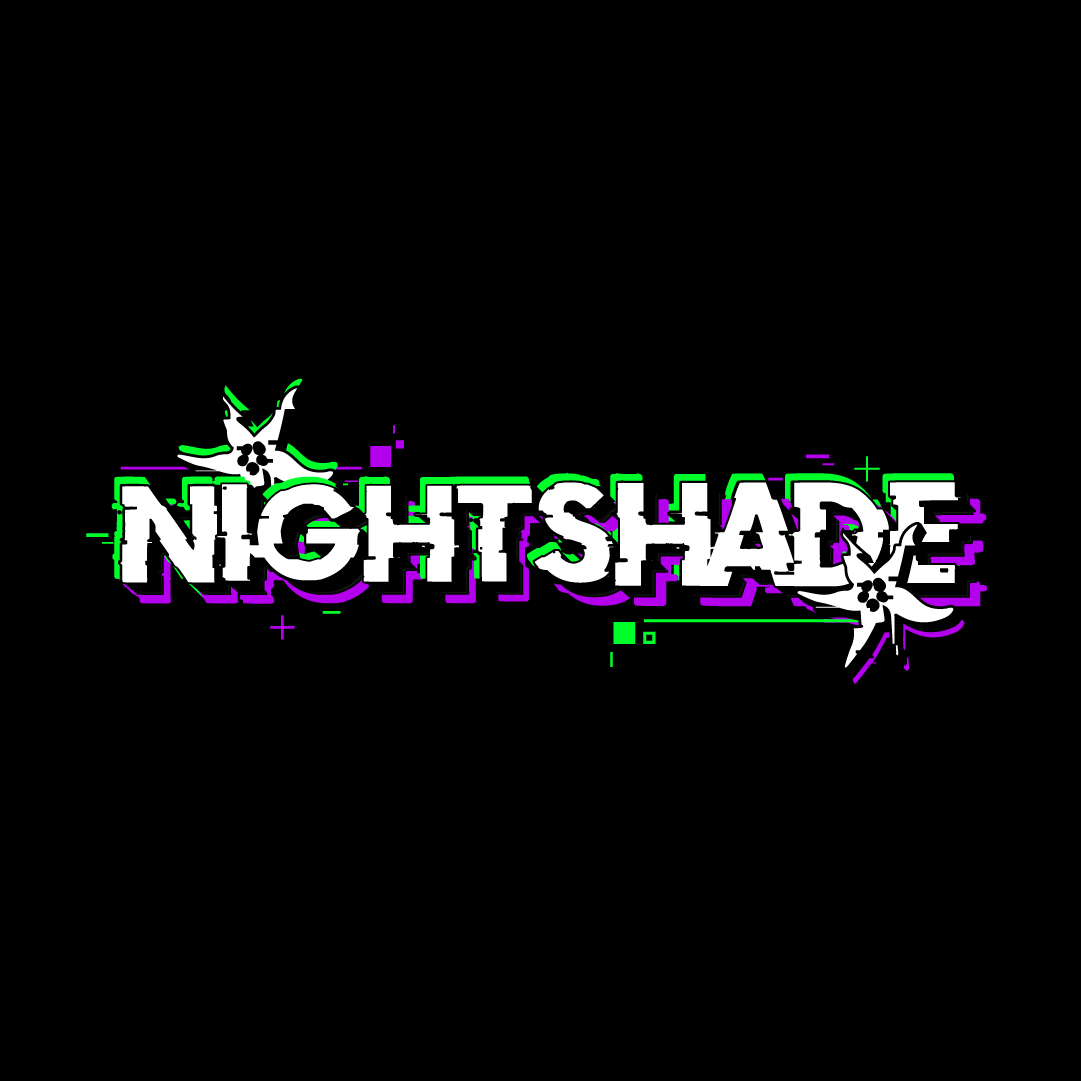
Final Concept - Black Background
Final Concept - White
Original Concept Candidates
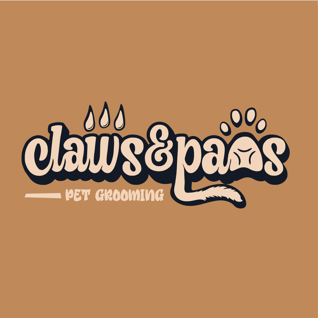
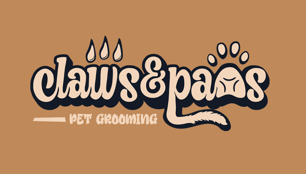
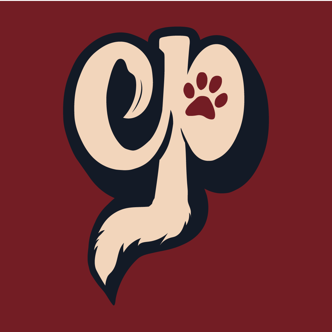
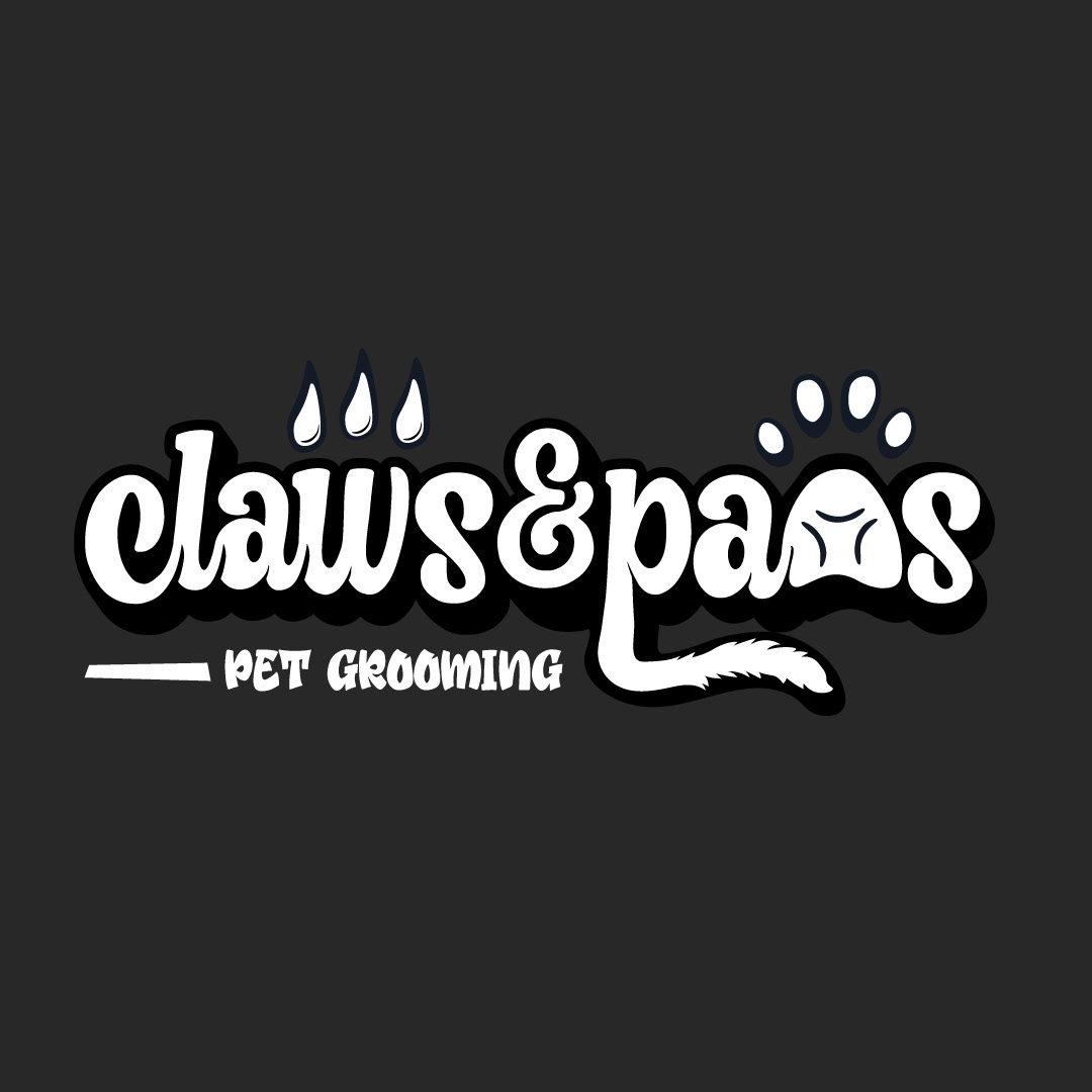
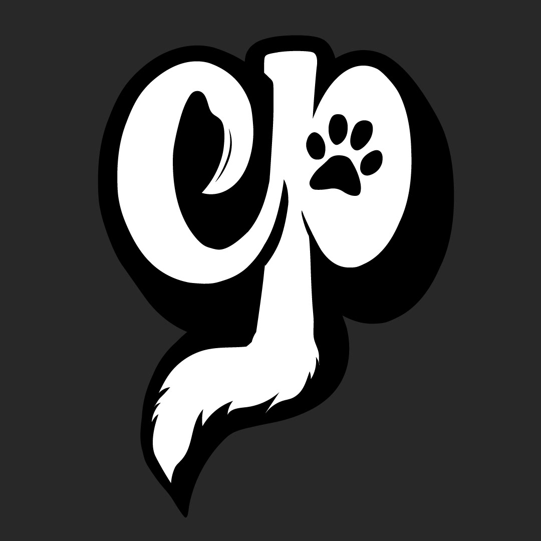
Claws & Paws - Mobile Pet Grooming
Client Work
This client came to me off of Instagram! Upon stumbling across my profile, Logan fell in love with my work and hit me up in the DM's. We quickly jumped on a call and a new Logo concept was quickly hashed out and born! I got to work creating her vision that she could apply to her new business, poste-haste!
These colour schemes were a bit different for me to work in, but very much exciting and left the final result satisfying. She also came to me with an entry level budget and we created a business card as well.
Below is the result!
These colour schemes were a bit different for me to work in, but very much exciting and left the final result satisfying. She also came to me with an entry level budget and we created a business card as well.
Below is the result!
Full Logotype w/ Subheading
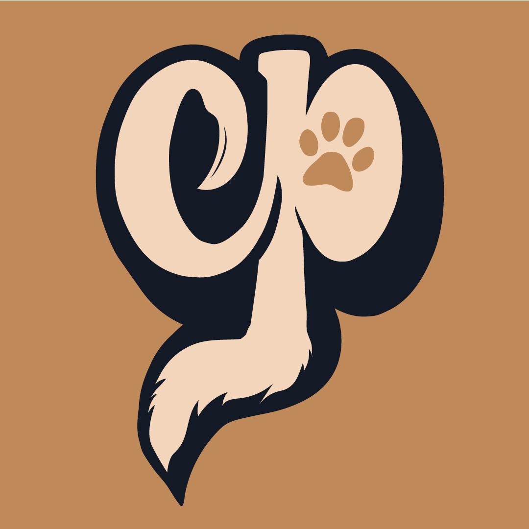
Logomark
Business Card - Back
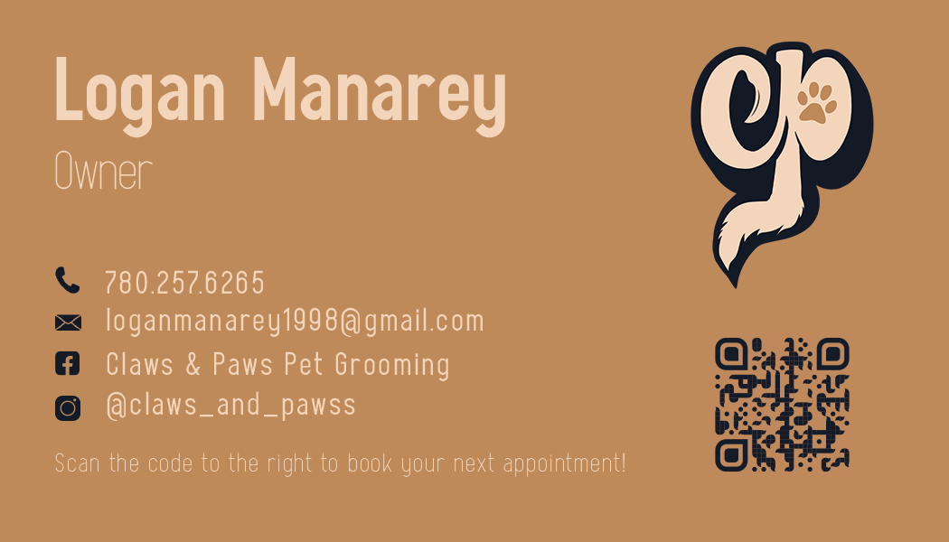
Business Card - Front
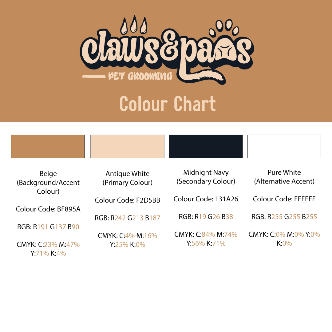
Although not a full-fledged brand guide, we did manage to fit a quick-reference colour chart for future use within the budget.
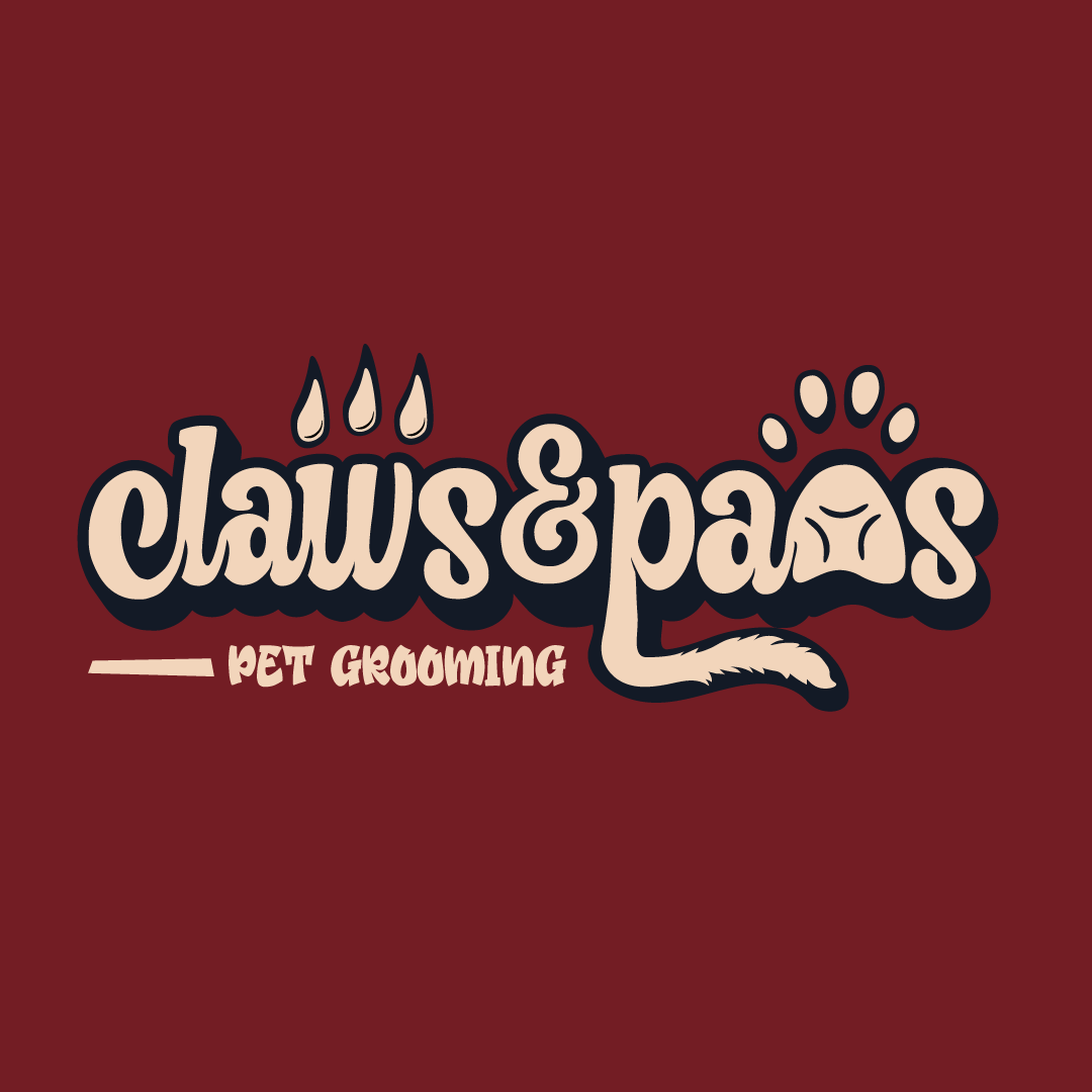
Alternative Colour Concept
Alt. Color Concept - Logomark
B & W - Logotype
B & W - Logomark
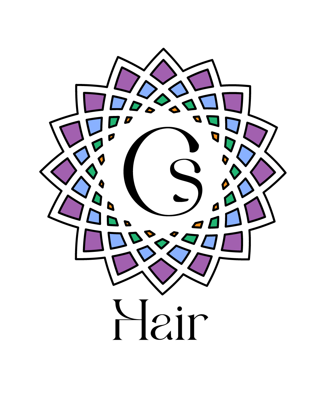
Hair by Cara Sloat
Client Work
Client Work
This logo design came to me during a design work giveaway I had held to drum up some business. The winner was Cara Sloat, a local St. Albert Hairstylist.
I wanted to capture her multidimensional use of colour, with gentle and calming, loosely-based 'earth tones' while keeping the feel overall feminine and encapsulating the industry.
Here is the result of that process.
I wanted to capture her multidimensional use of colour, with gentle and calming, loosely-based 'earth tones' while keeping the feel overall feminine and encapsulating the industry.
Here is the result of that process.
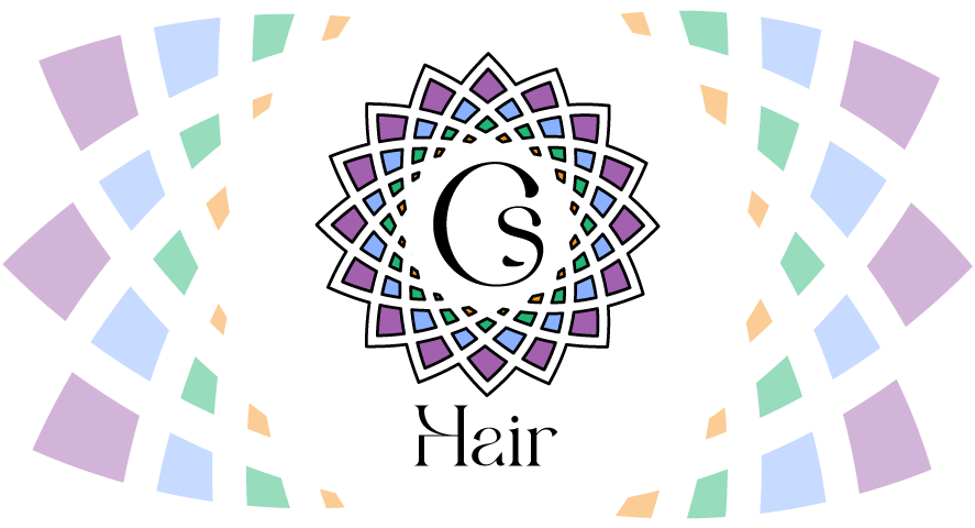
Logo Mark - Full Colour
Logotype - Full Colour
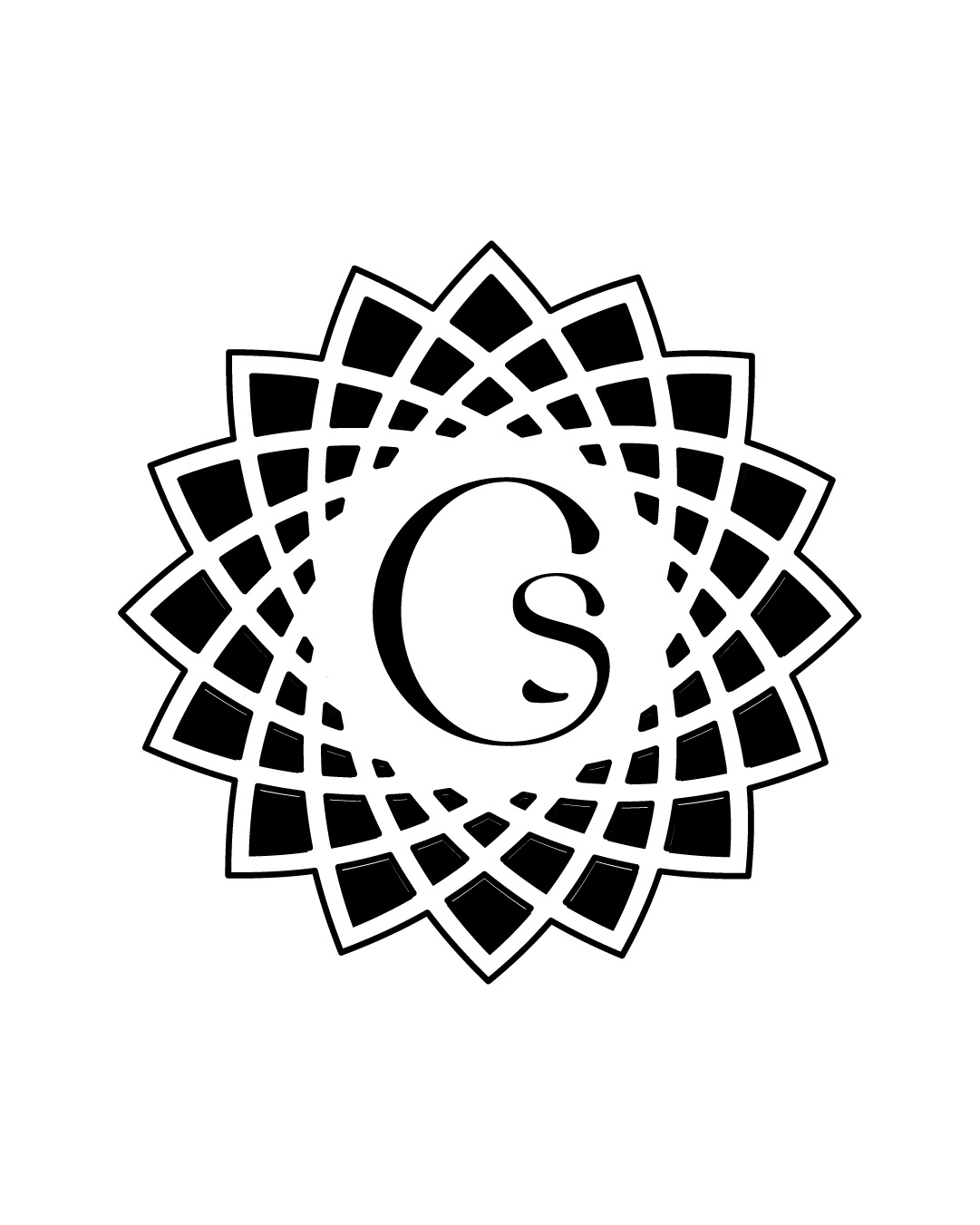
Black Logomark
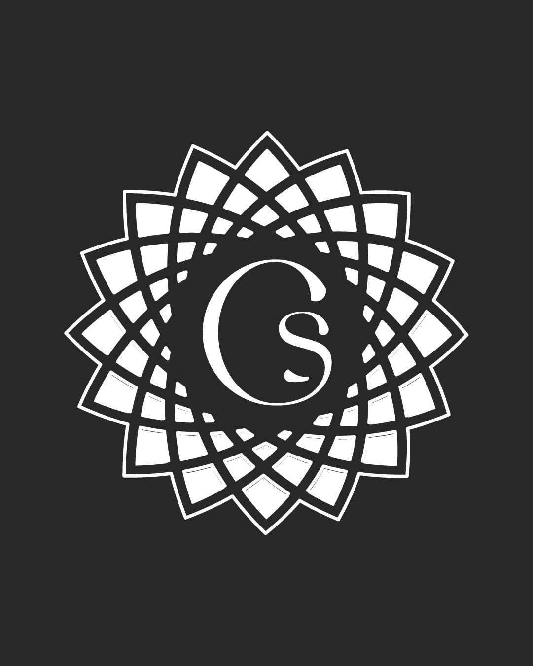
White Logomark
Business Card - Back
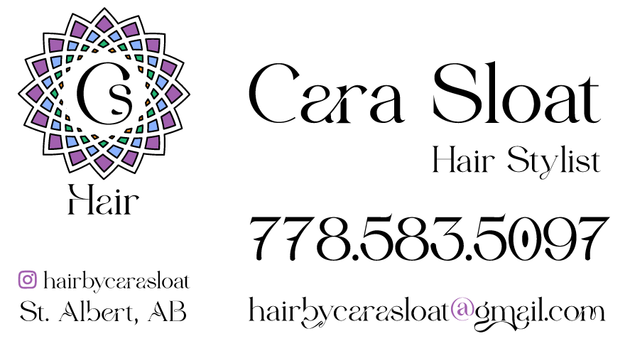
Business Card - Front
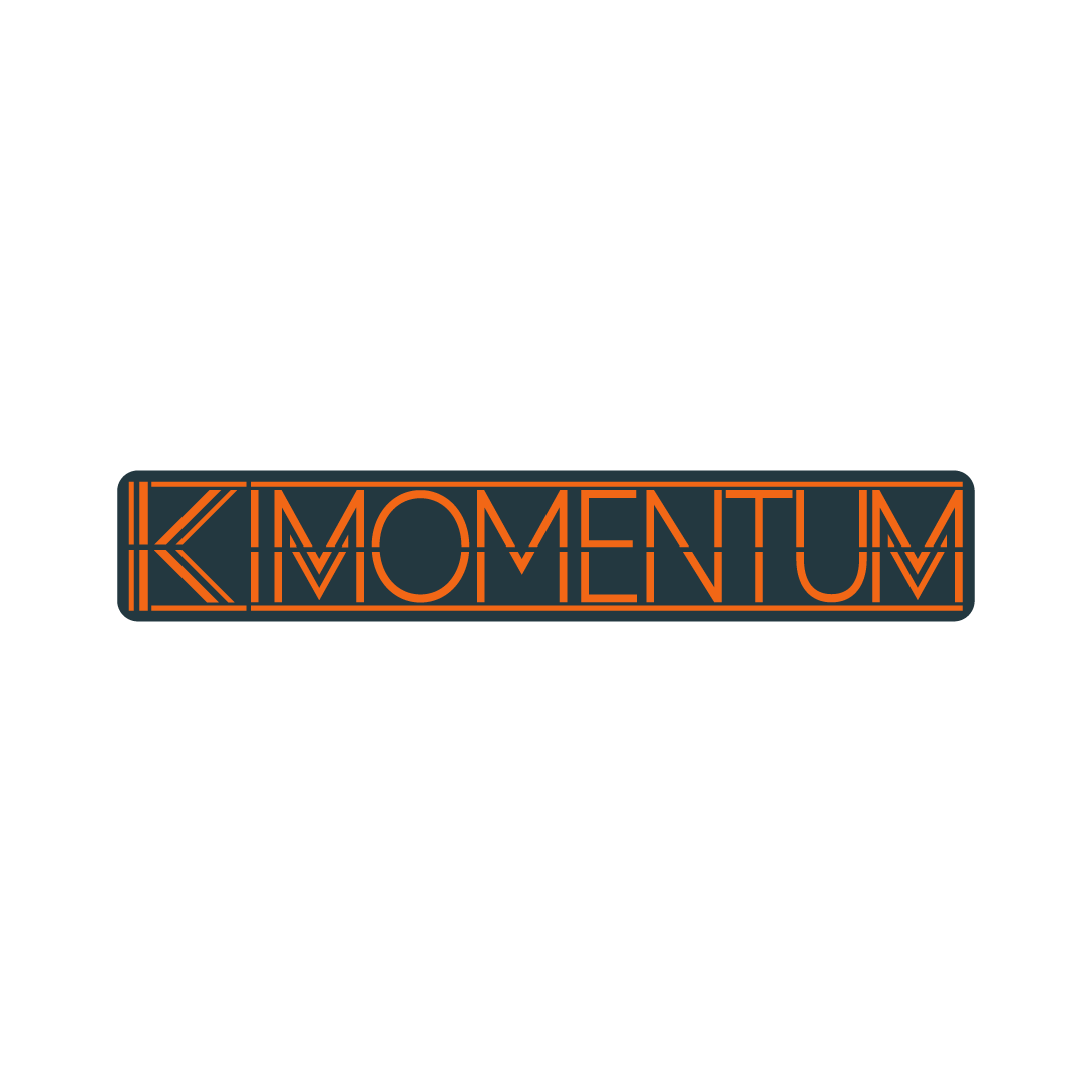
Kimomentum Fitness
Client Work
Client Work
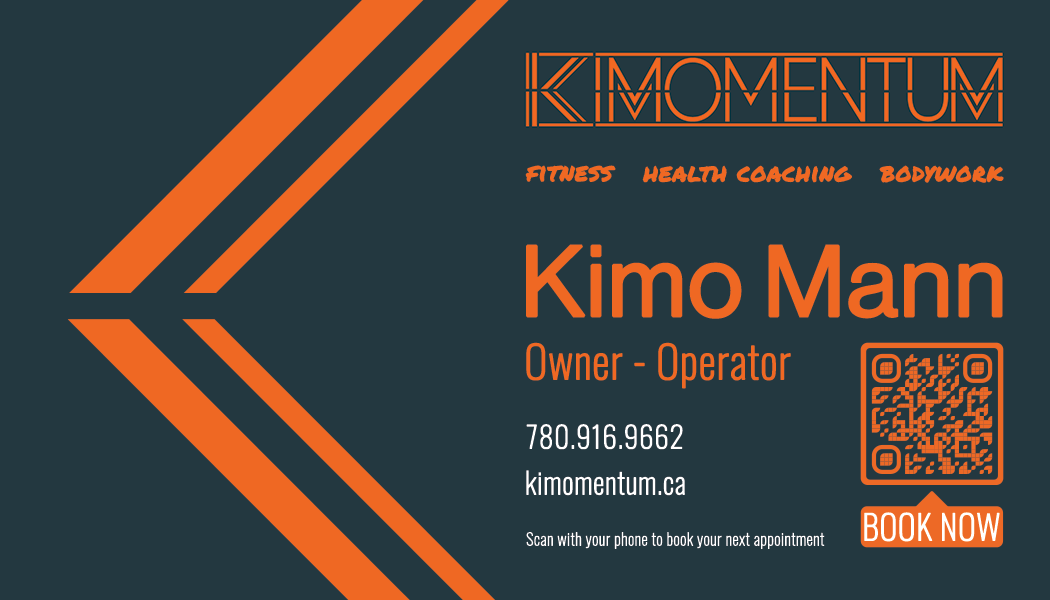
Here is the showcase of a logo project I created for a client that ran a personal training business. He came to me with an entry-level budget and asked for logo design, and business cards. We also developed a website (which will be linked below)
He wanted something energetic, yet-mature, and something vivid yet rich and alluring. So I explored some broad concepts with colour first, before entering overall design. We went for a design aesthetic that communicated motion and dynamism.
Kimomentum is so much more than personal training, so we needed to capture that essence in a simple, yet striking and visual way.
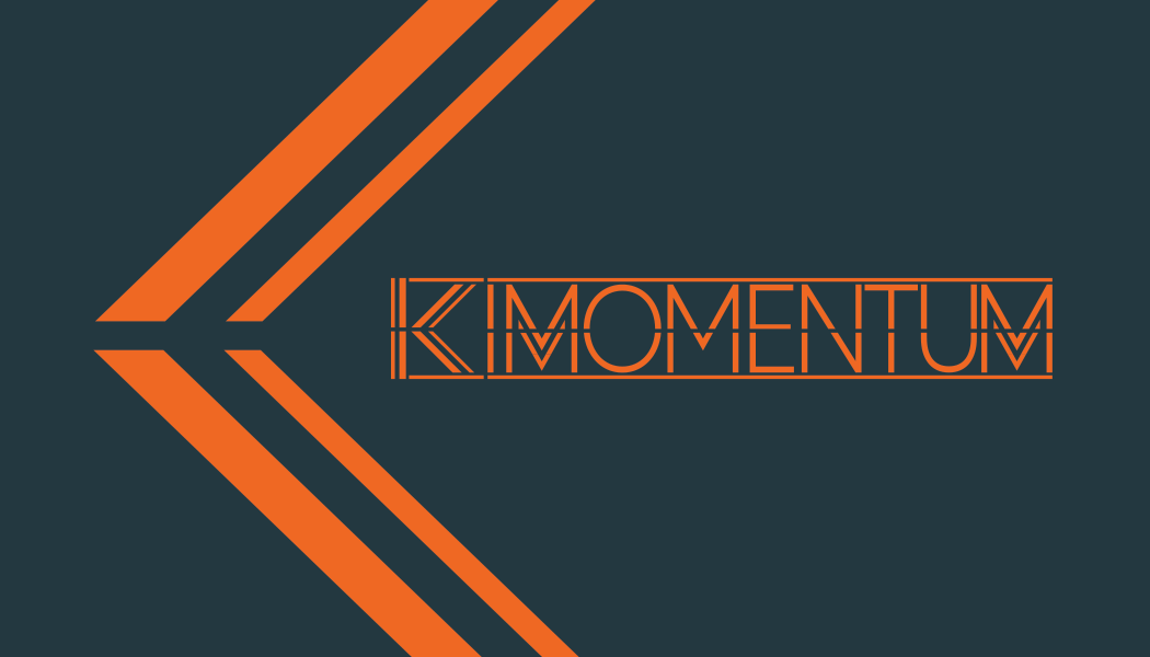
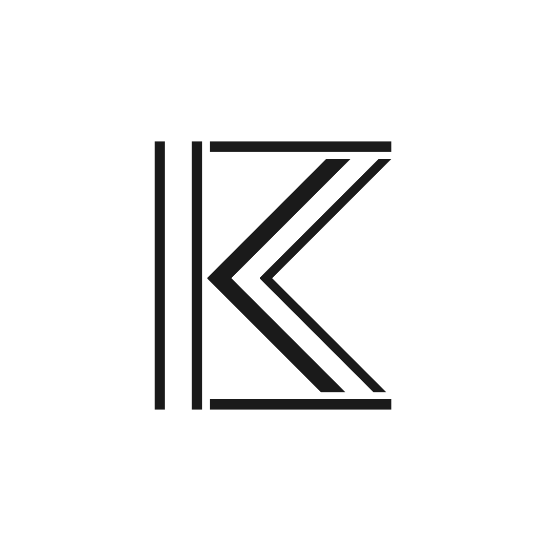
Logotype - Dark
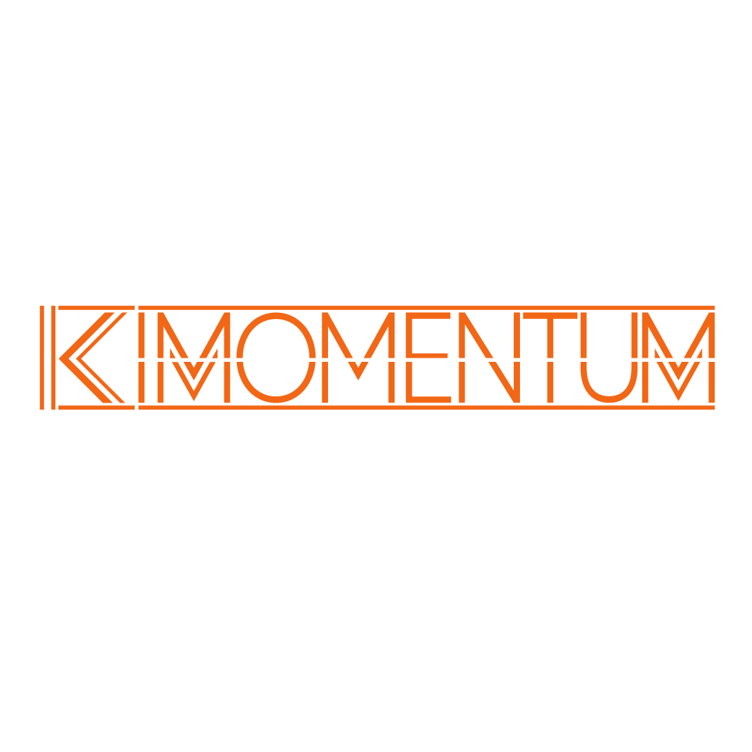
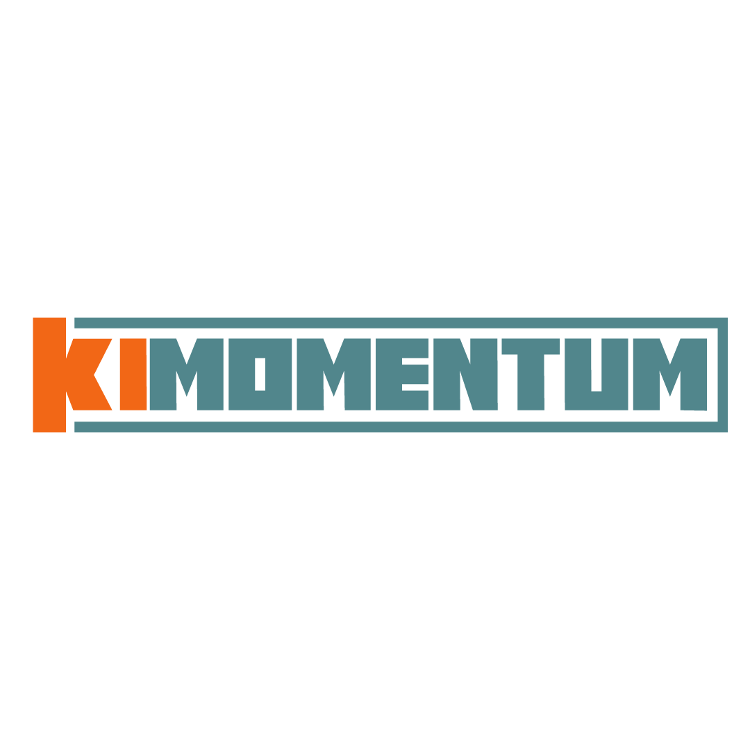
Full Logotype
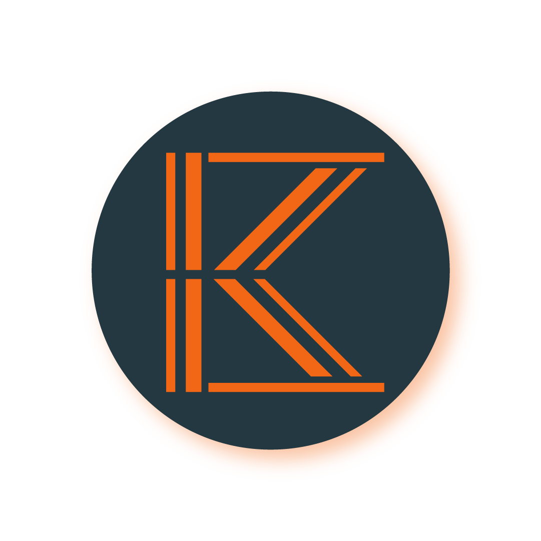
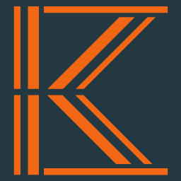
Full Logo Mark w/ Dropshadow
WebClip
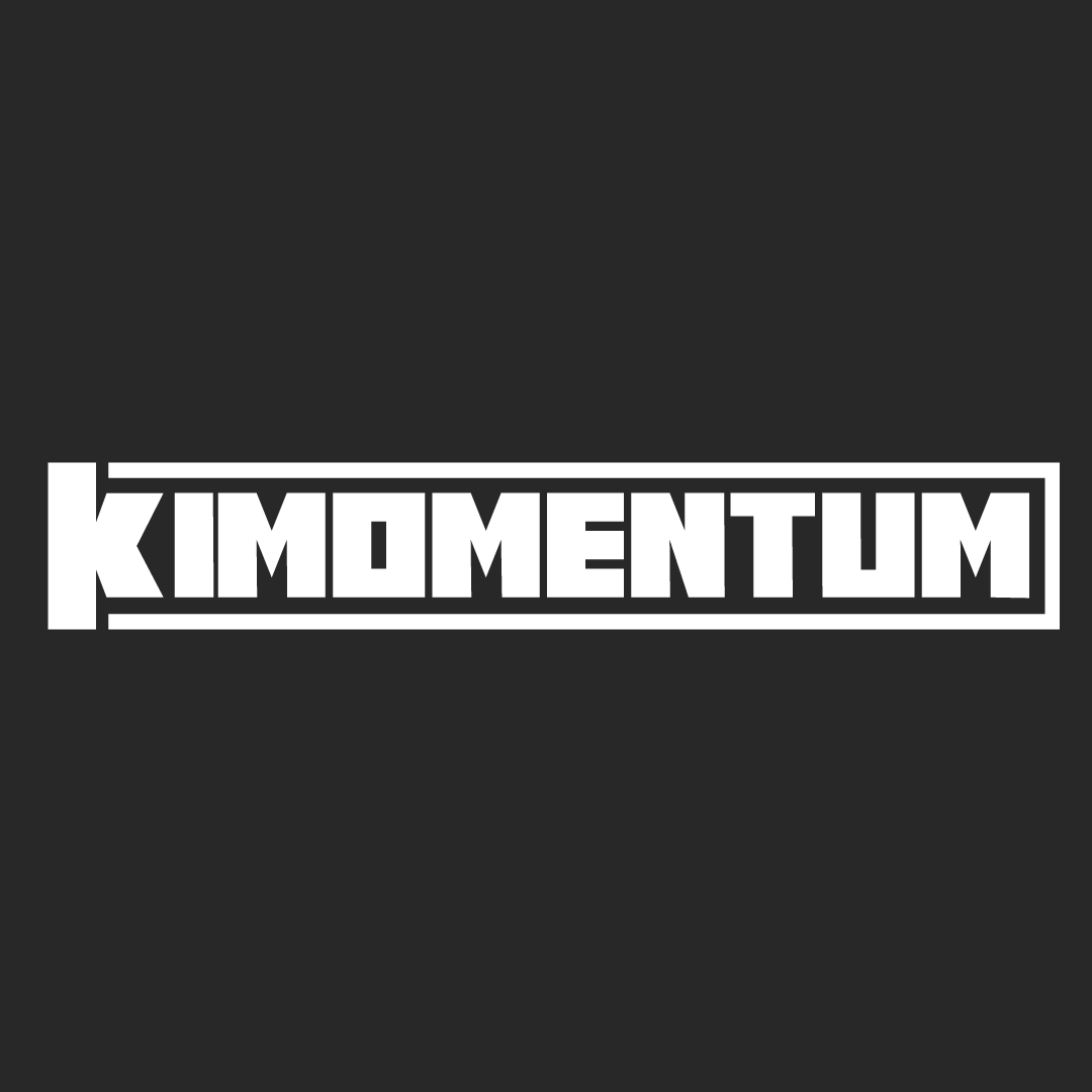
Full Logotype - Orange Only
Business Card - Front
Business Card - Back
Alternative Concept - Full Color
Alternative Concept - White
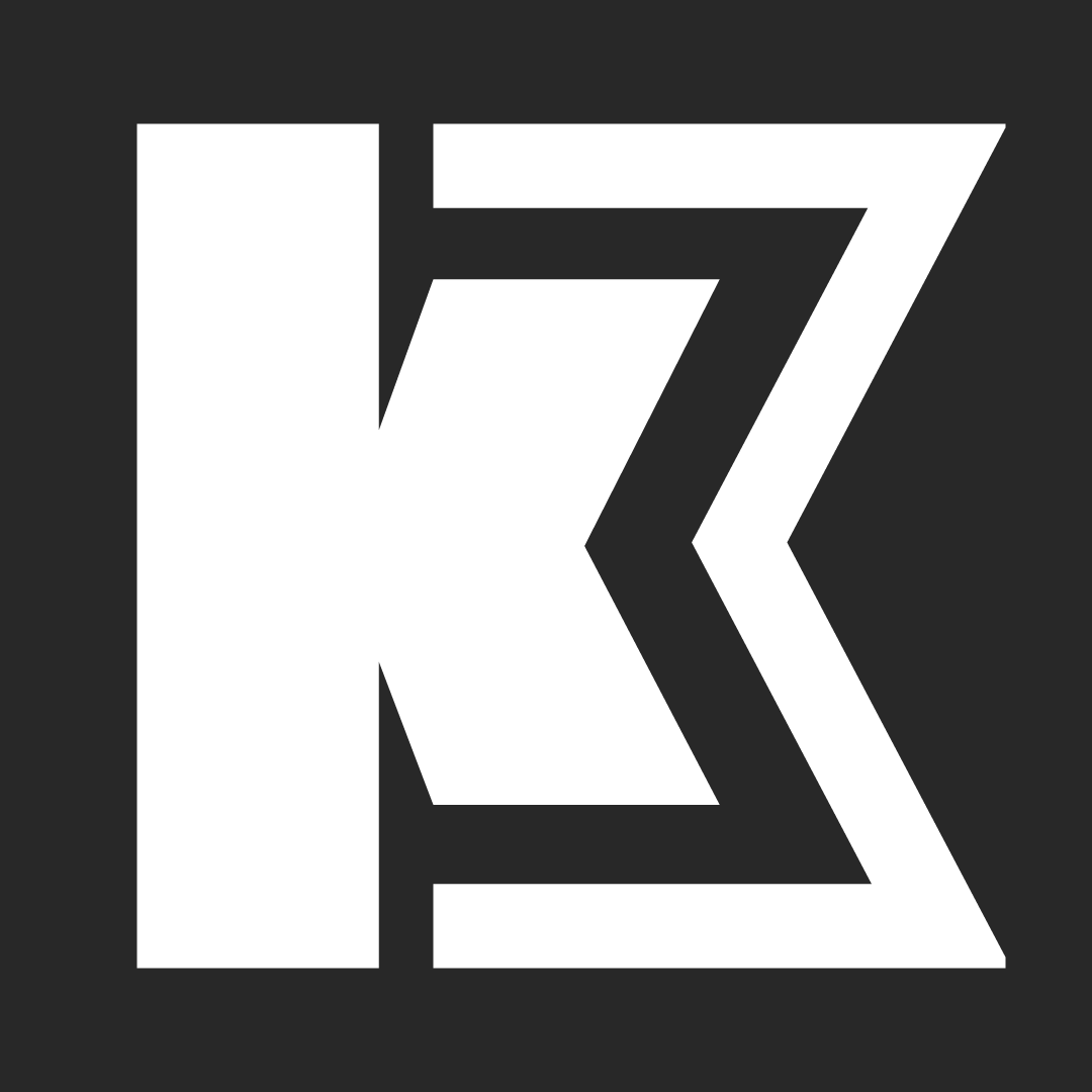
Alt Concept - White Logomark
LEGO Rebrand Concept
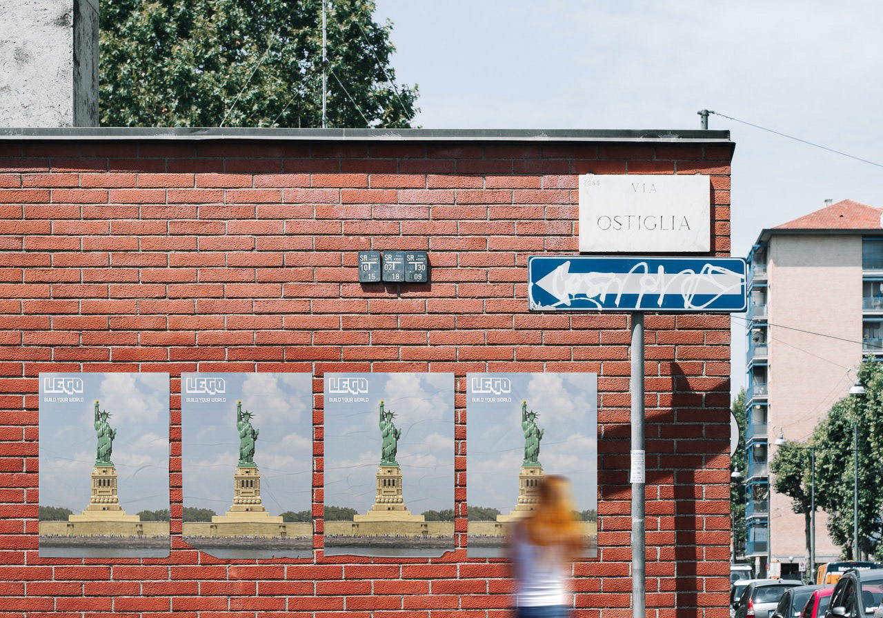
LEGO Rebrand Concept I did in school for Corporate Design class. We had to take an existing corporate identity, and transform it, and rationalize why. I decided to rebrand LEGO, and the reason for that was, I discovered that the largest demographic of purchases of LEGO came from 29-45 year olds, who grew up playing with it! Thing is, these people were buying it mostly for their children, but since this was also the largest group of purchasers, why not market towards them as well? So I created a brand to speak more towards that demographic, rather than market directly towards children, while still retaining a playful look that would also appeal to kids. LEGO has plenty of interesting products targeted towards adult and millennial aged buyers, who would be interested in these products, but have no awareness of them.
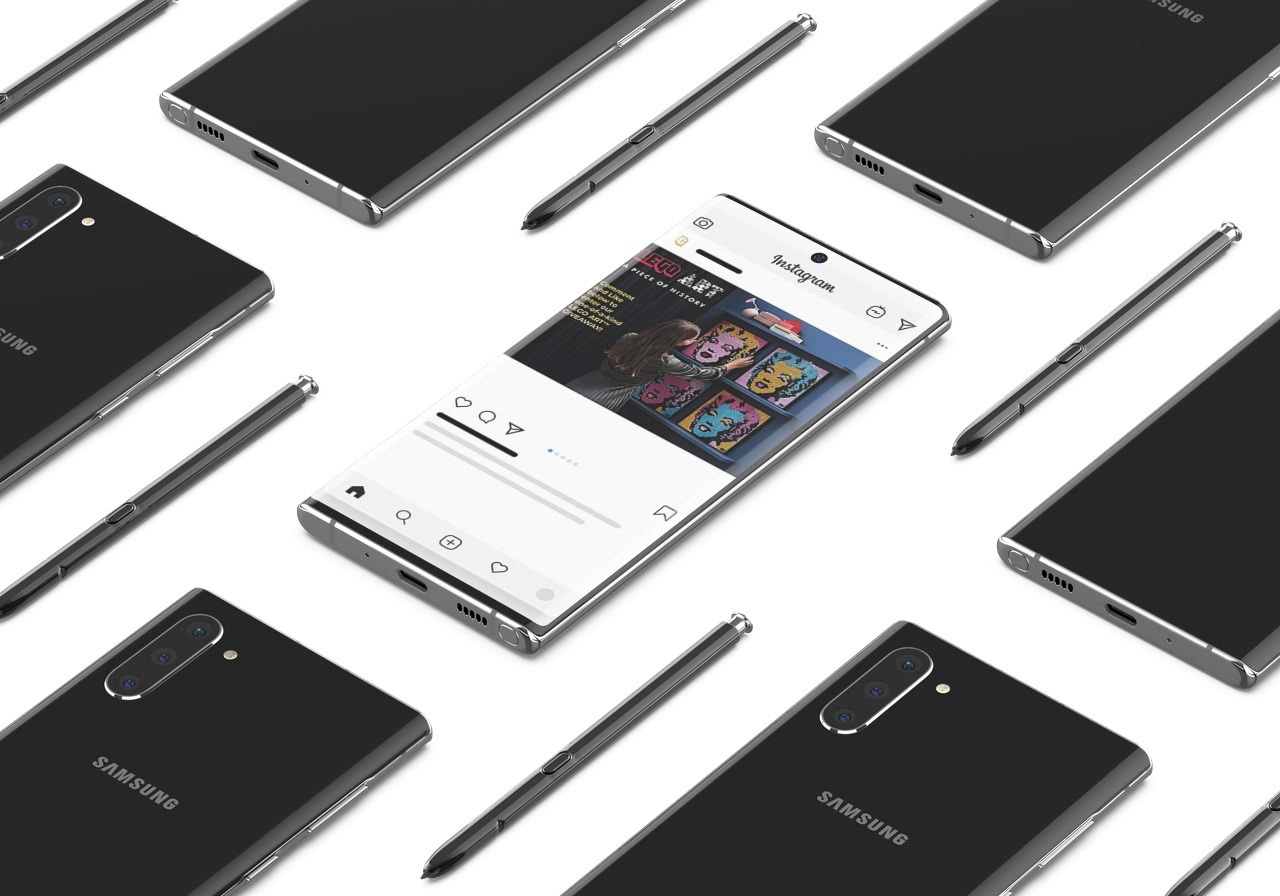
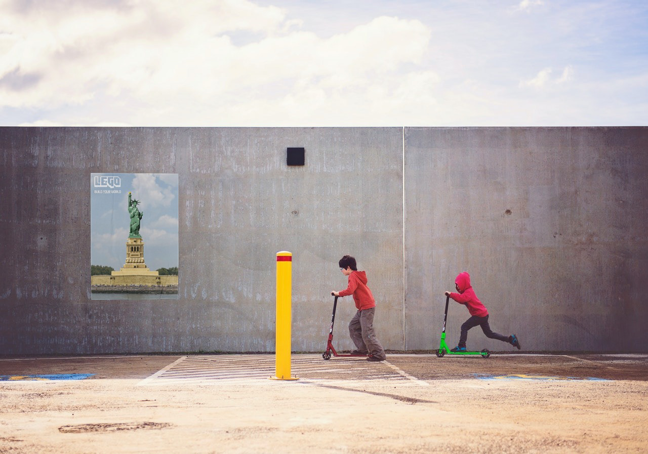
In the ad campaigns, I also feature products such as LEGO ART and the real world collections of actual landmarks, in an effort to further appeal to a more grown up audience. The colours of the brand were made to appear more mature, rather than the hyper-saturated hues that appeal to children. I also mocked up a redo of the website to create a more user-friendly feel, that was easier and faster to navigate and make a purchase, while increasing interactivity.
In the ad campaigns, I also feature products such as LEGO ART and the real world collections of actual landmarks, in an effort to further appeal to a more grown up audience. The colours of the brand were made to appear more mature, rather than the hyper-saturated hues that appeal to children. I also mocked up a redo of the website to create a more user-friendly feel, that was easier and faster to navigate and make a purchase, while increasing interactivity.
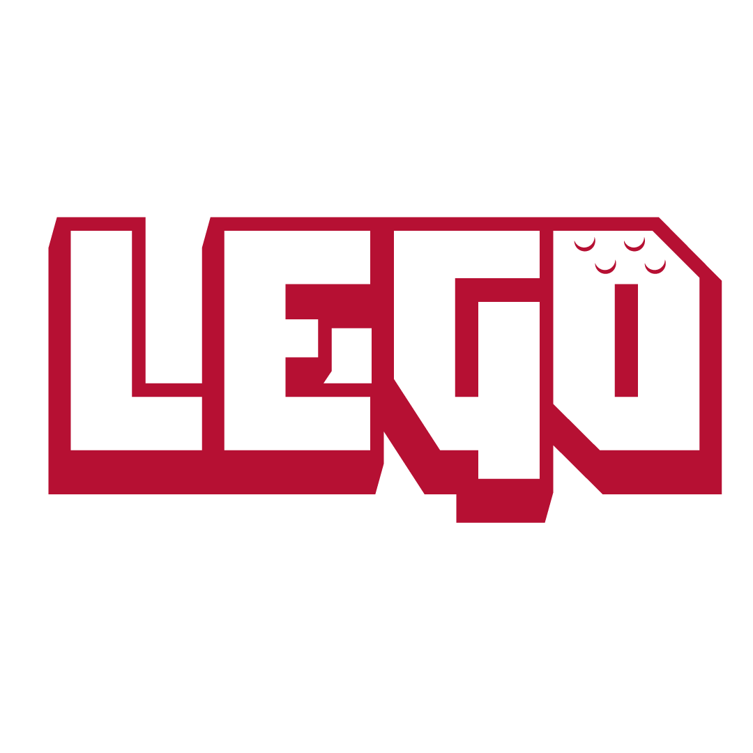
Final Logo
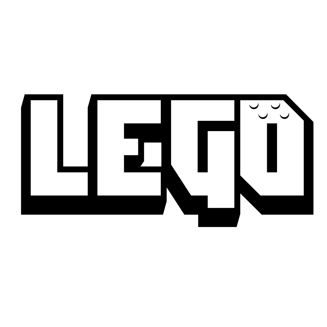
Logo - Black on White
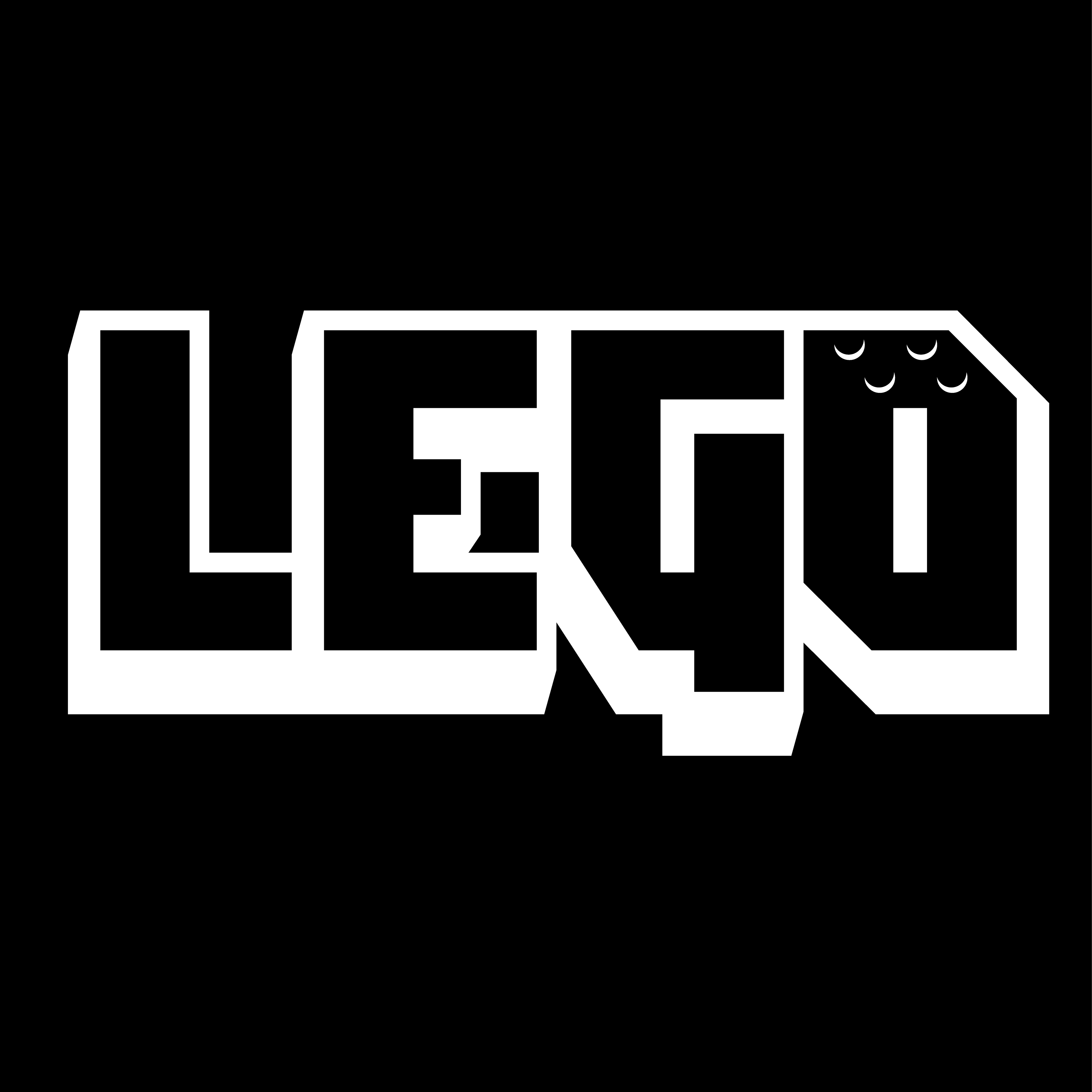
Logo - White on Black
Icon Alternate
Icon Alternate - White
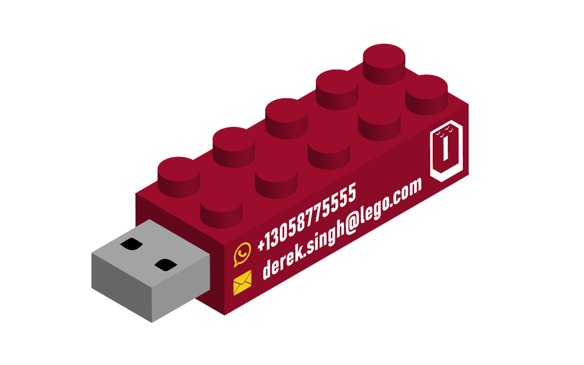
Functional Lego Block USB Key Business Card for Executives
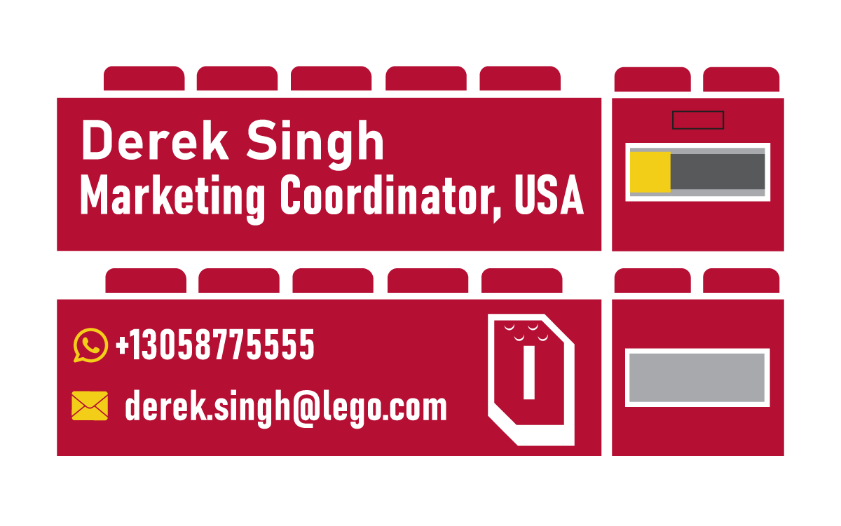
USB Key Business Card Orthographic View

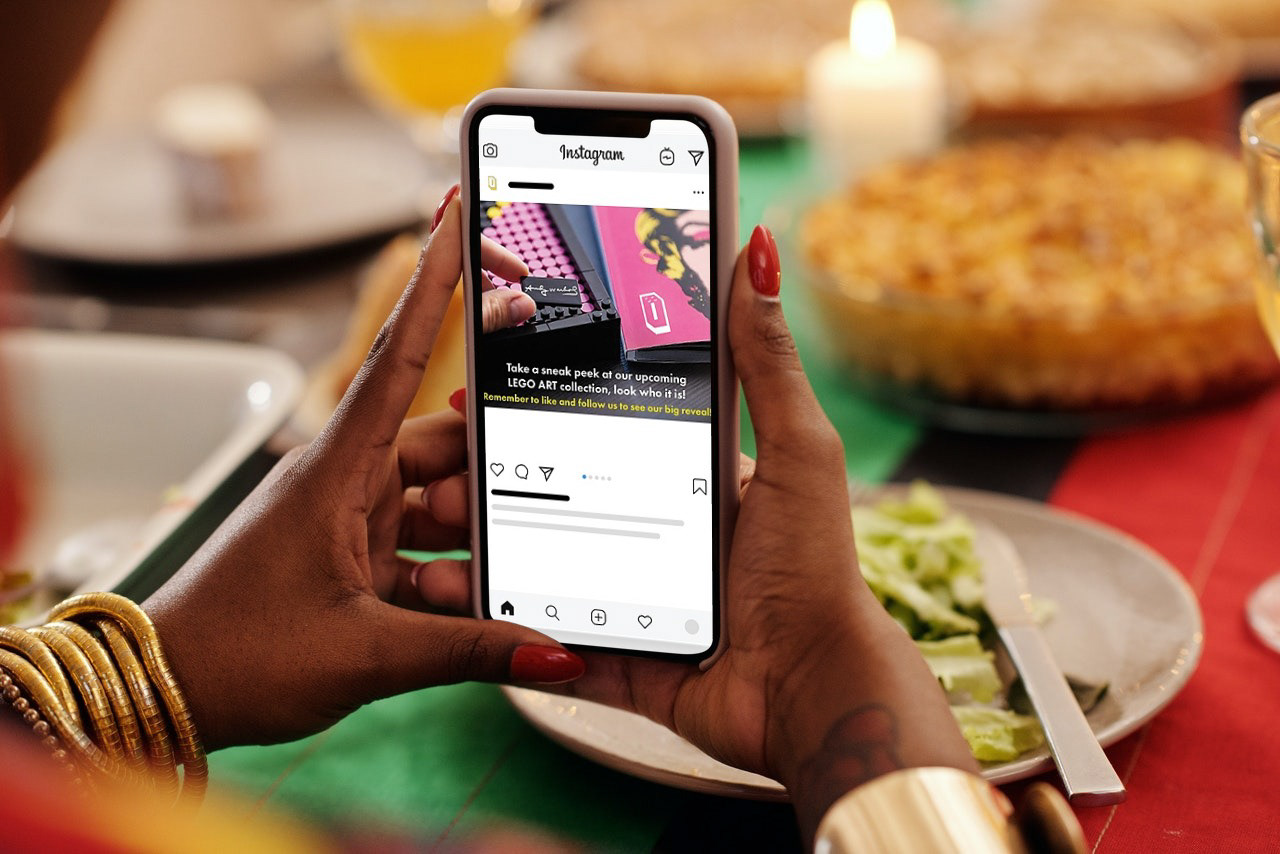
Social Media Ad Campaign Mockup
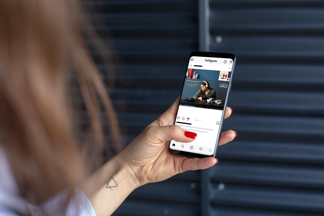
Social Media Ad Campaign Mockup
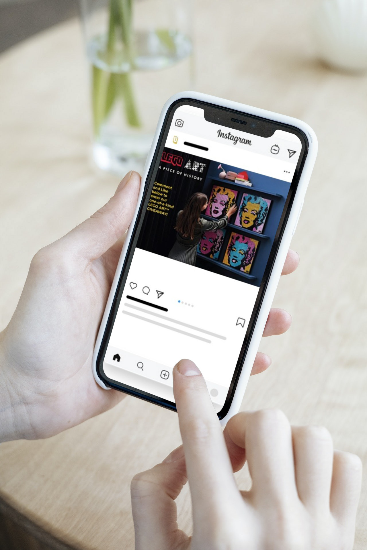
SM AD Campaign Mockup
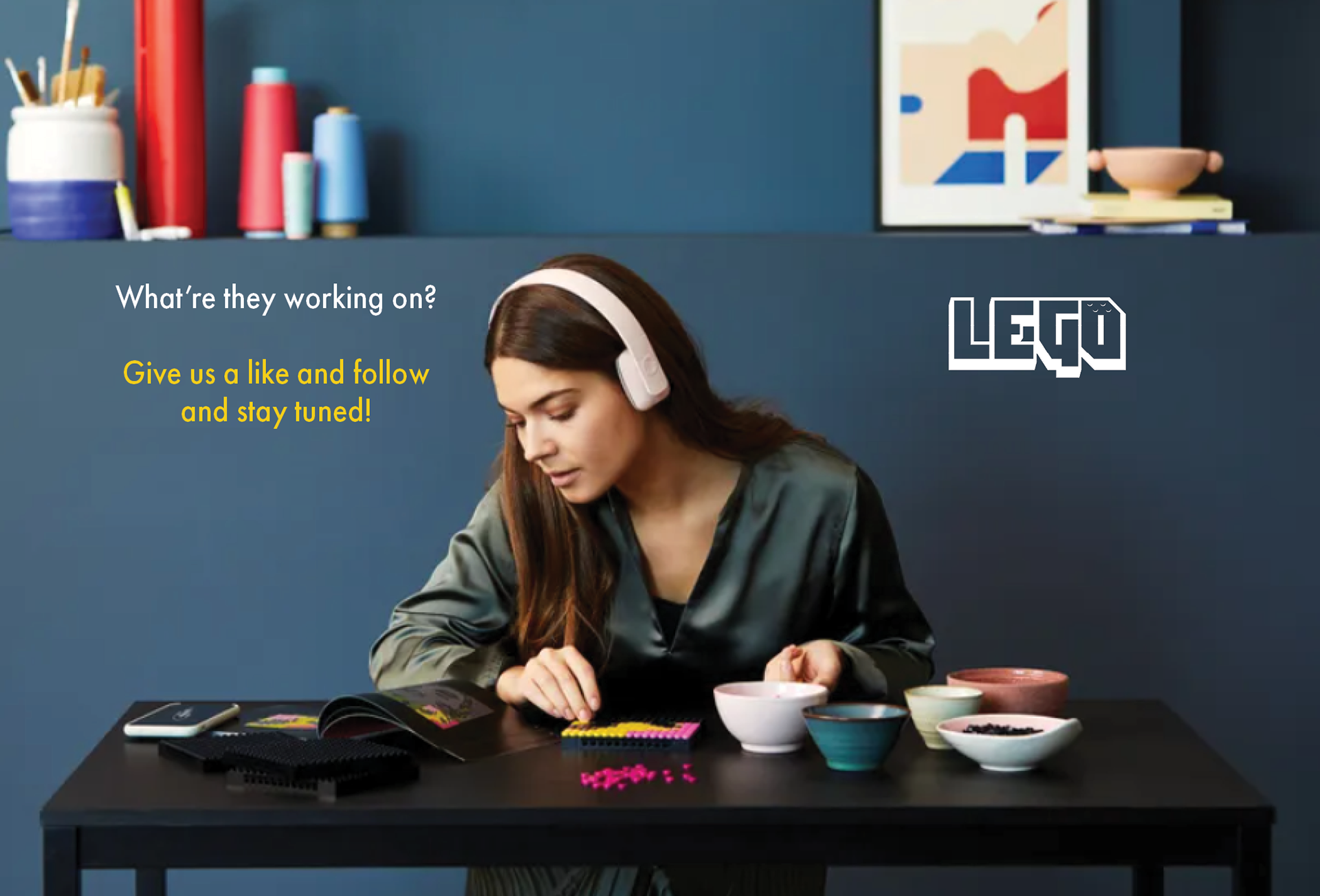
Social Media Ad Campaign
Train Ad
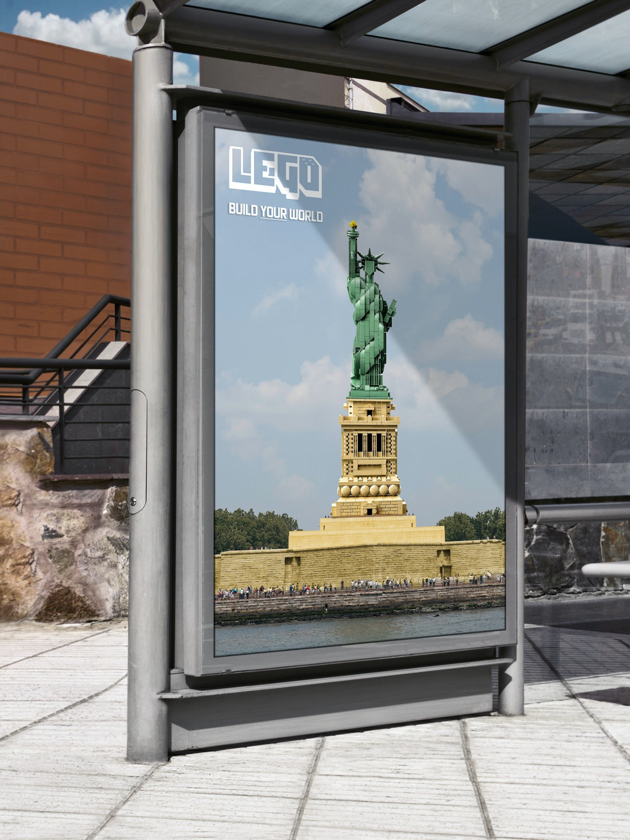
Bus Stop Ad
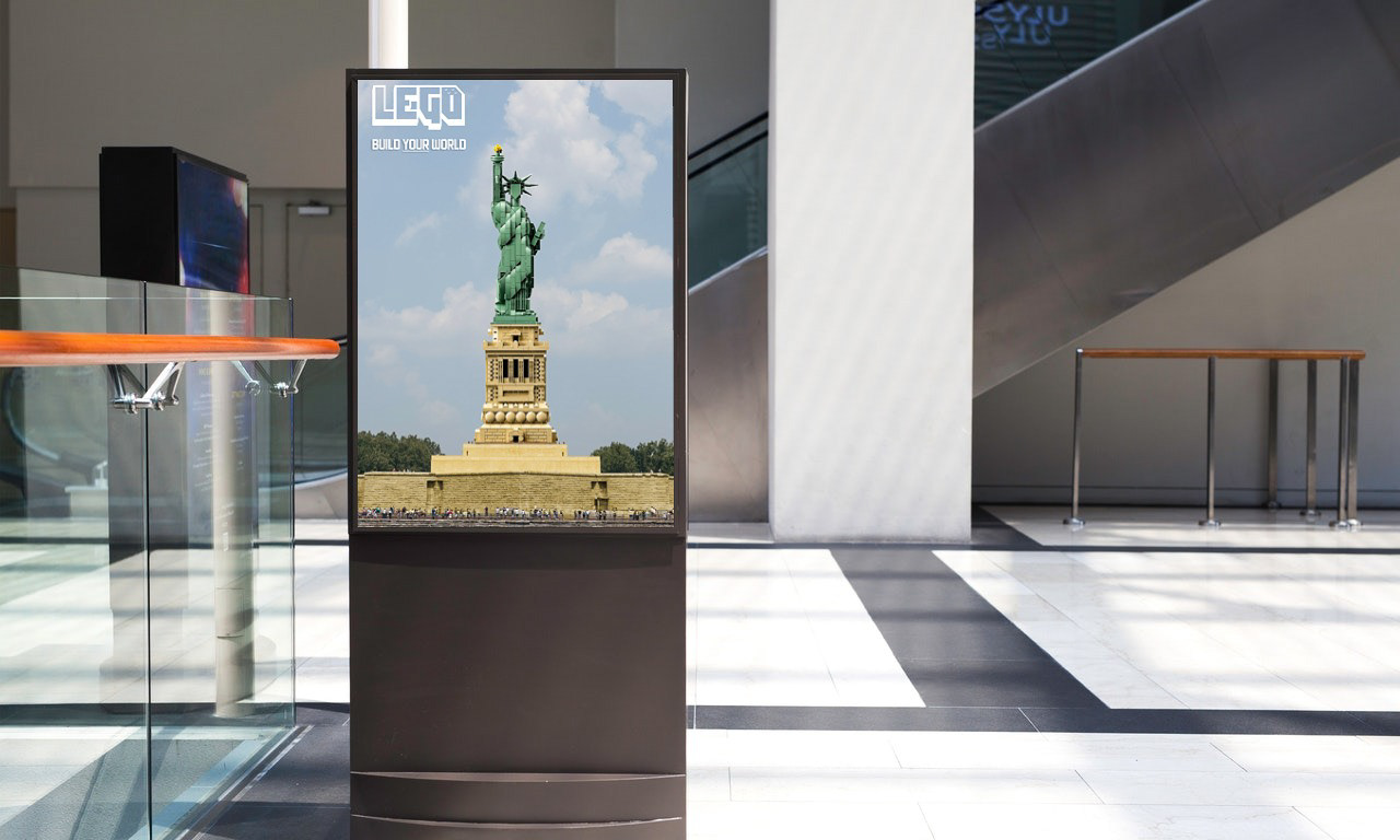
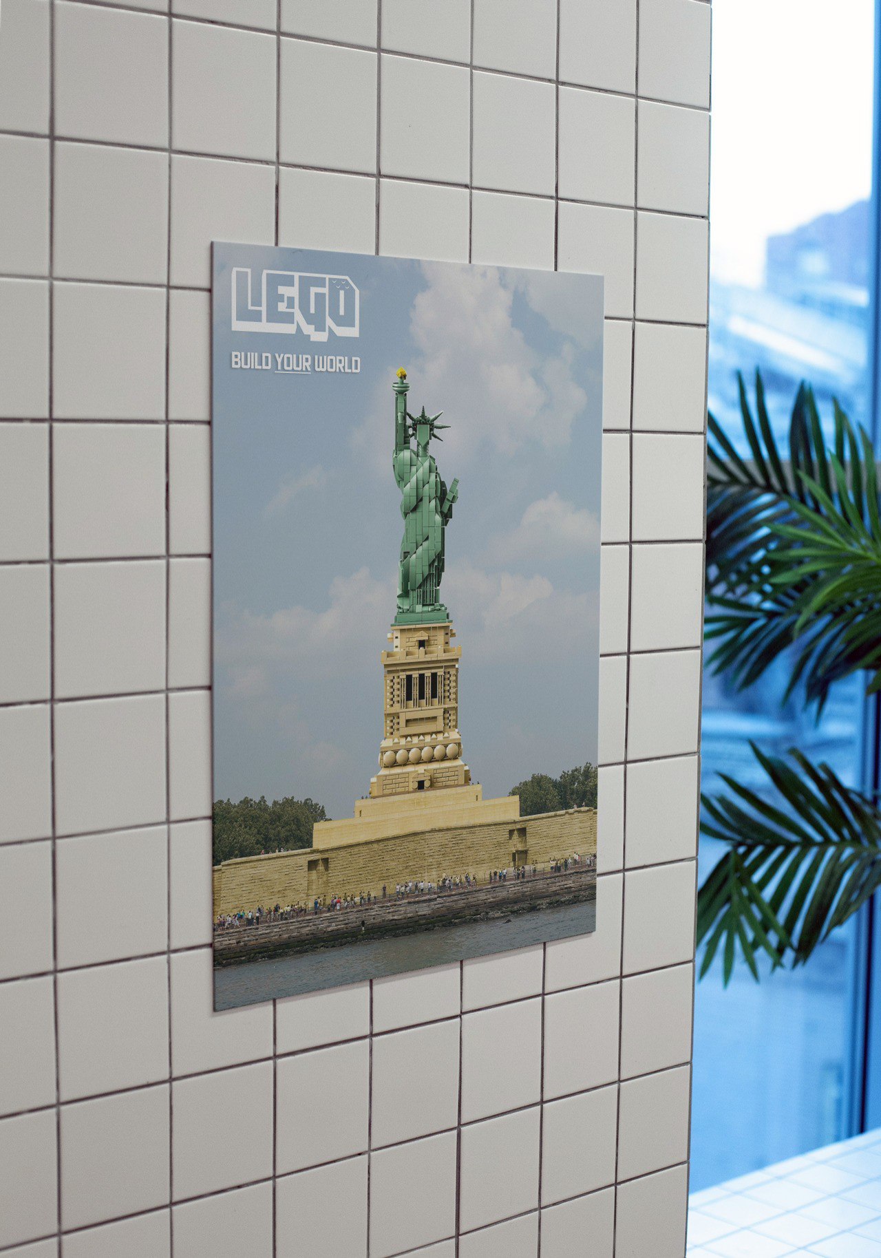
Mall Deployment
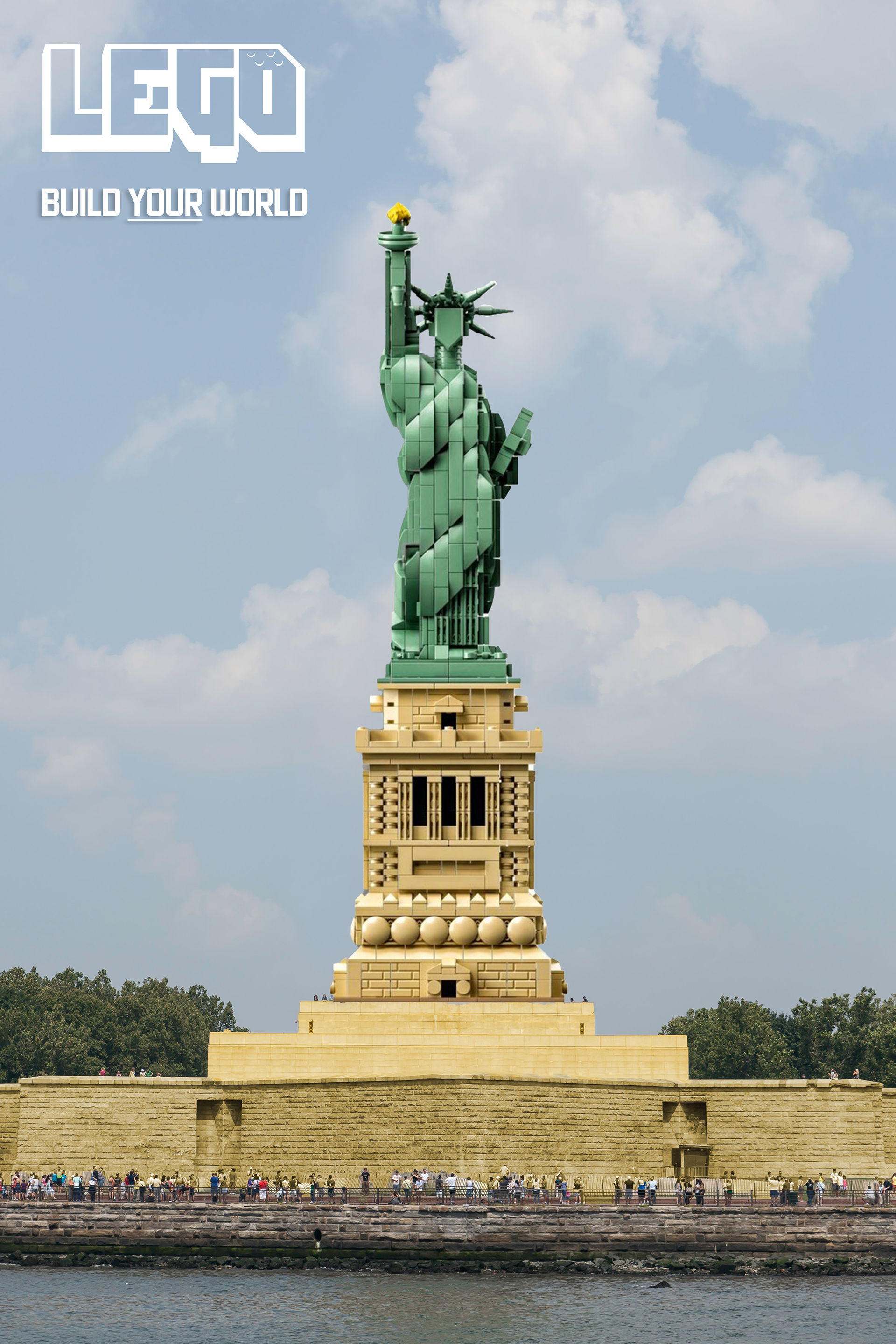
LEGO Ad
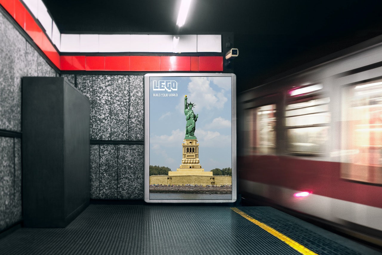
Subway Ad Deployment
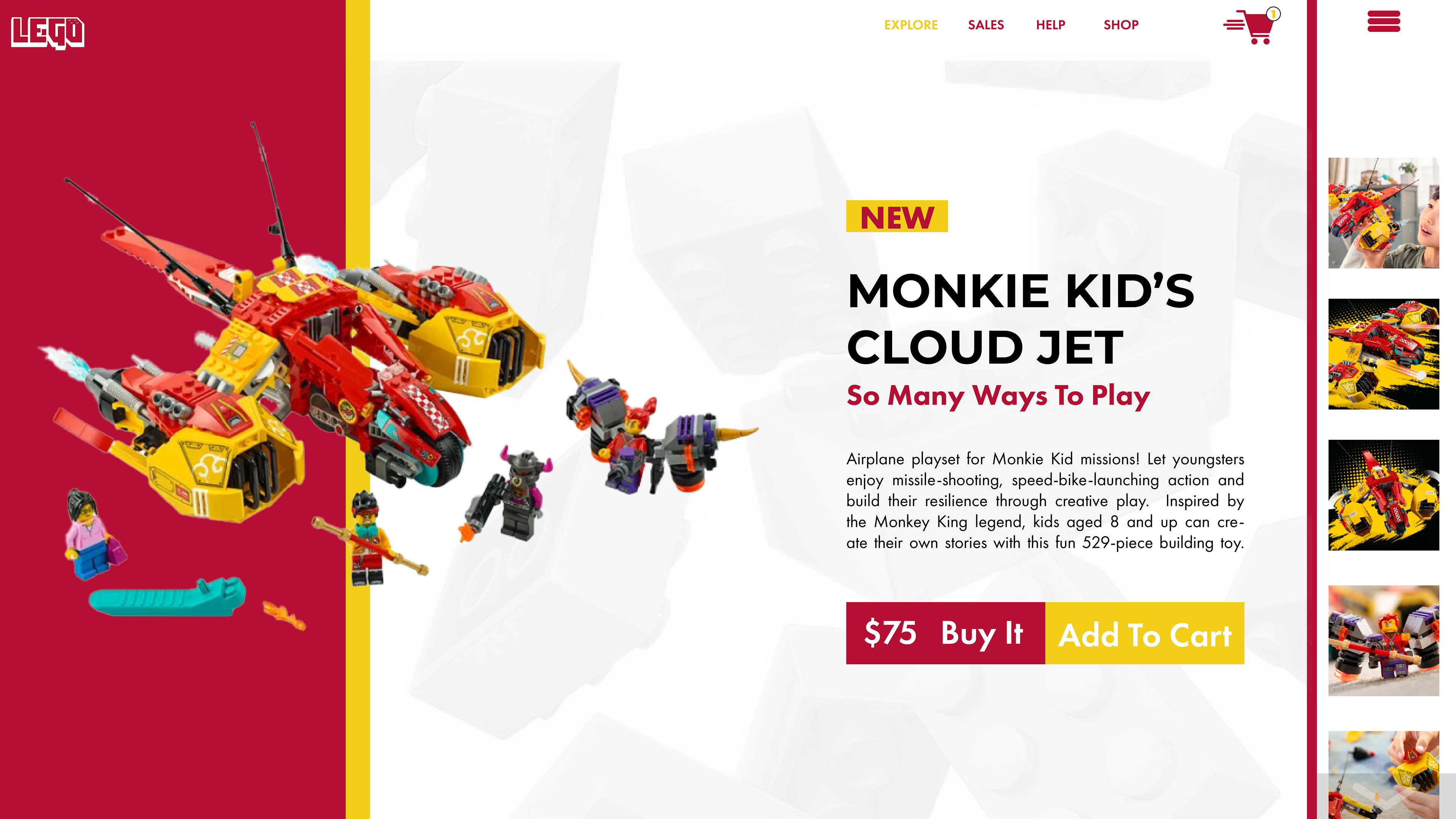
Item Purchase Page Concept
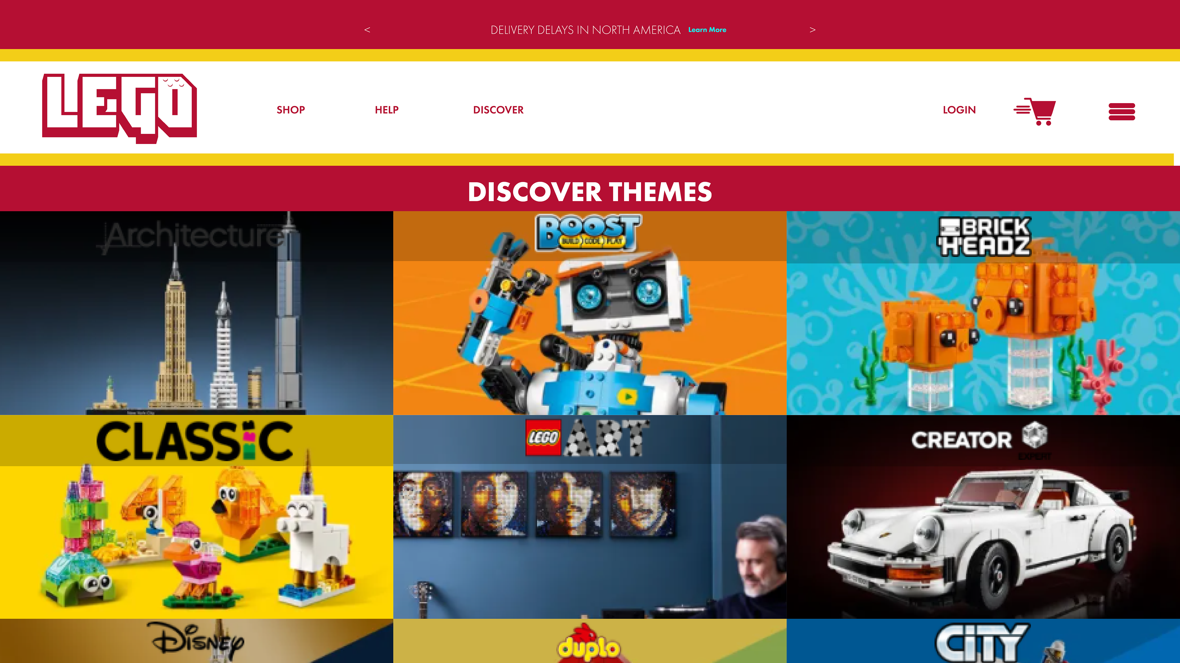
Discover Page Concept - Clickable Tiles
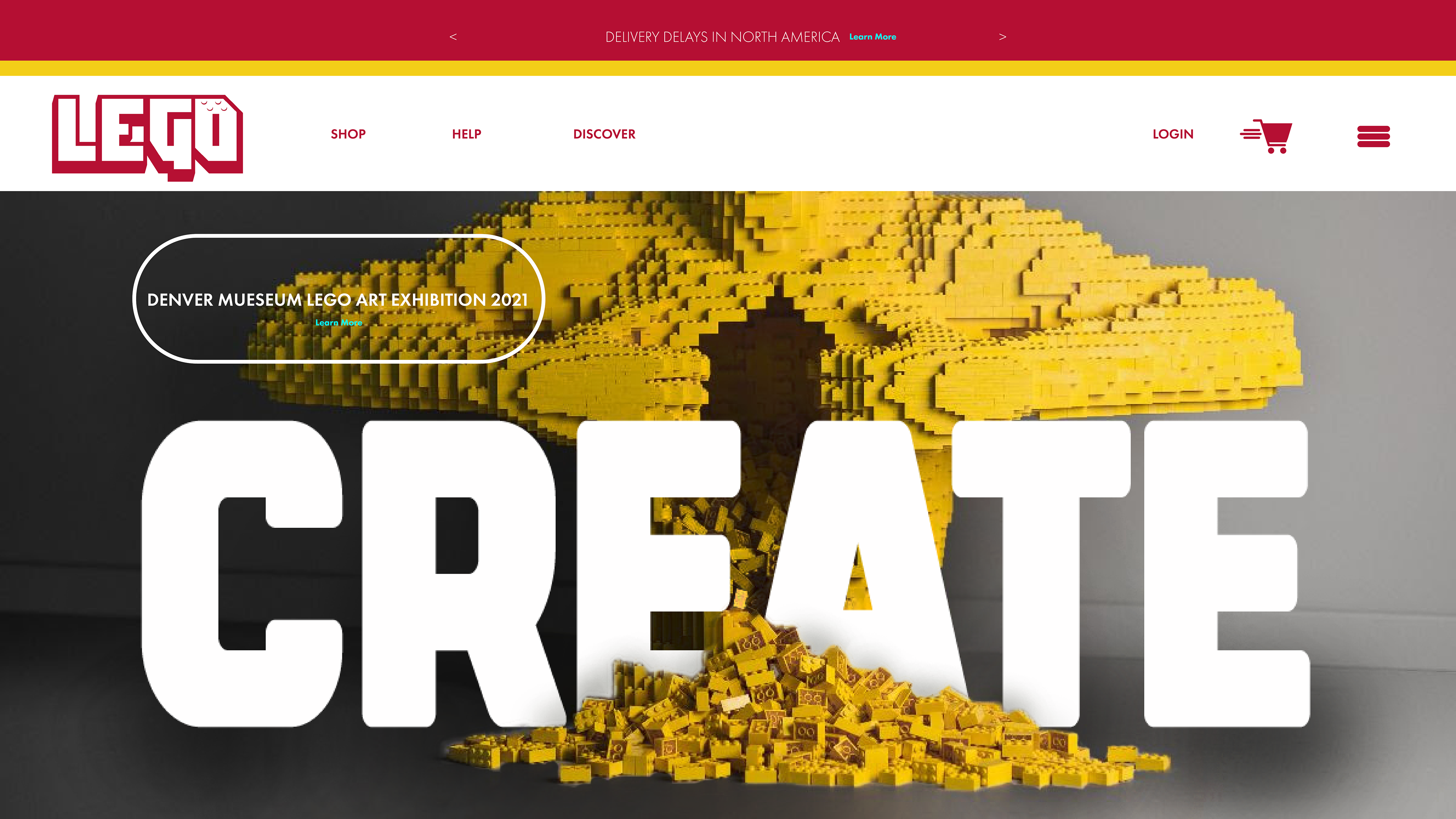
Home Page Concept
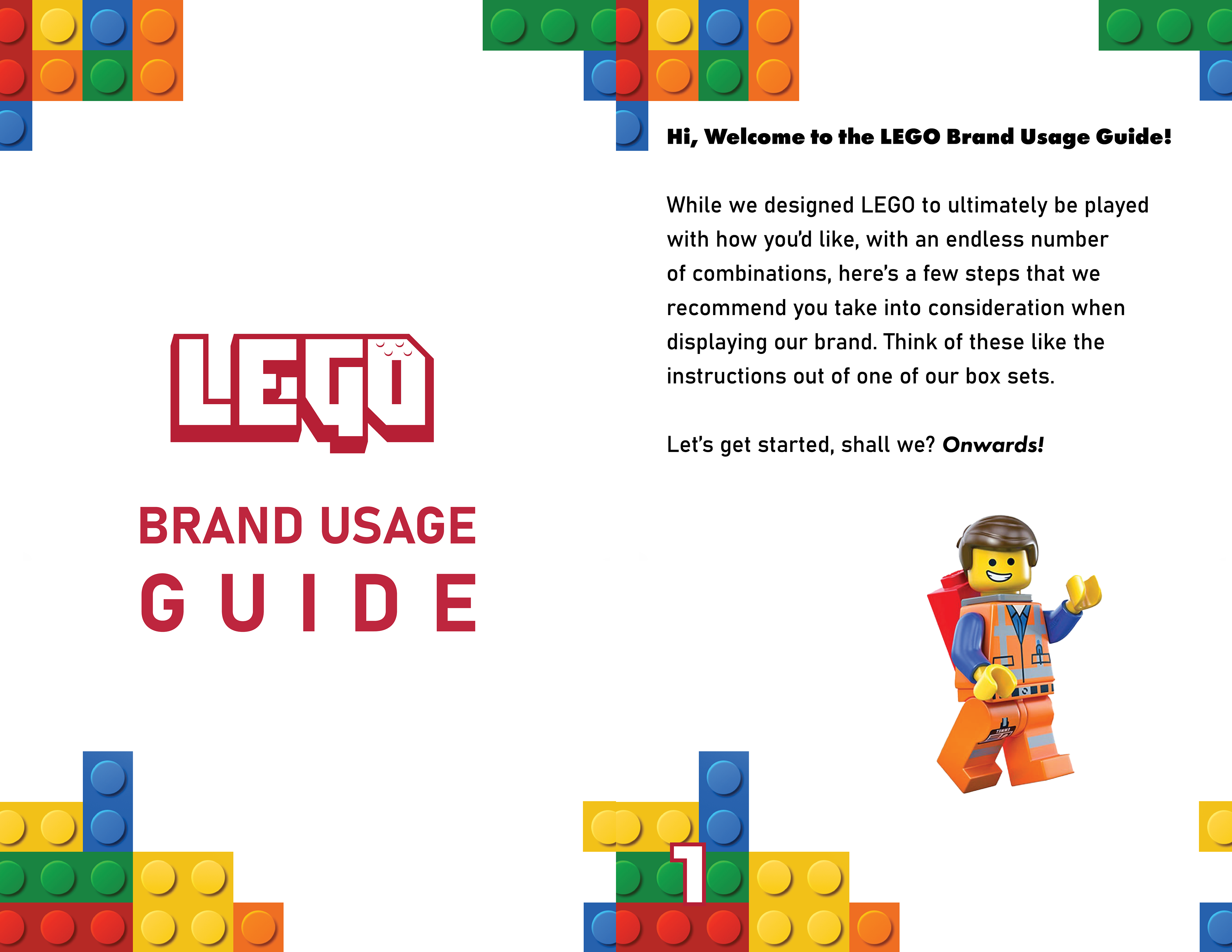
Brand Usage Guide
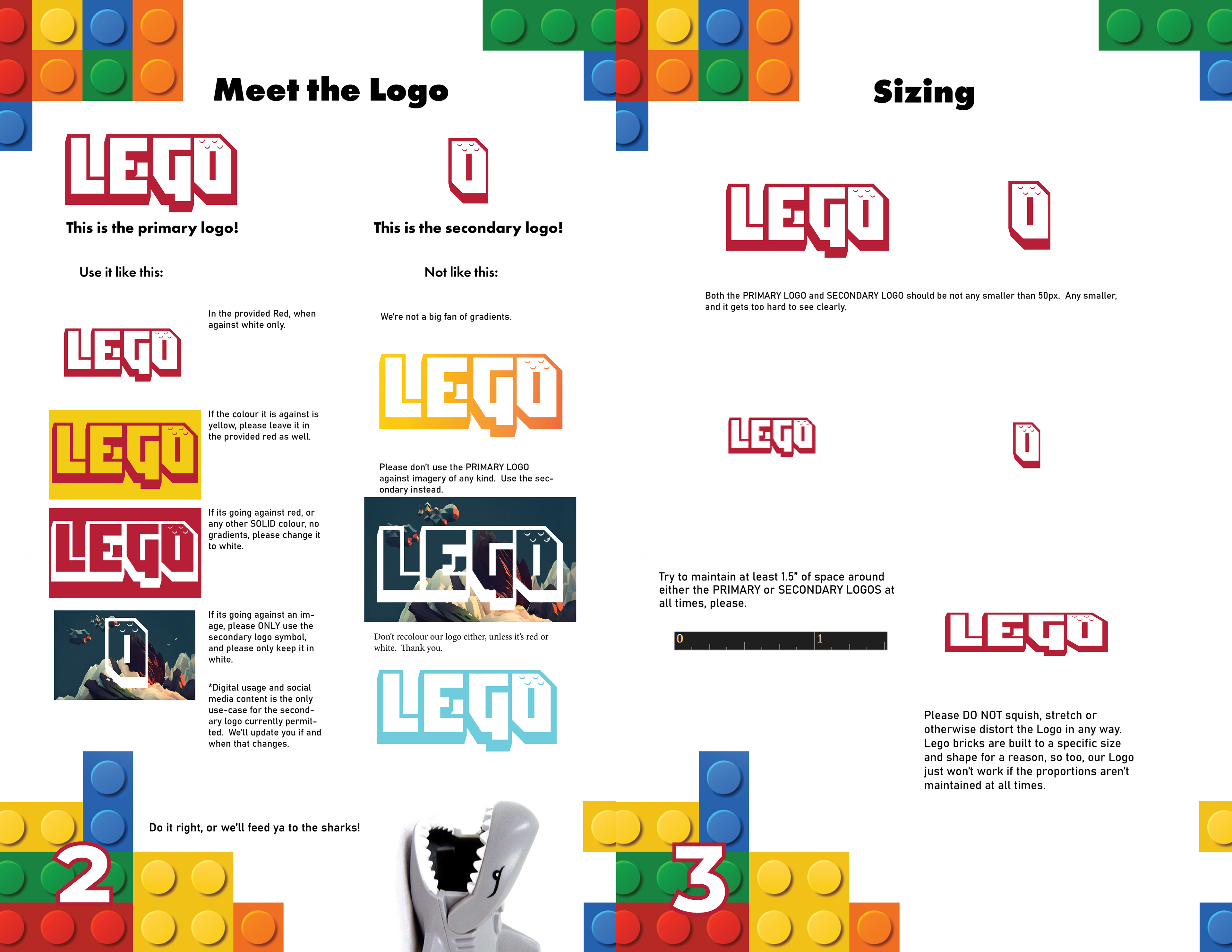
Brand Guide Page 2-3
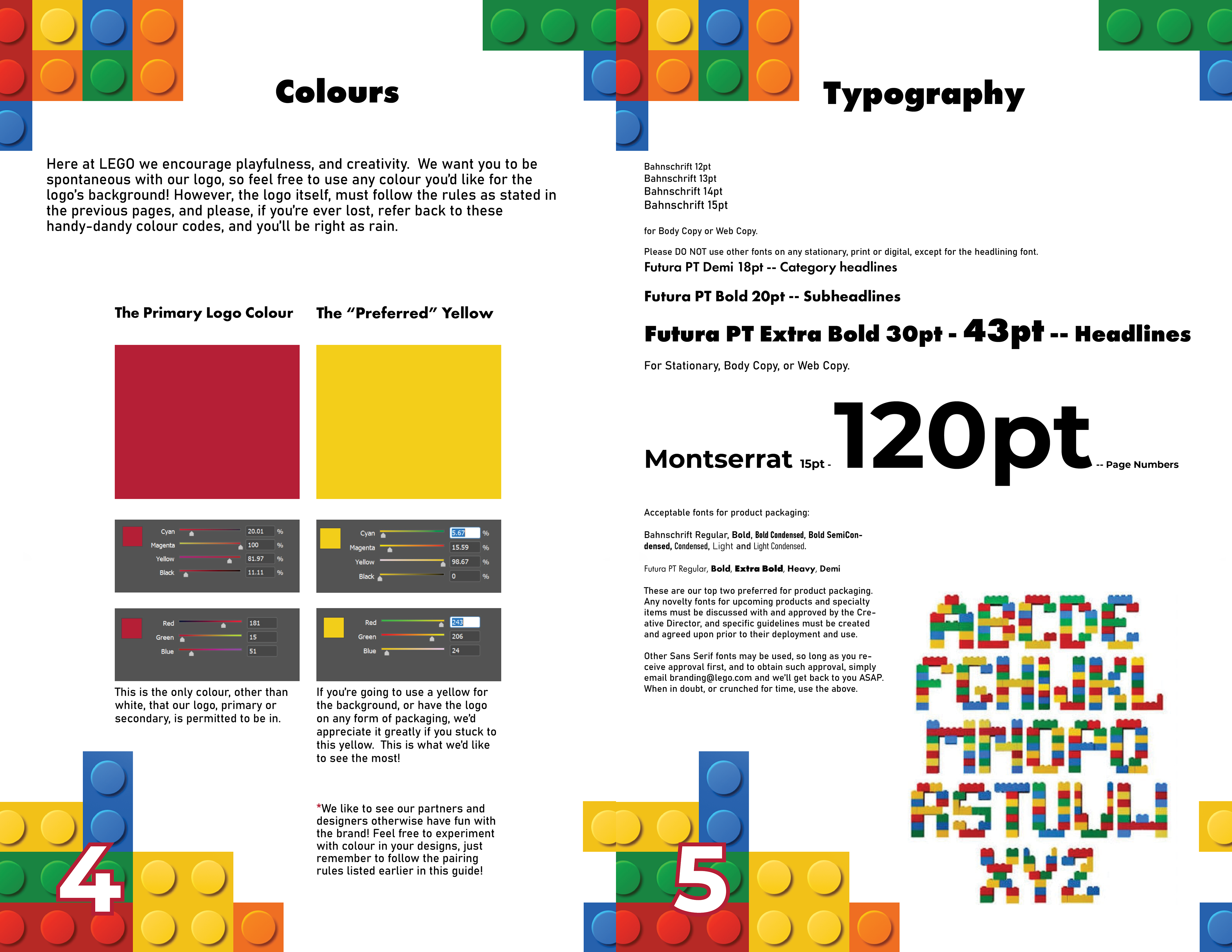
Brand Usage Guide Page 4-5
Brand Usage Guide Page 6
A 3D intro graphic hero image concept
Social Media Deployment Concept
Ad Deployment
Ad Deployment 2
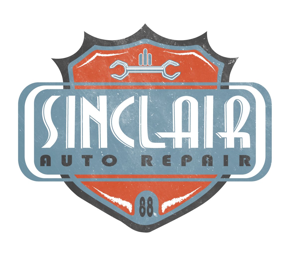
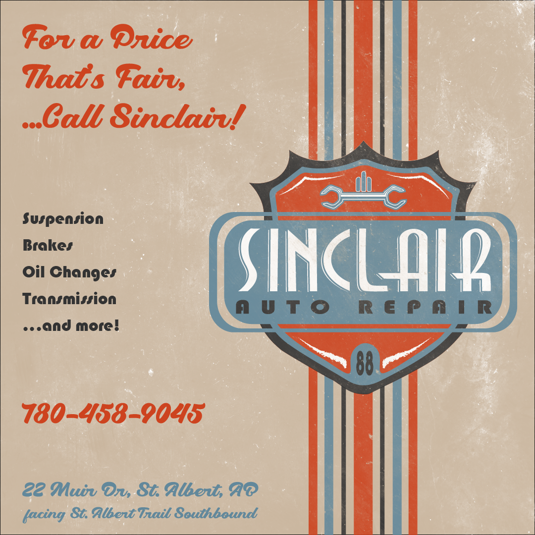
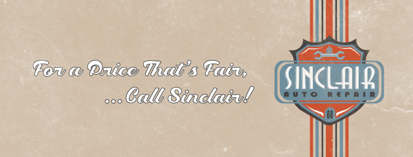
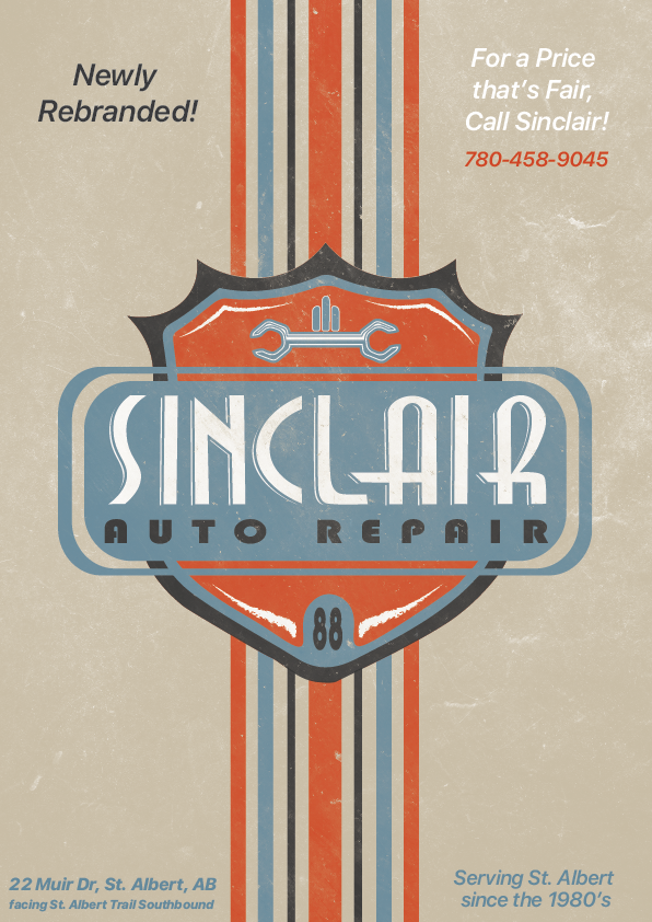
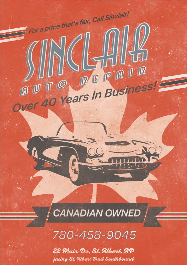
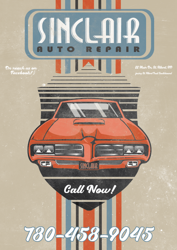
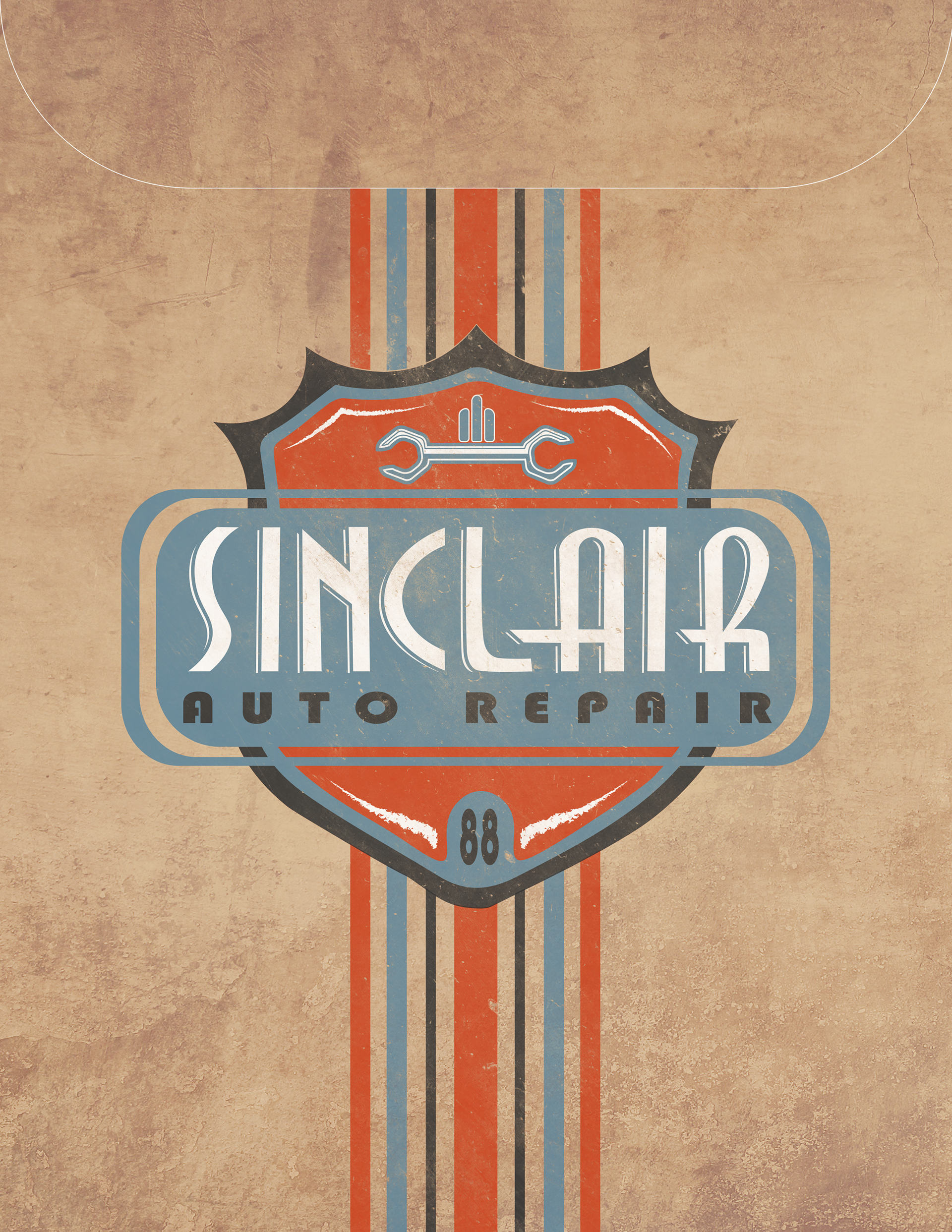
Sinclair Auto Repair
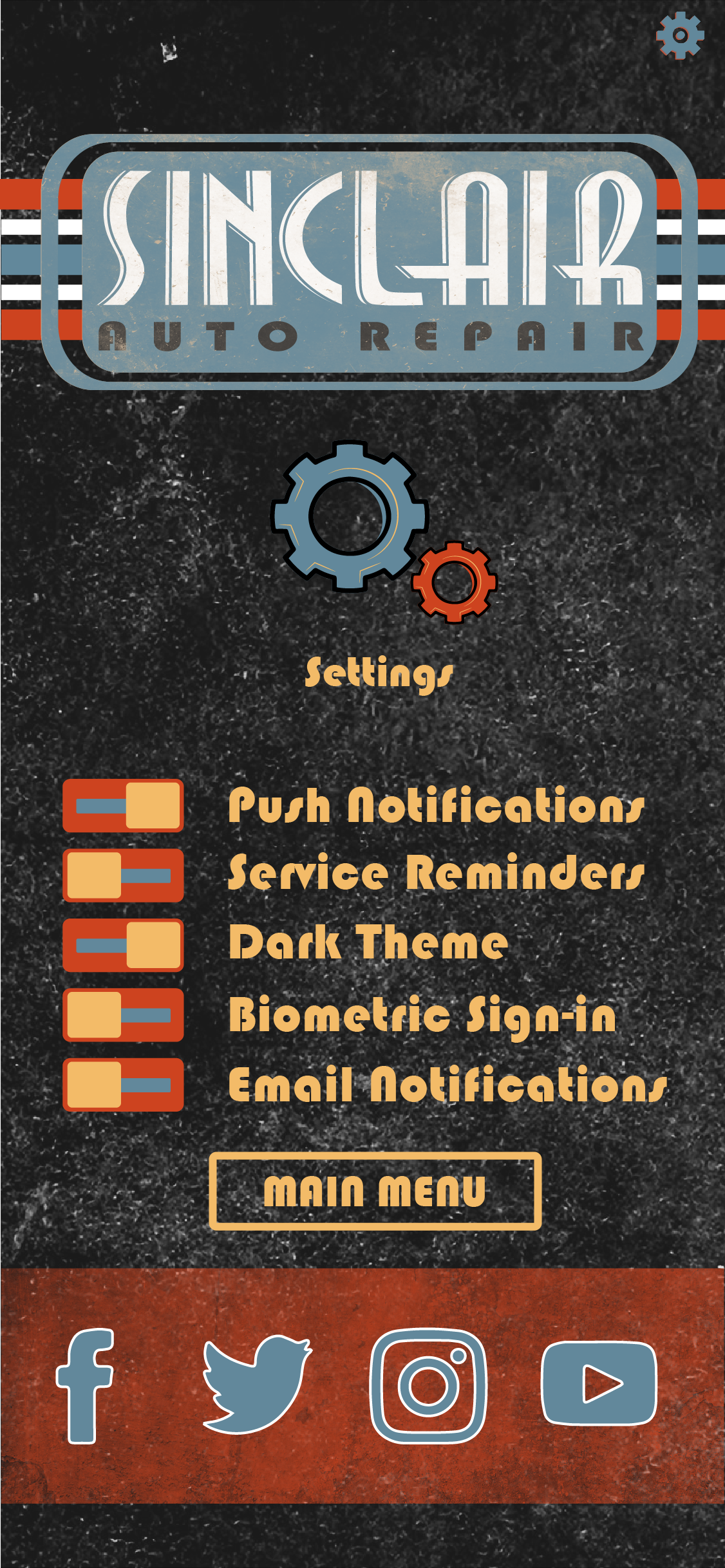
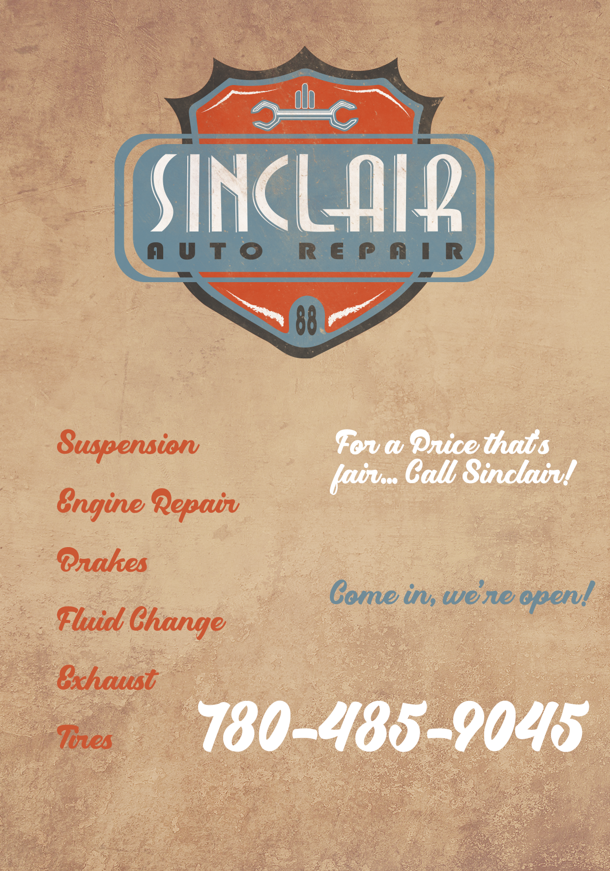
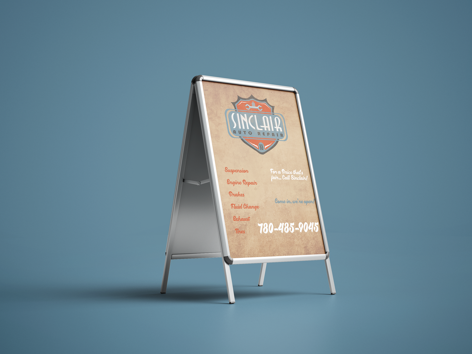
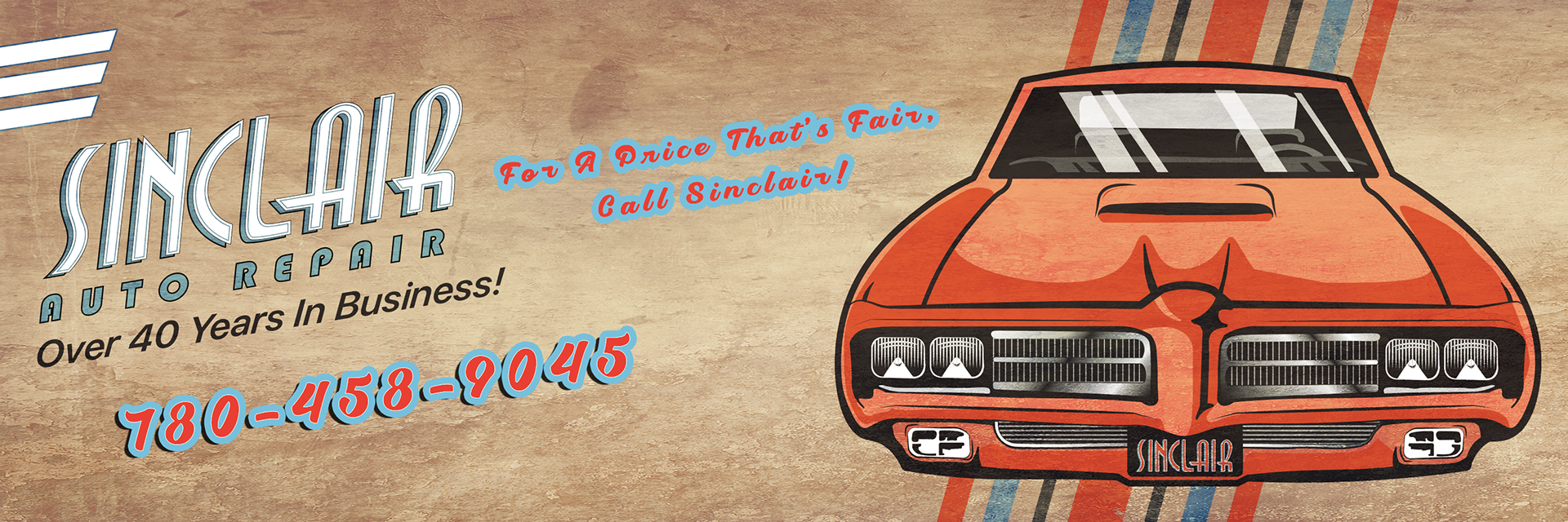
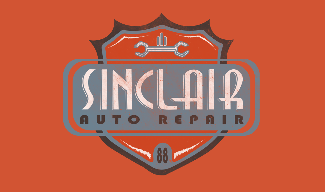
Sinclair Auto Repair is a mechanic shop here in St. Albert, AB, Canada -- They have been in business for over 40 years, serving the local St. Albert and Greater Edmonton Region. Their current branding is non-existent, so I took it upon myself to create a brand identity from top-to-bottom, complete with print and digital media ad campaigns, and even designing a mobile app! That way, users are always reminded of the brand on their phones, and increase the ease-of-access, by being able to book service times in, without having to get on the phone, and do so at one's leisure, and keep a record of their quotes from shop inspections, so they can come back to them and fulfill them at their convenience. I went for a retro vibe with their logo and color palette, to create something that would have that universal appeal across demographics and be easy to identify amidst the sea of "racing" and "high performance" styled branding as is typical in the automotive space.
I illustrated the cars in the print ads as well, using adobe illustrator -- the typography for the logo wasn't a font either, it was hand drawn lettering, that was straightened out using grids in Adobe Illustrator.
I illustrated the cars in the print ads as well, using adobe illustrator -- the typography for the logo wasn't a font either, it was hand drawn lettering, that was straightened out using grids in Adobe Illustrator.
Final Logo Concept

FB/Insta Ad Carousel

FB/Insta Ad Carousel

FB/Insta Ad Carousel
FB/Insta Ad Carousel 2

FB/Insta Ad Carousel 2
FB Business Page Cover Photo
FB Biz Page Cover Photo 2
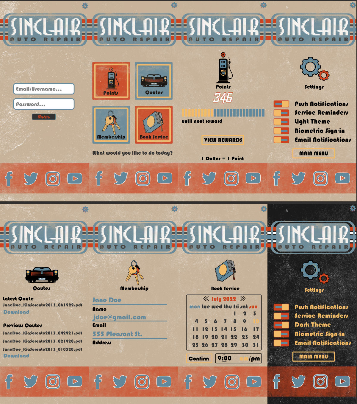
Mobile App At-A-Glance
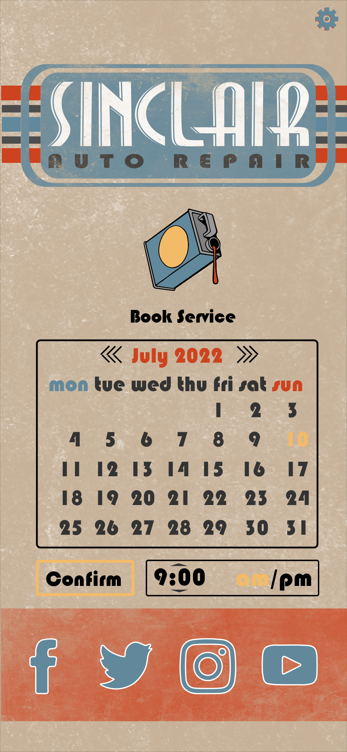
Schedule A Service
Dark Mode
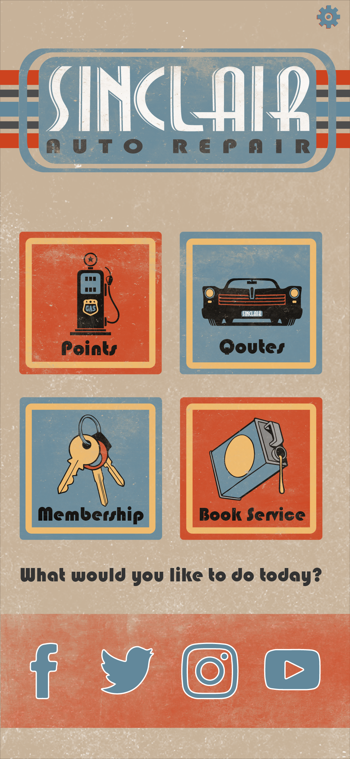
Home Screen
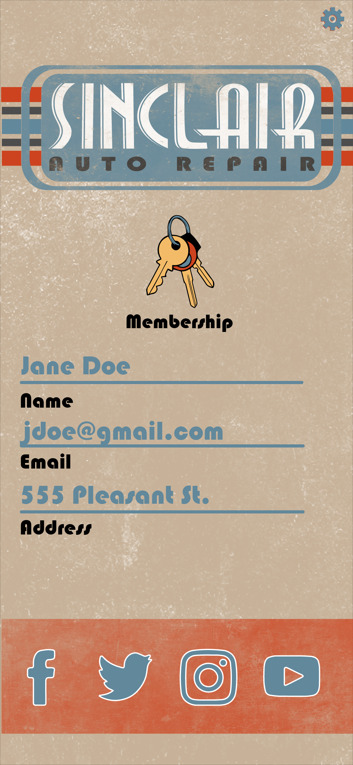
Account
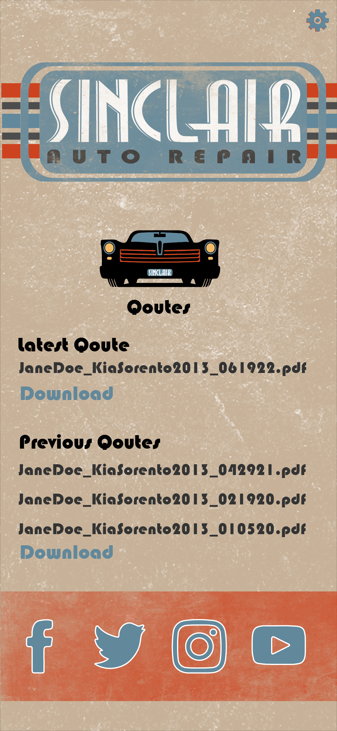
Quotes
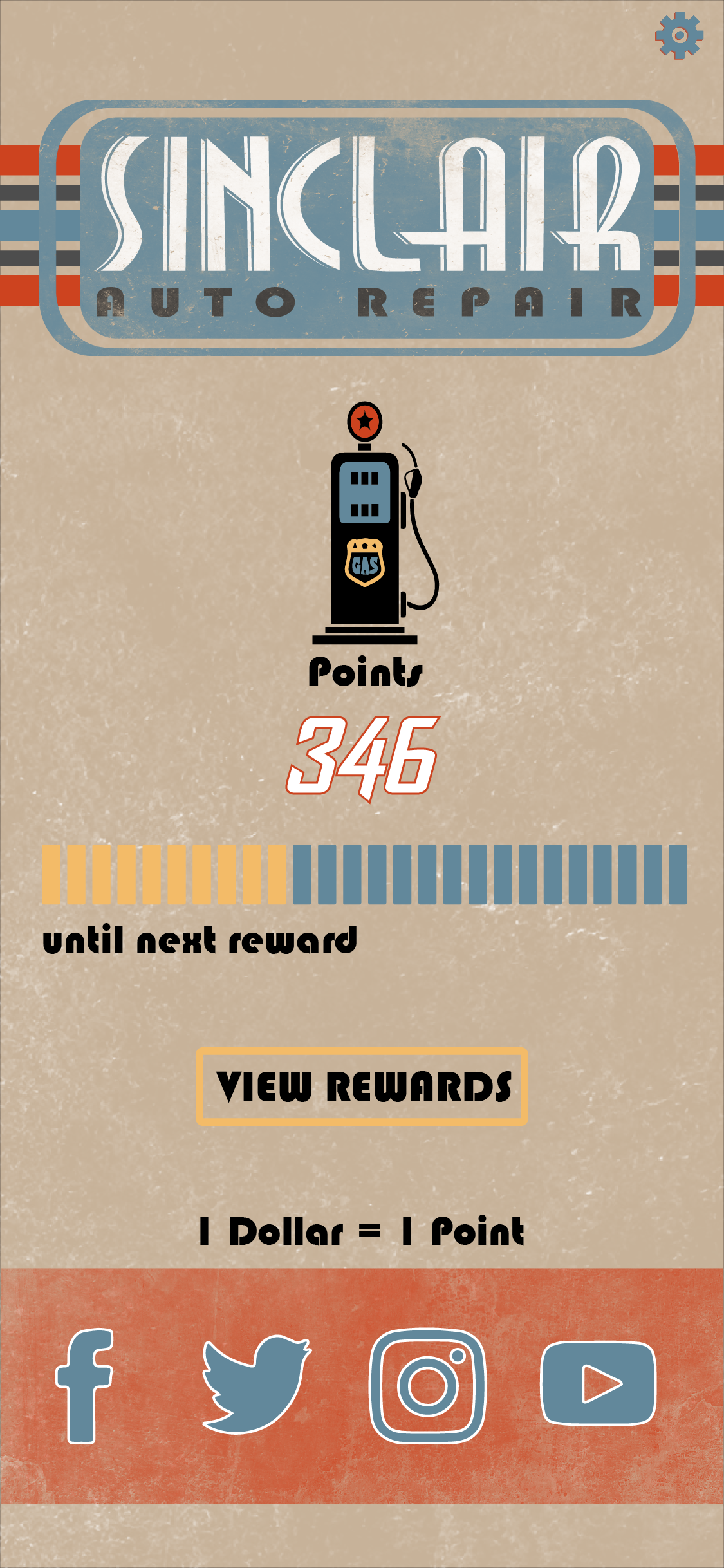
Points
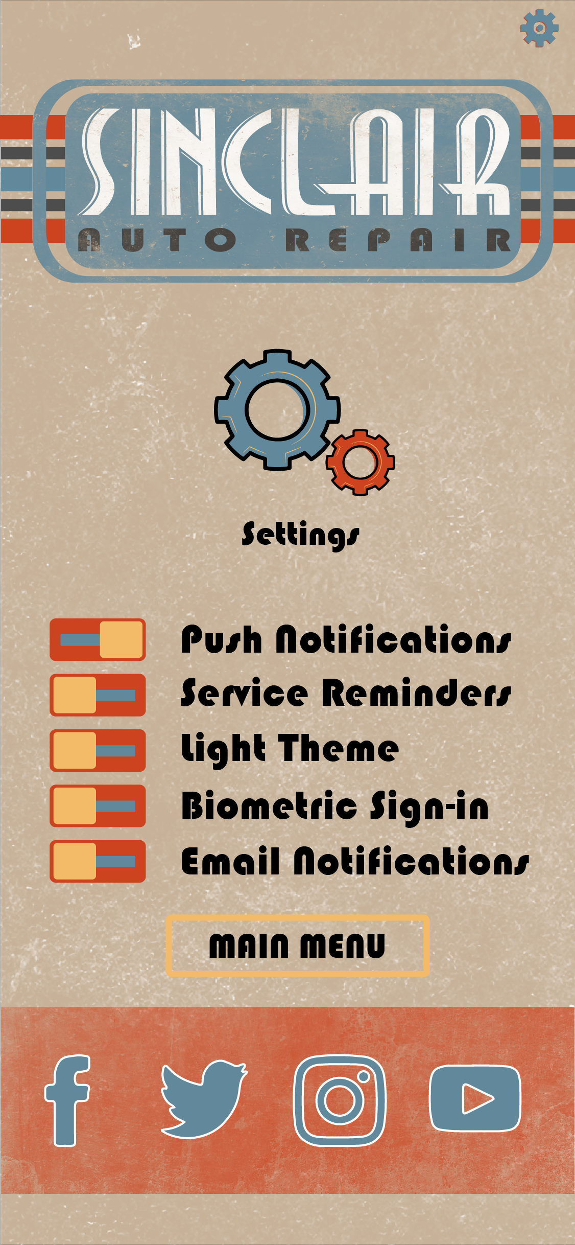
Settings
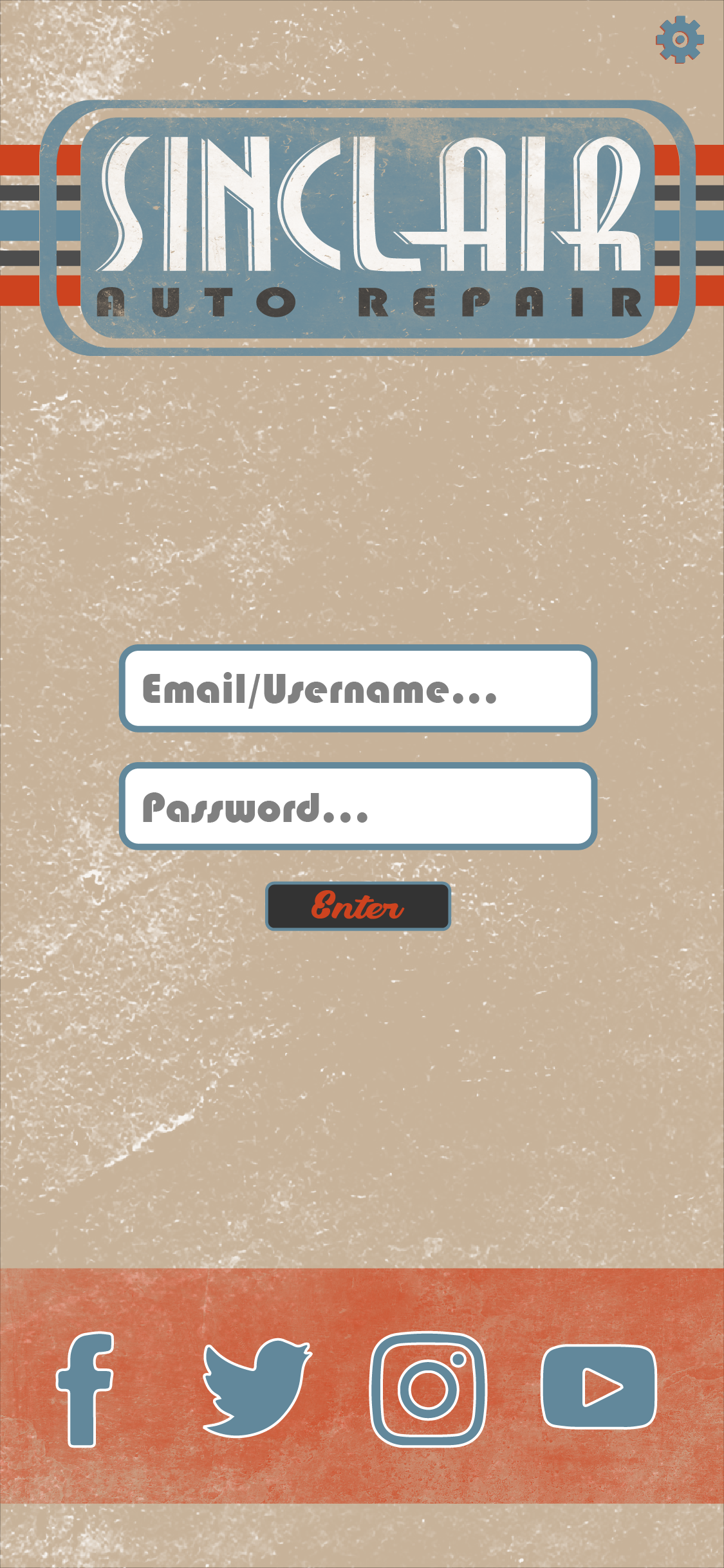
Login
A-Stand Ad
A-Stand Mockup
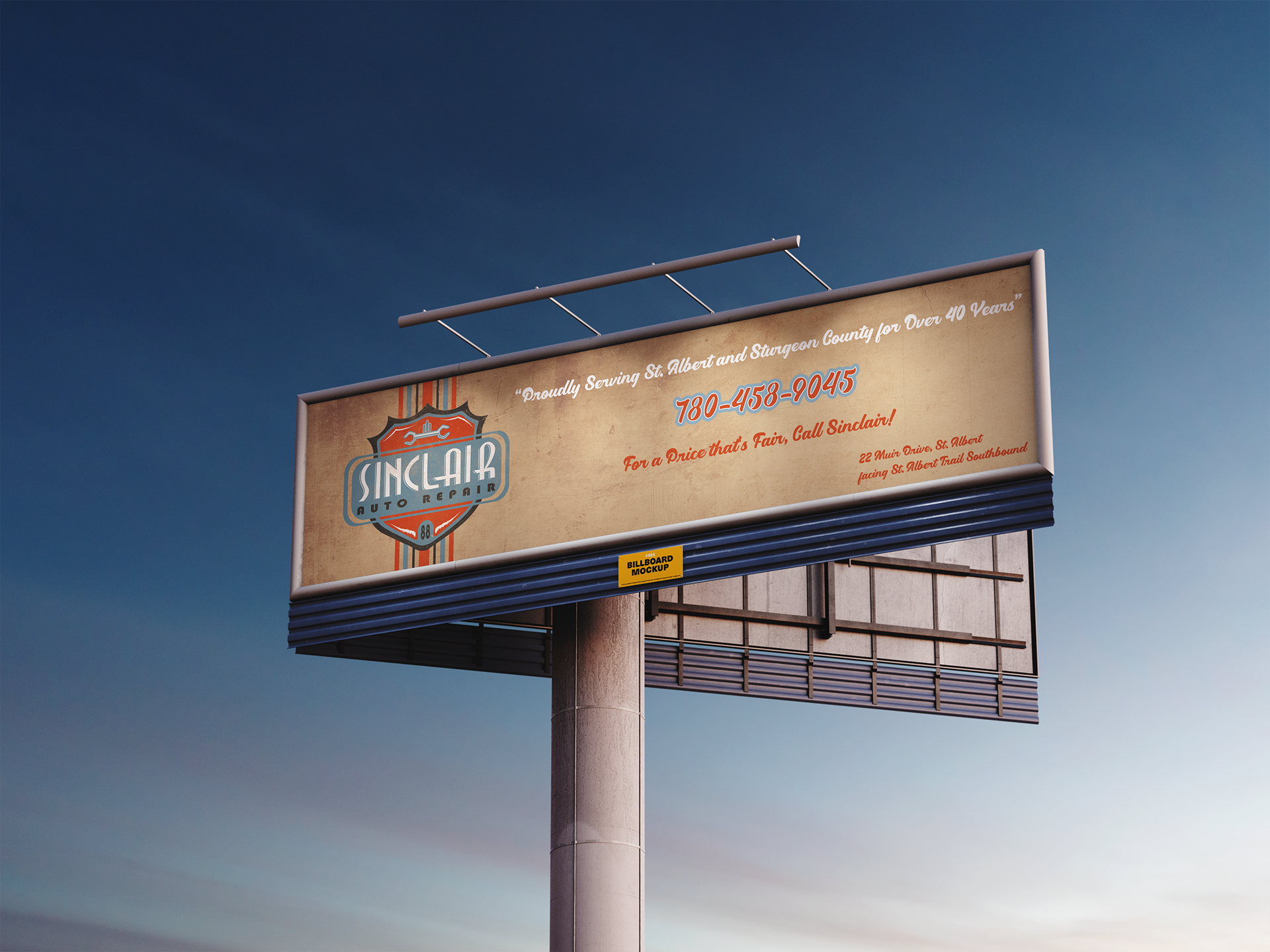
Billboard Ad + Mockup
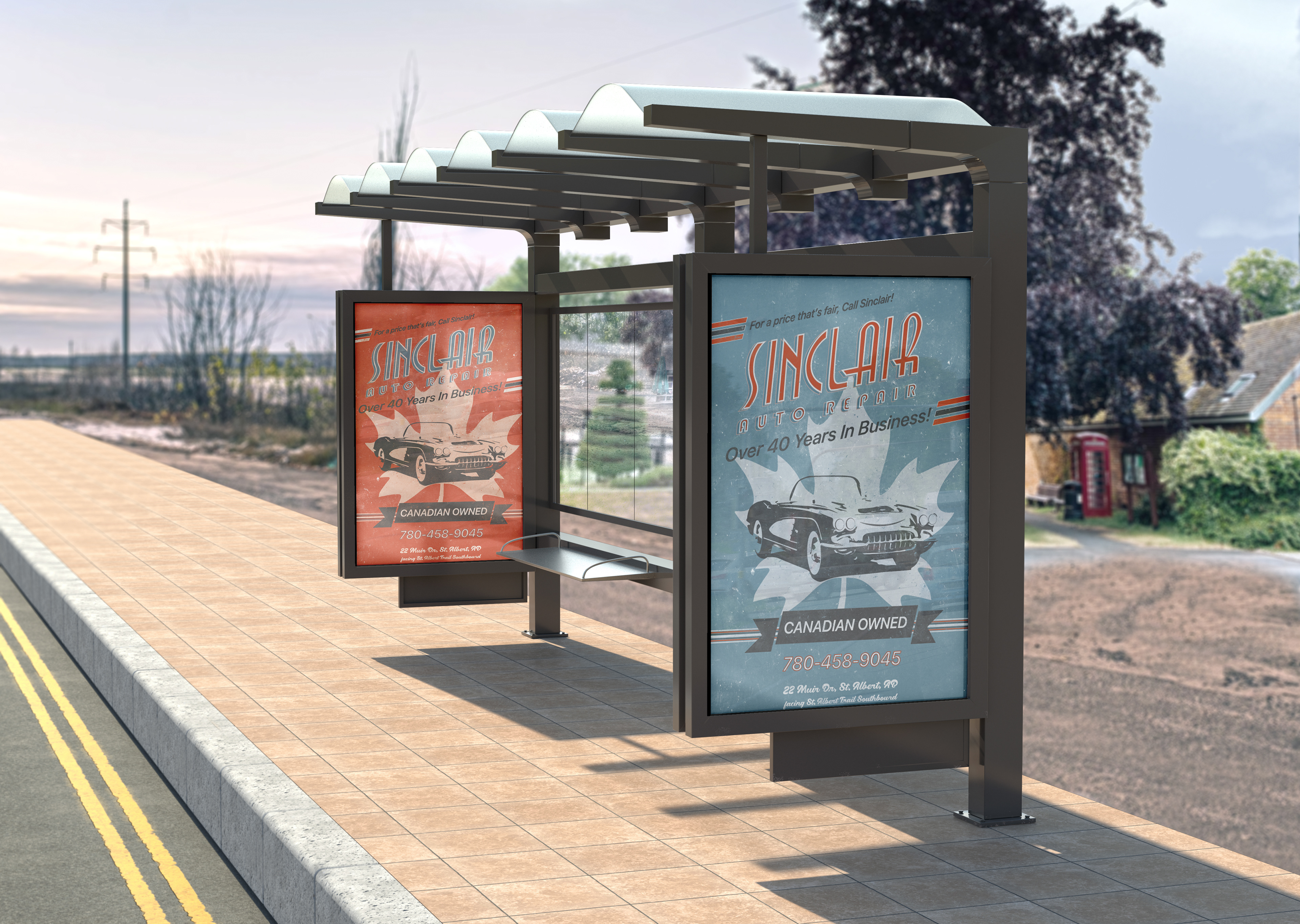
Bus Stop Ad Mockup
Semi Truck Ad
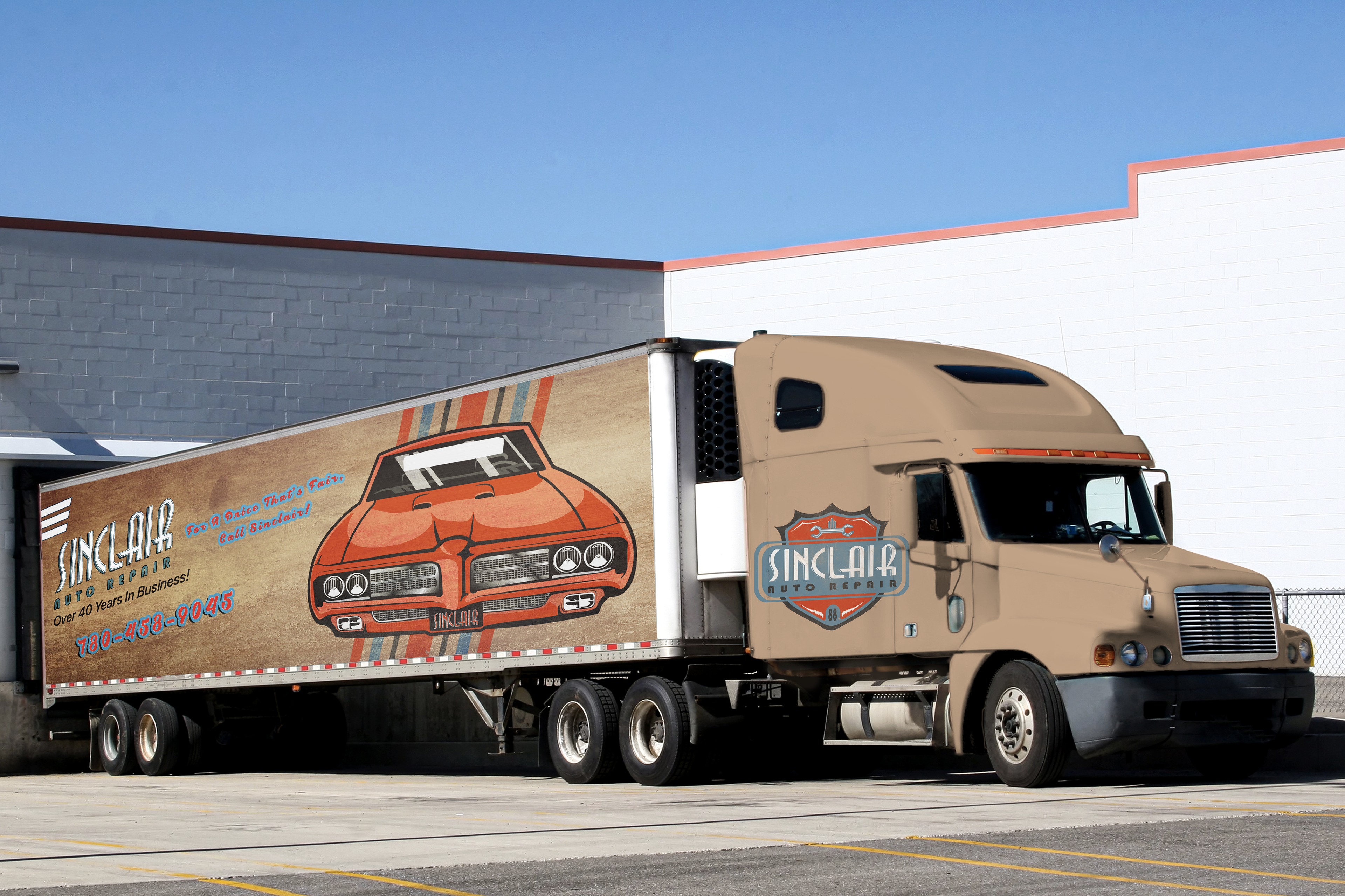
Semi Truck Ad Mockup
Print Ad - Brand Intro
Bus Stop Ad - Orange

Bus Stop Ad - Blue
Print Ad - CTA
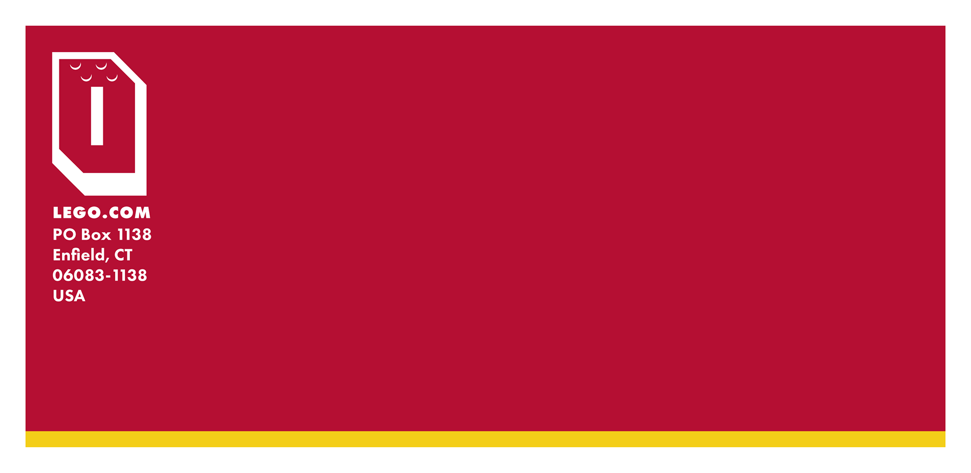
Legal Envelope
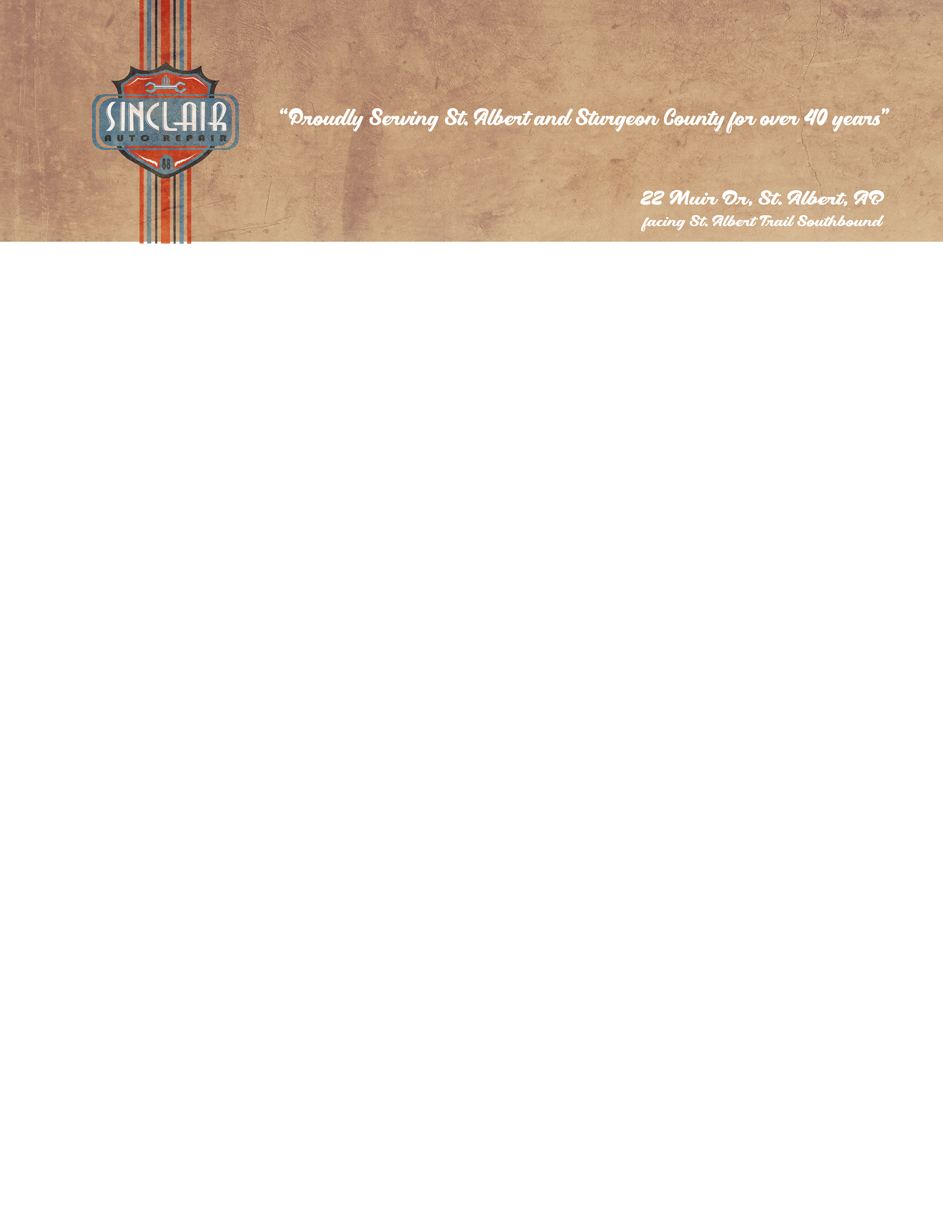
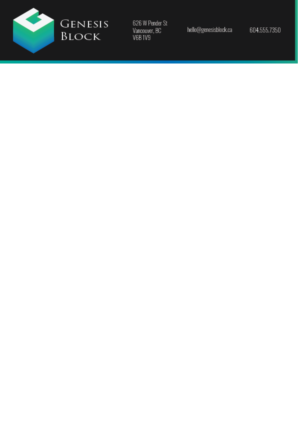
Letterhead
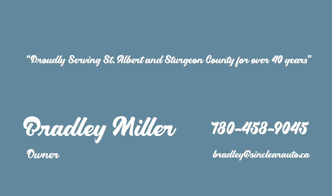
Business Card
Business Card Back
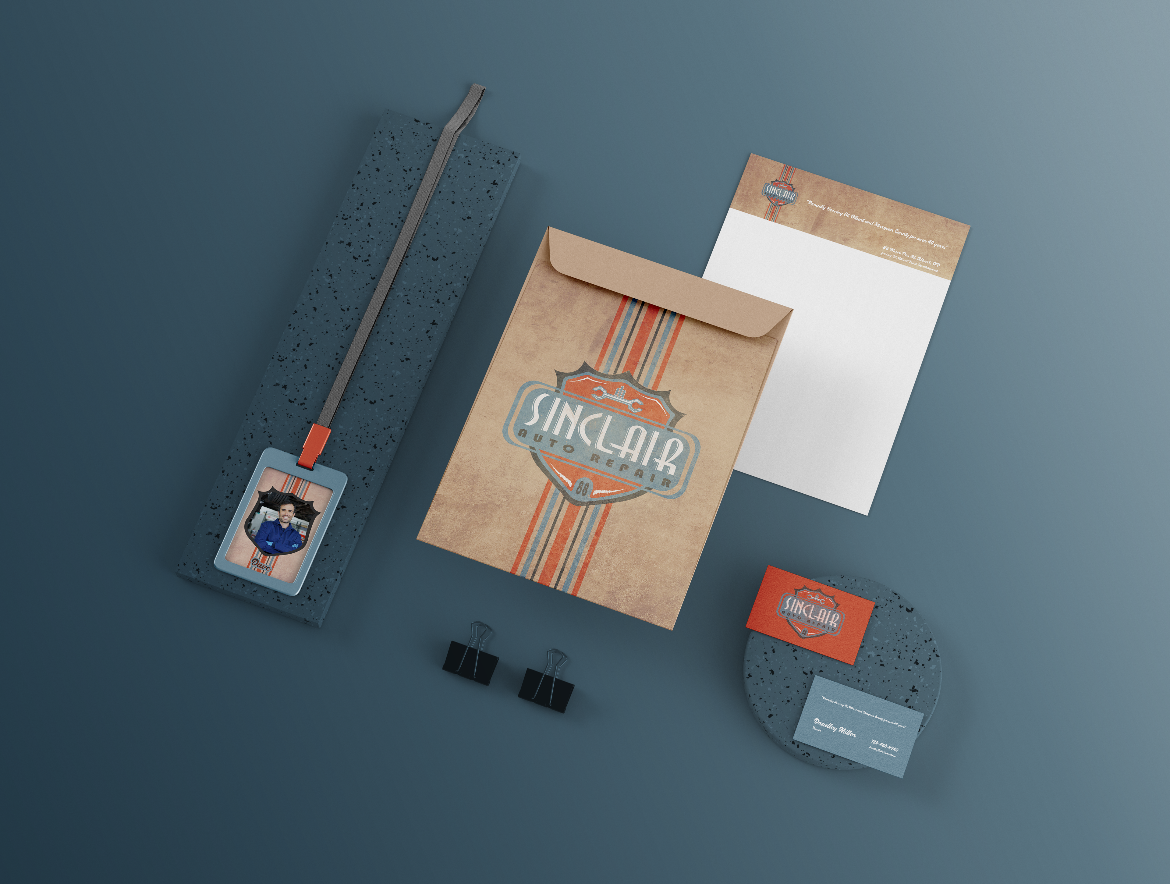
Stationary Mockup
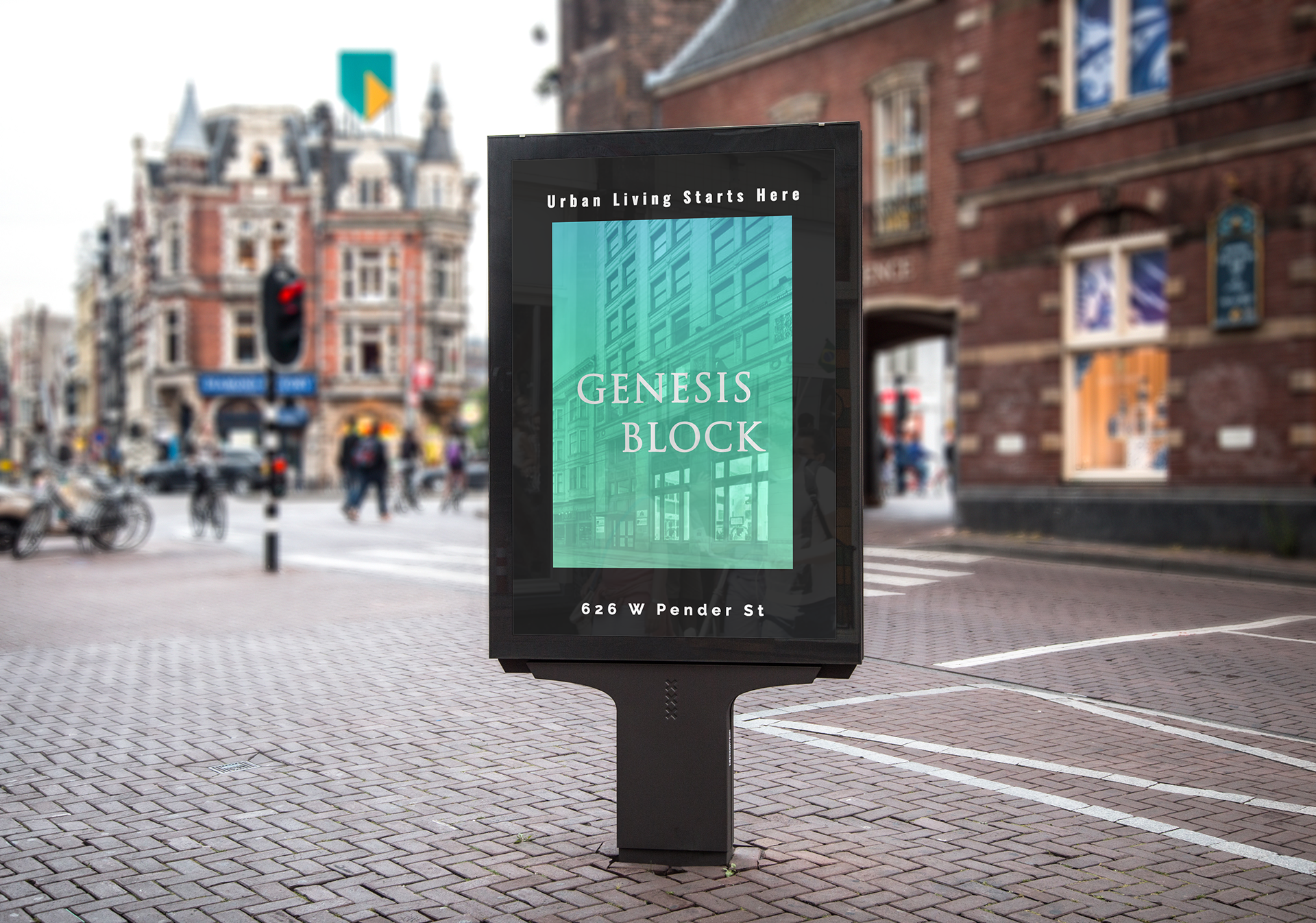
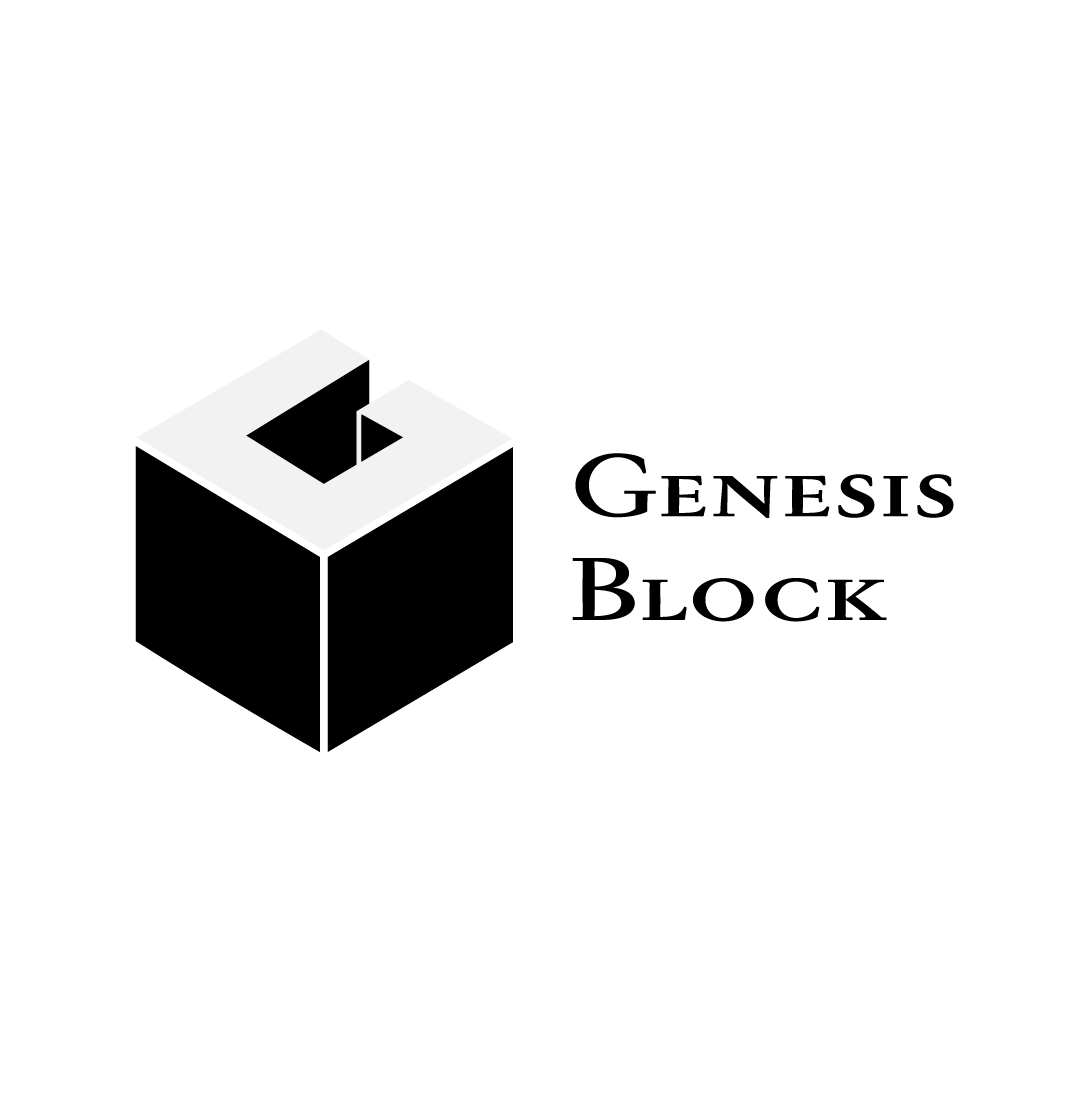
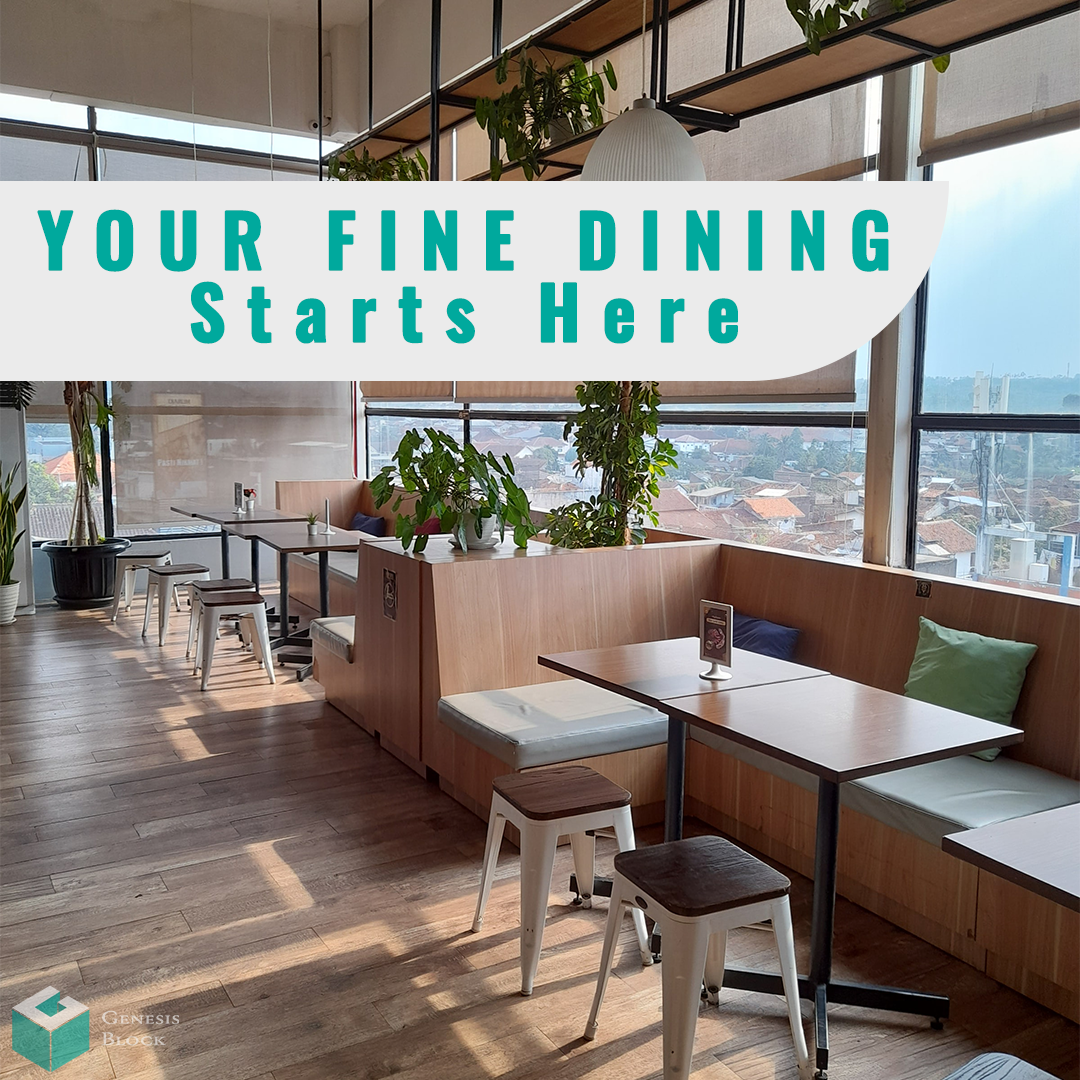
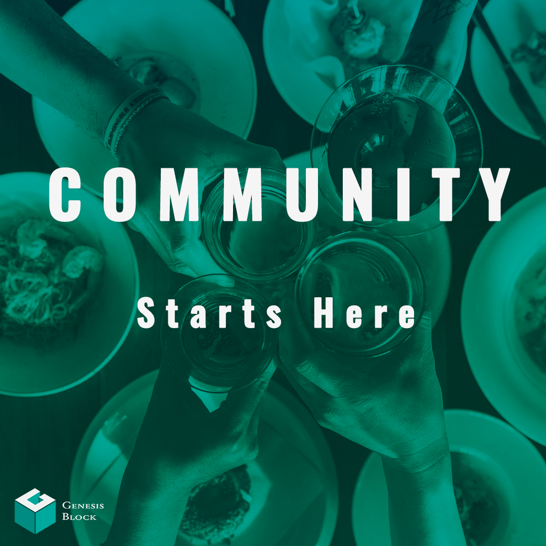
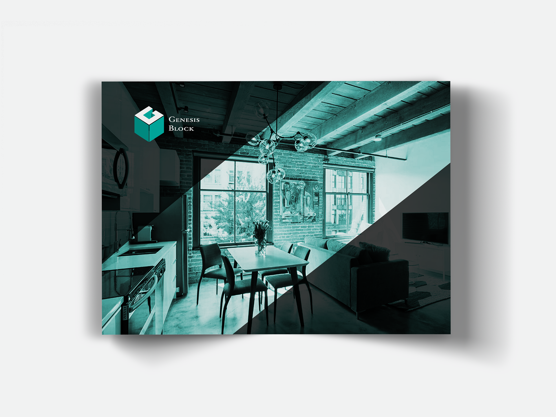
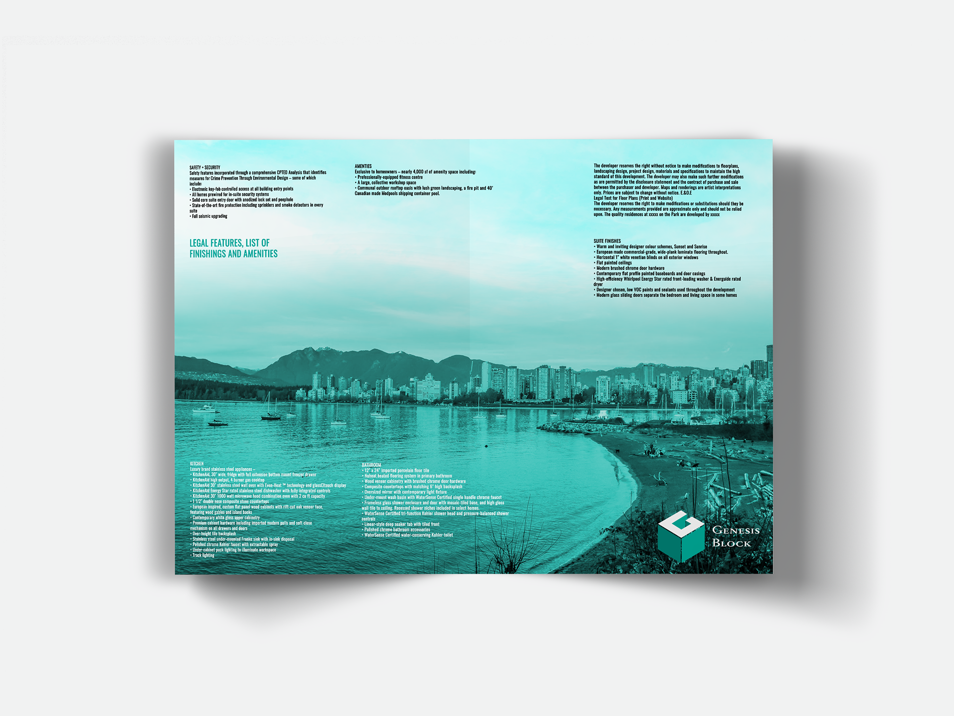
The Genesis Block Real Estate Redevelopment
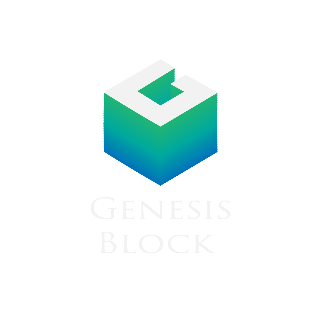
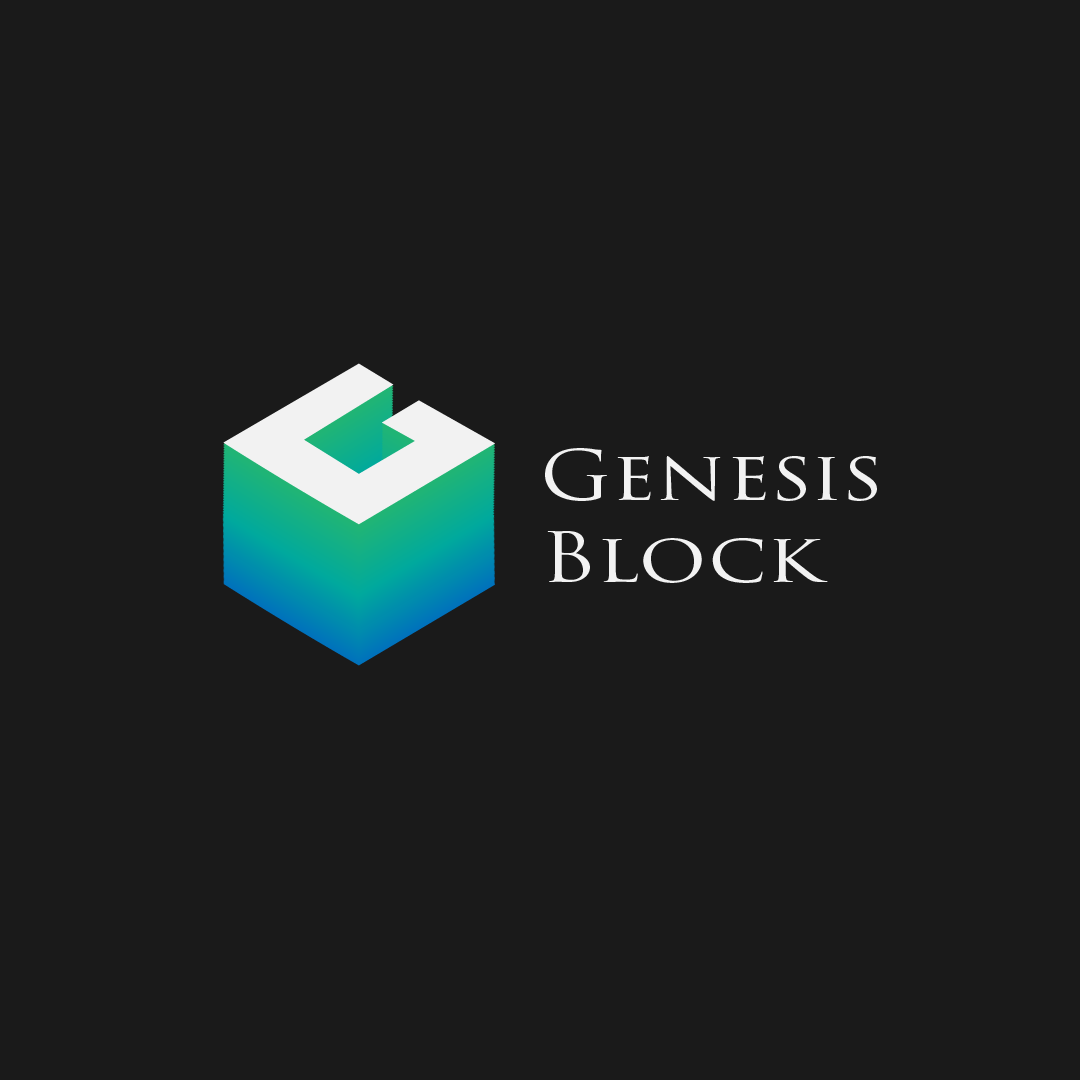
The Genesis Block was a brand identity design that I created for a redevelopment of the London Building in Vancouver, BC. It's a historic building located in the heart of downtown Vancouver on Pender Street. The commercial developer wants to see a fully fledged concept, from logo to presentation folder, displaying floor plans and advertising campaigns. I went with something that spoke abstractly to the area that it was from -- Vancouver being a coastal location and the London Building being one of the first high rises in Vancouver, it's only minutes away from the ocean, so a seafoam teal, and a blue to teal gradient colour scheme as accents, spoke to the oceanic location. It's also a colour that evokes freshness, vibrancy, and independence, something that speaks to values of our target demographic of well-heeled young urban professionals. The brand signals a fresh start, for a storied and historically rich location, and that's the feeling it wants investors to feel.
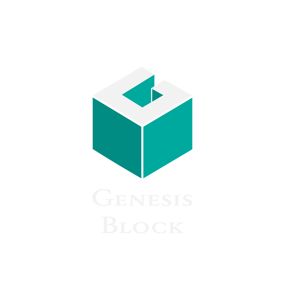
Final Logo Concept - Vertical Orientation
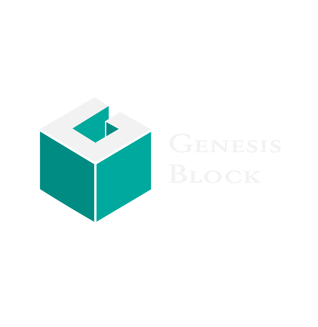
Final Logo Concept - Horizontal Orientation
Initial Logo Concept
Initial Logo Concept
Black And White Version
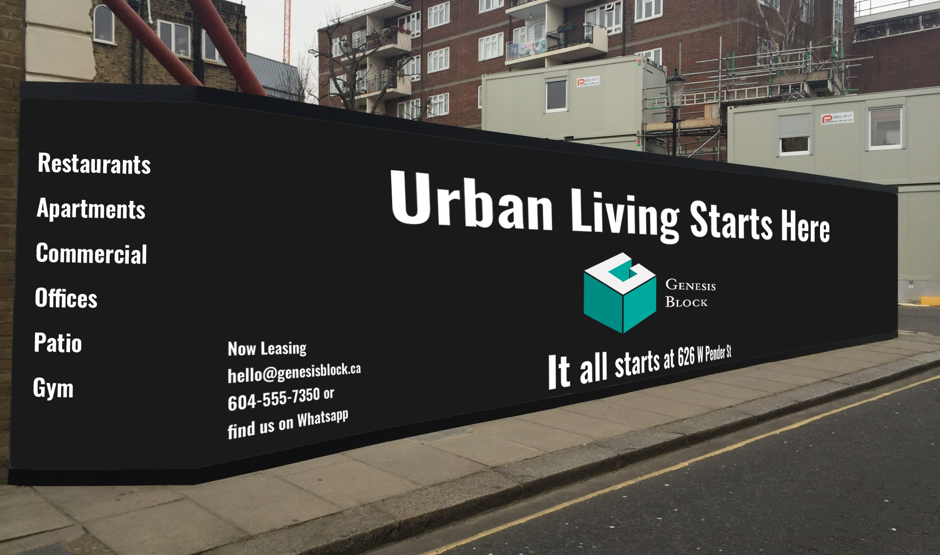
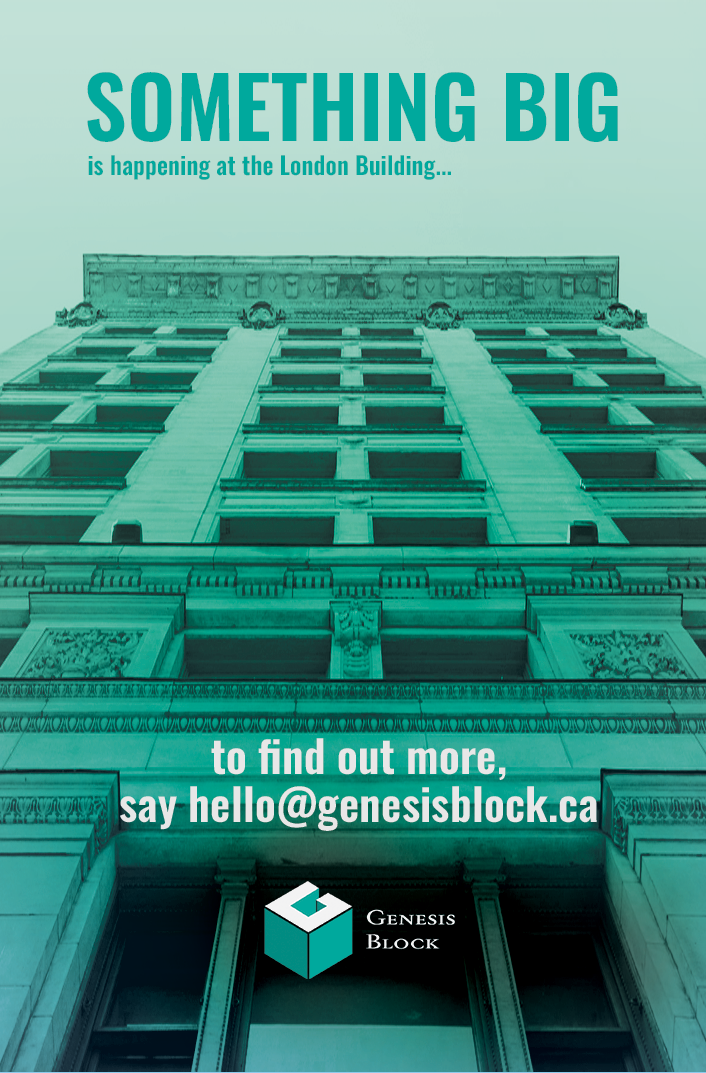
Hoarding Ad Concept
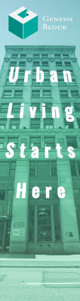
Digital Banner AAd
Instagram Ad
Instagram Ad
Instagram Ad
Instagram Ad 2
Instagram Ad 2
Instagram Ad 2
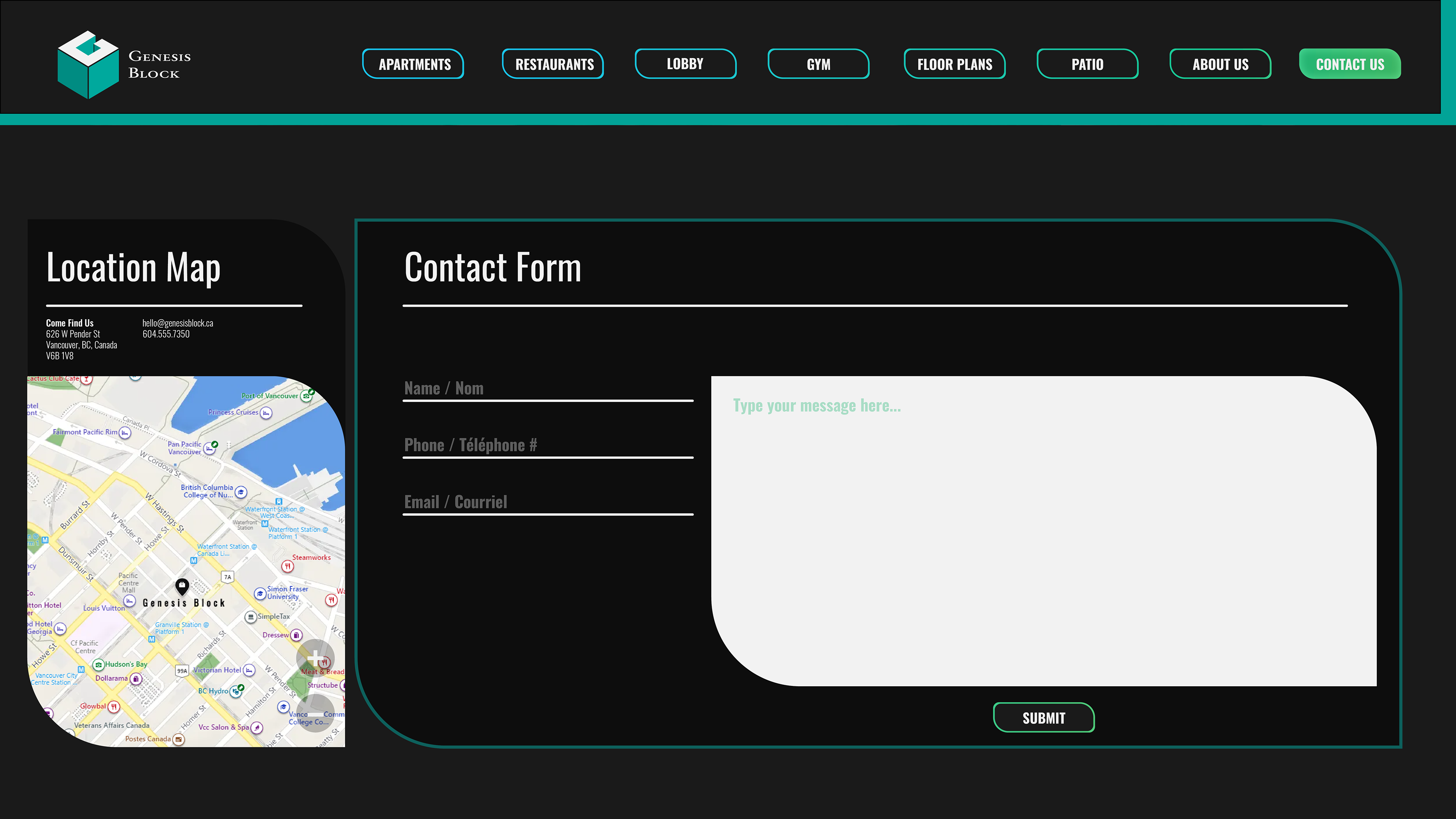
Contact Us Page Mockup
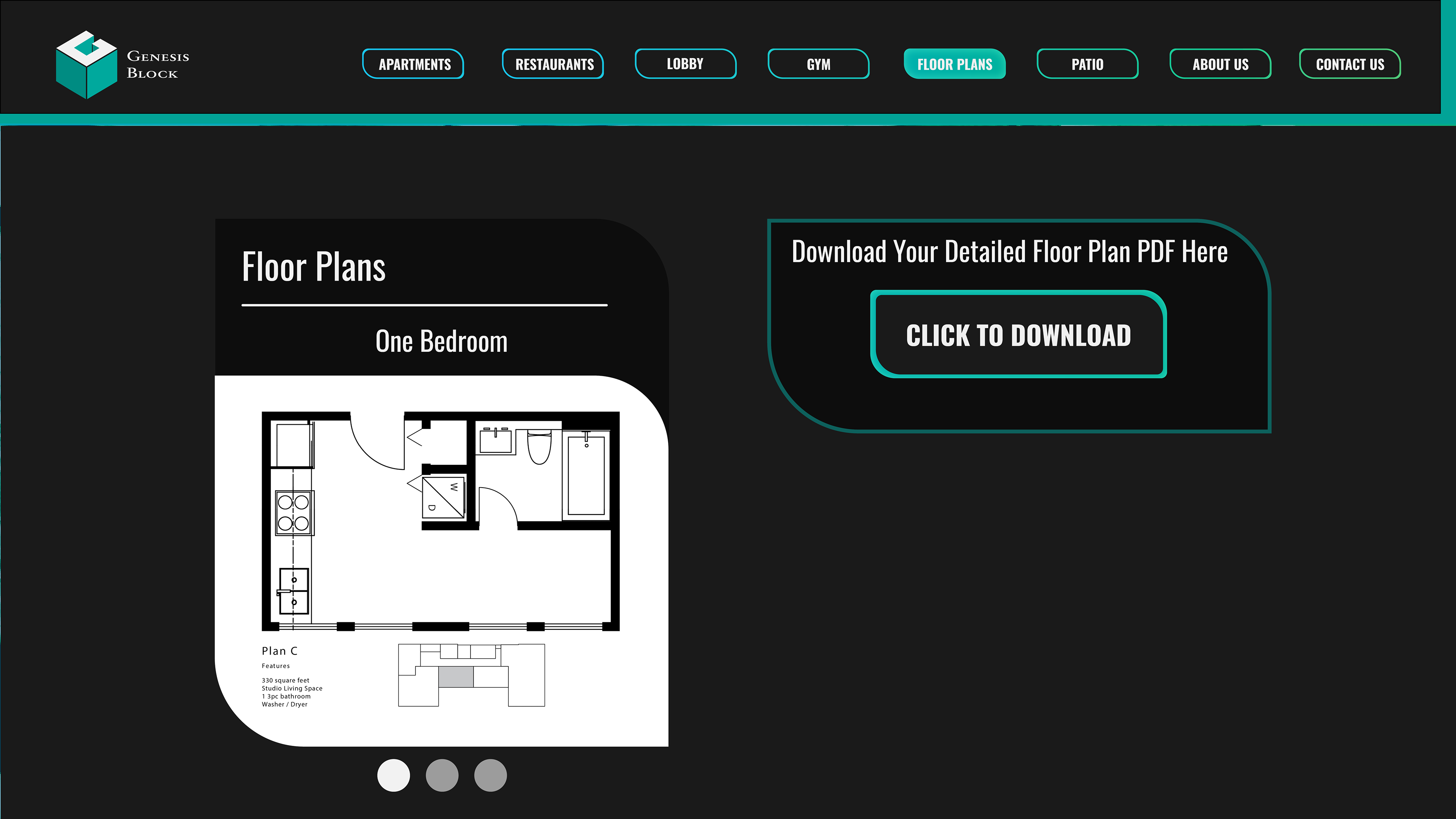
Floor Plan Mock Up
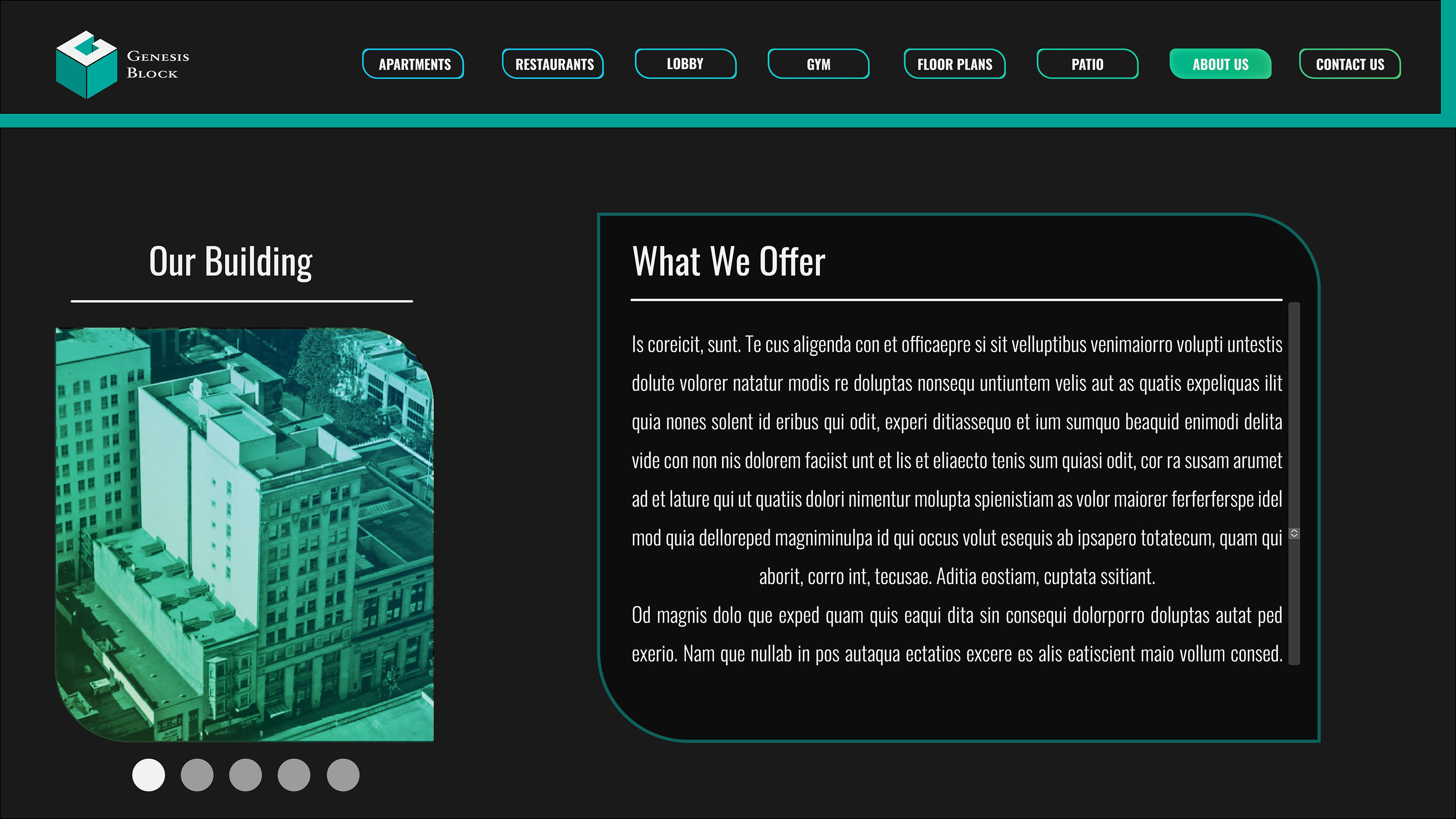
About Us Page Mockup
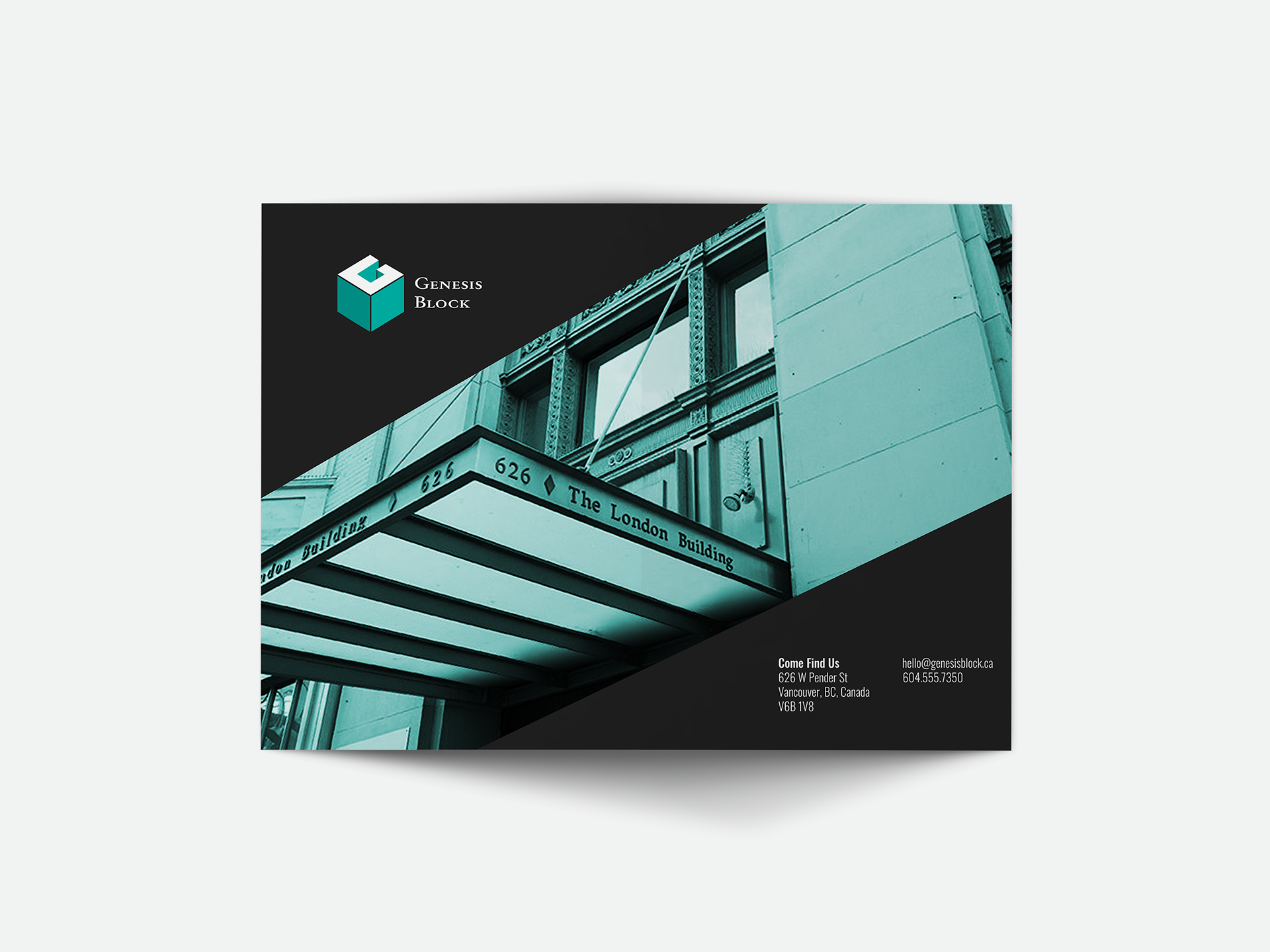
Front Cover Presentation Folder
Inside Cover Presentation Folder
Location Page
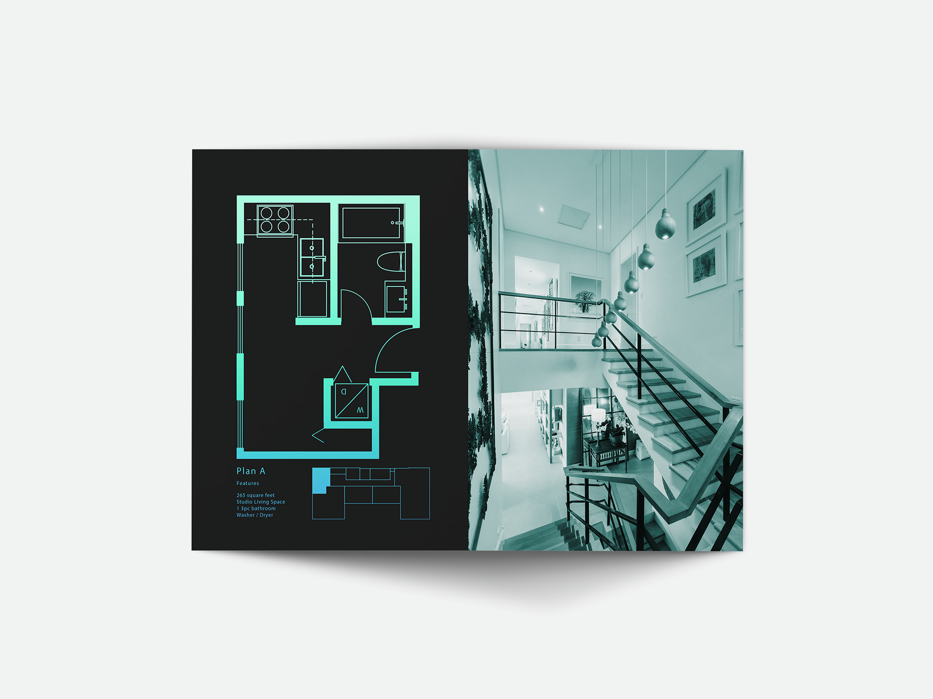
Floor Plan 1
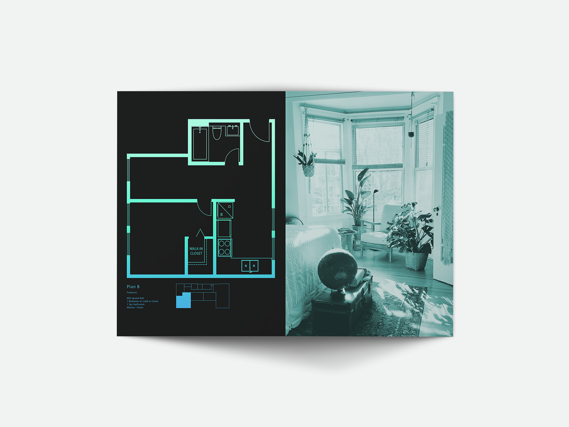
Floor Plan 2
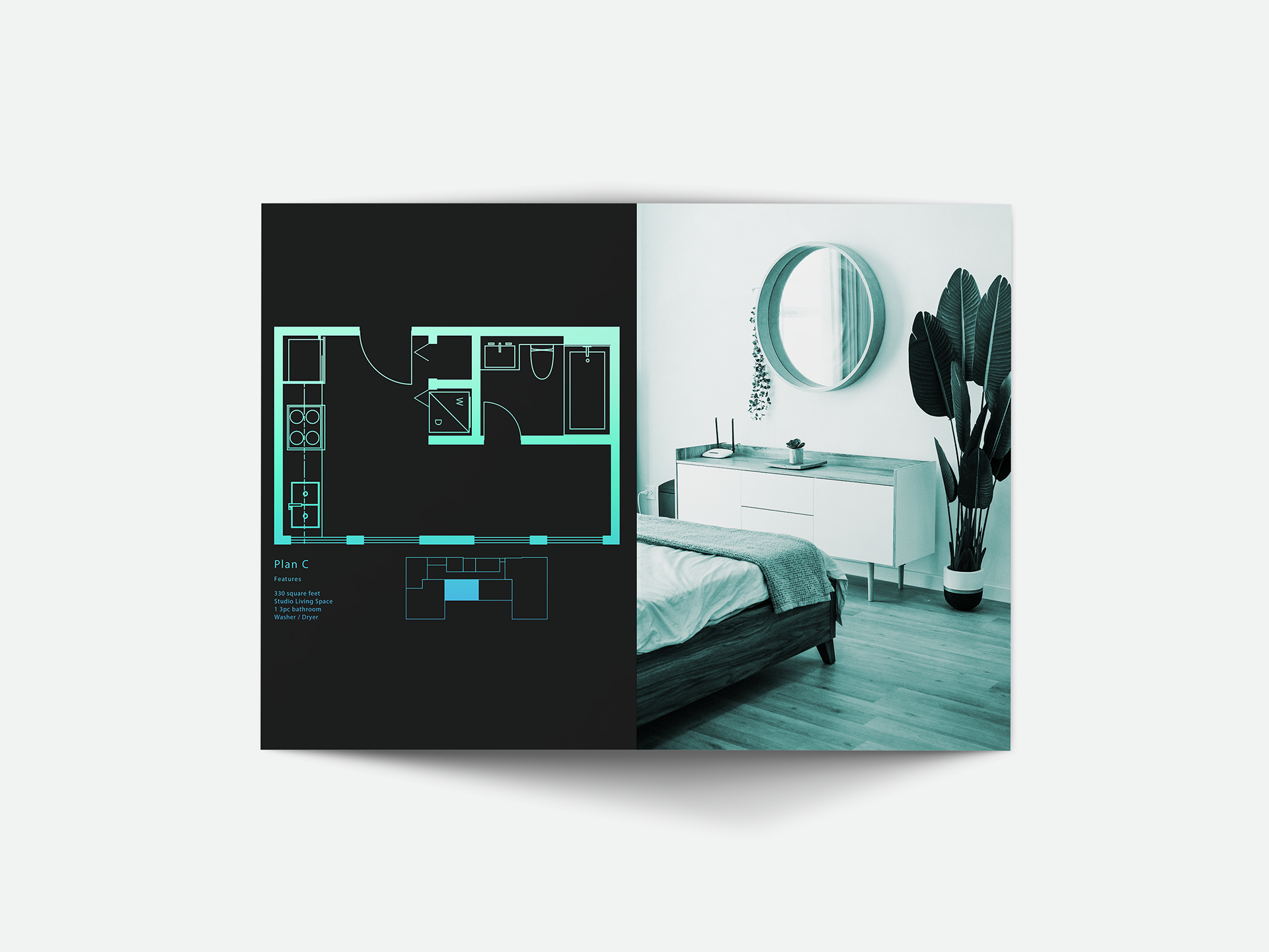
Floor Plan 3
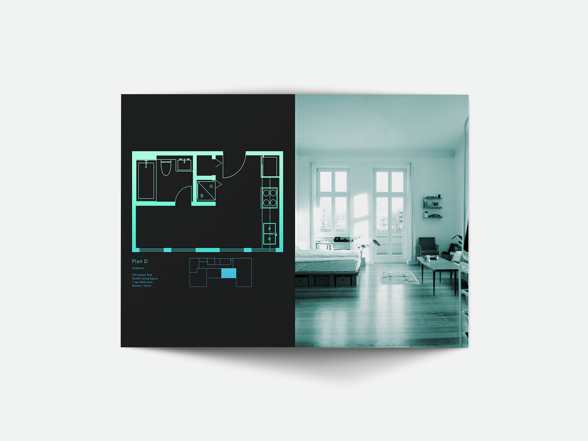
Floor Plan 4
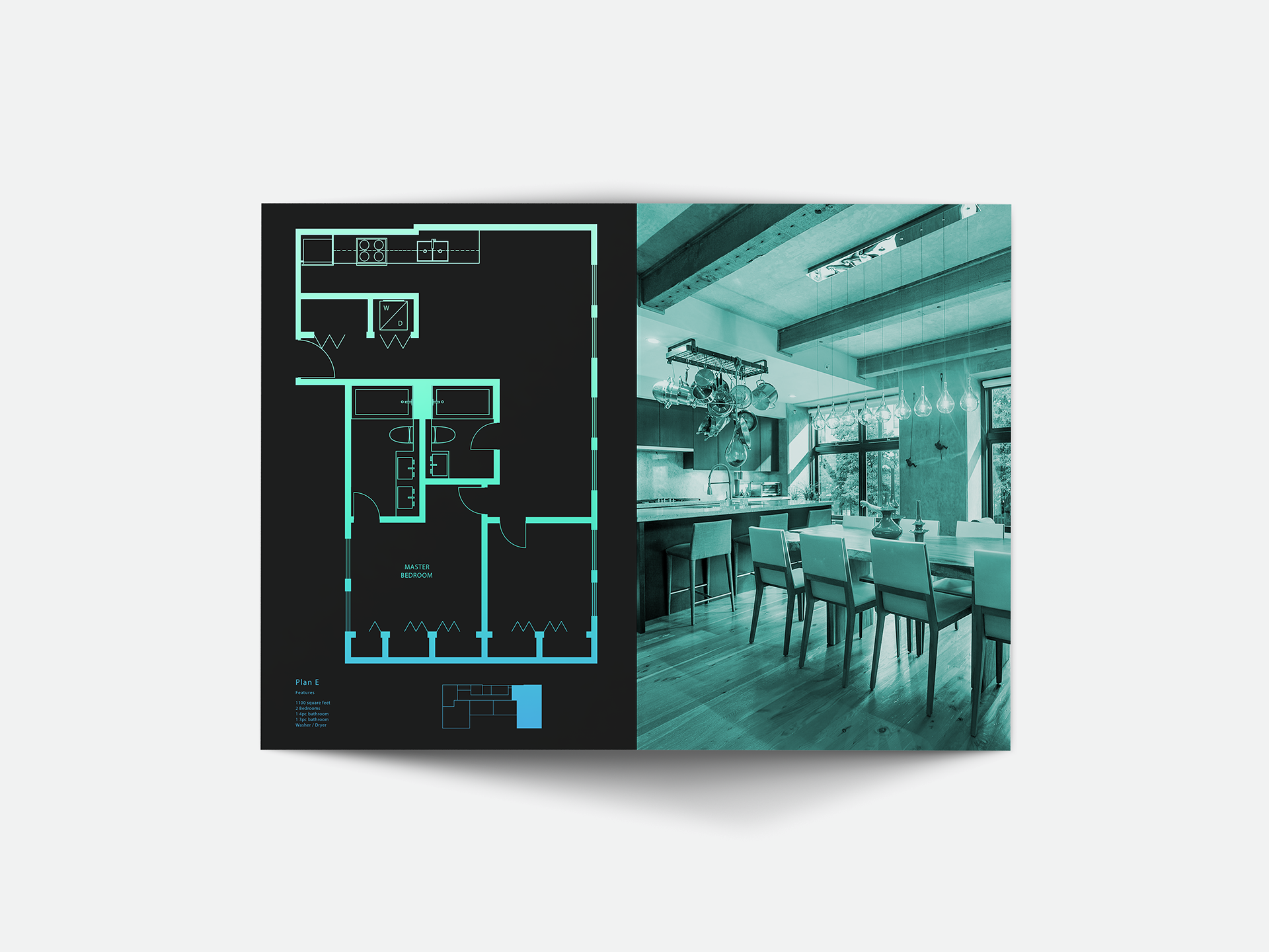
Floor Plan 5
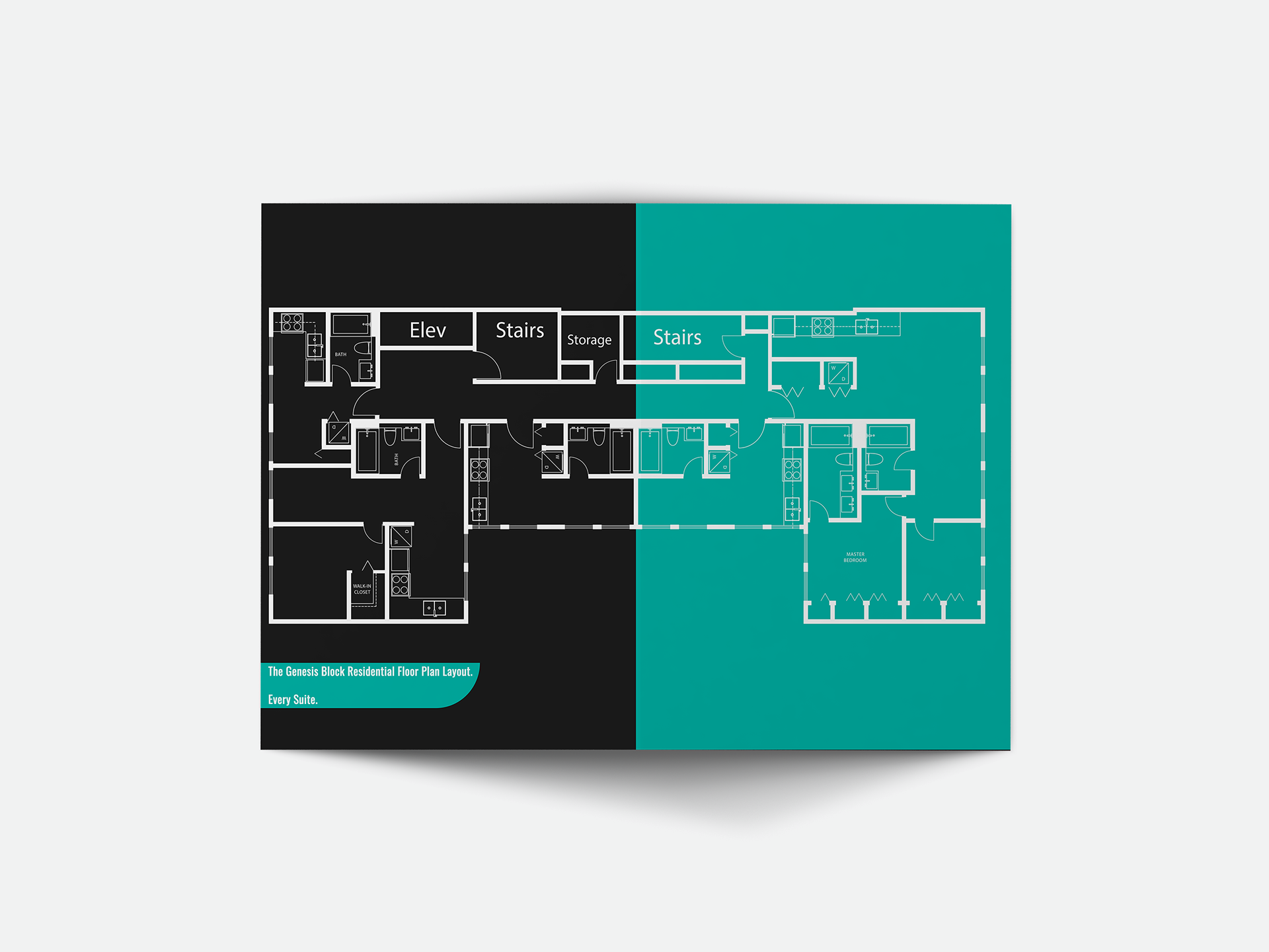
Every Floor Overall Building Plan
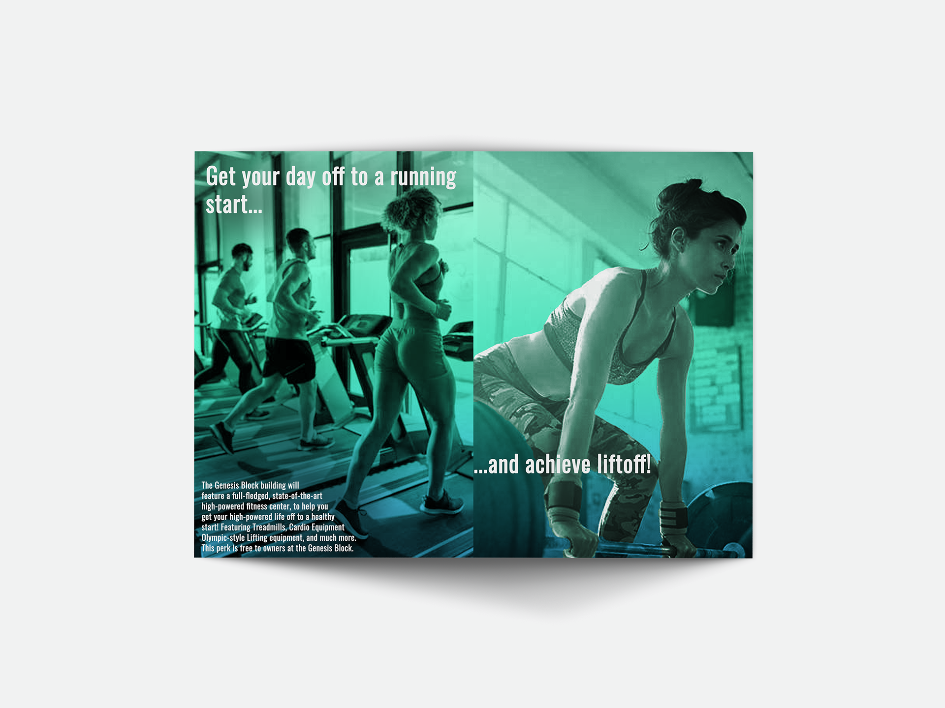
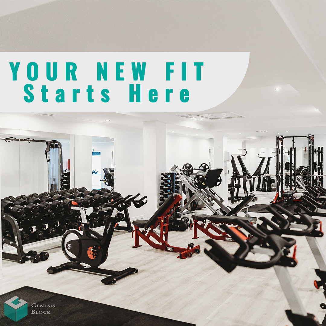
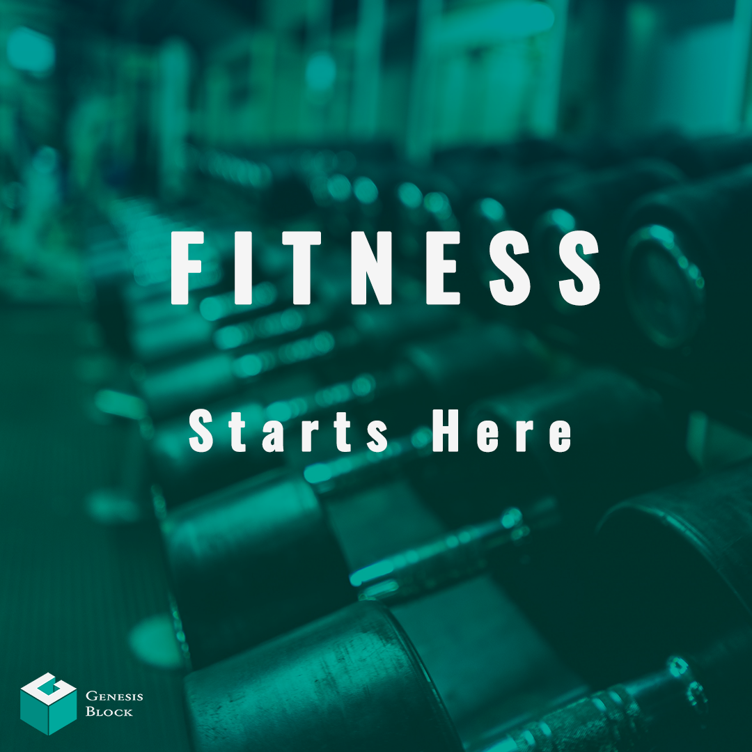
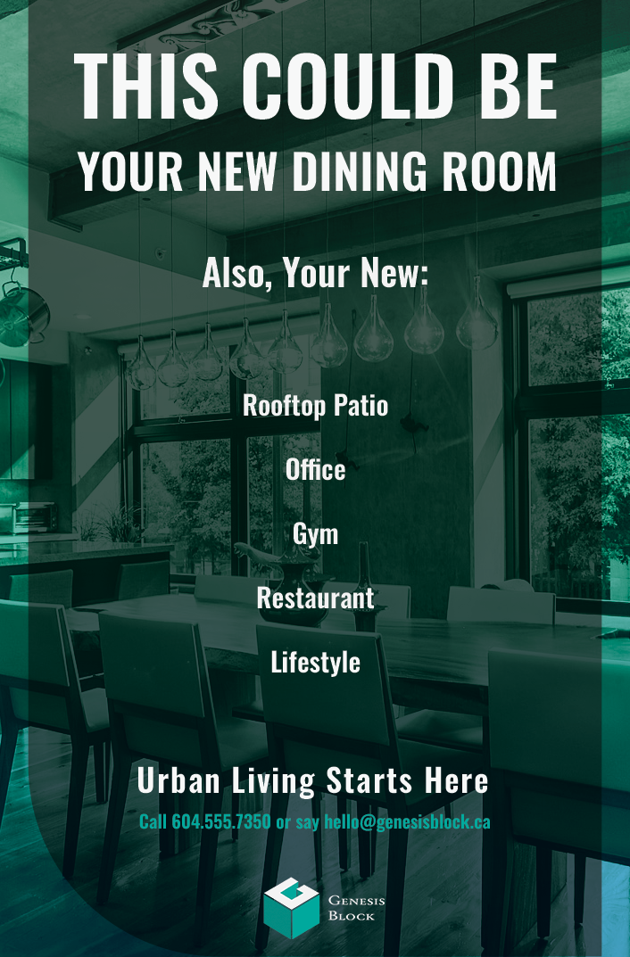
Exercise Center Promotional Page
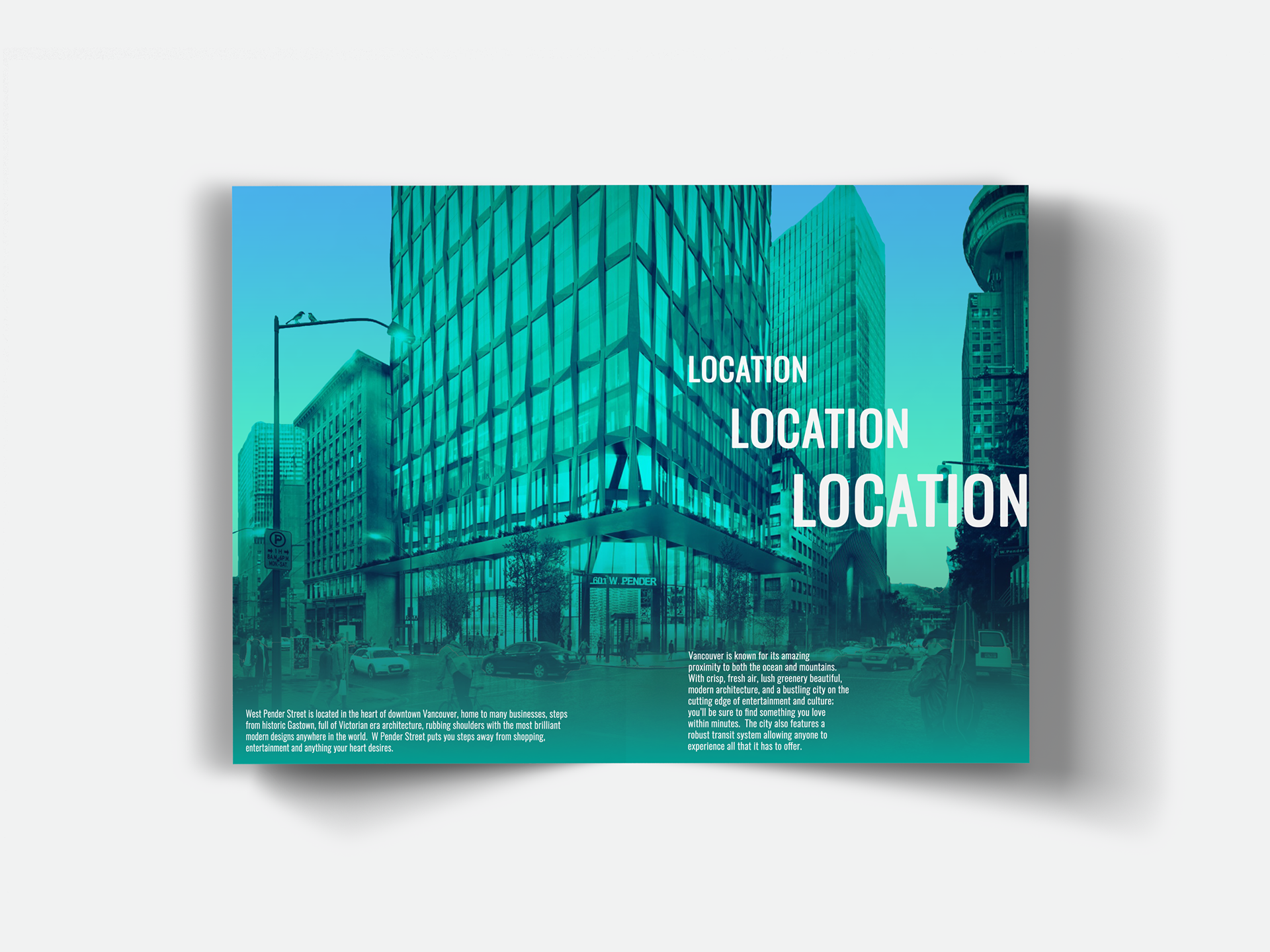
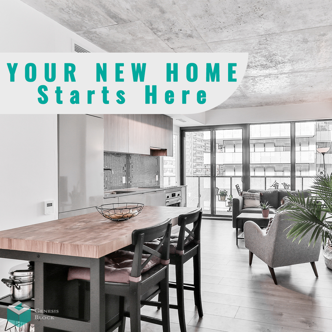
Location Promotion Page
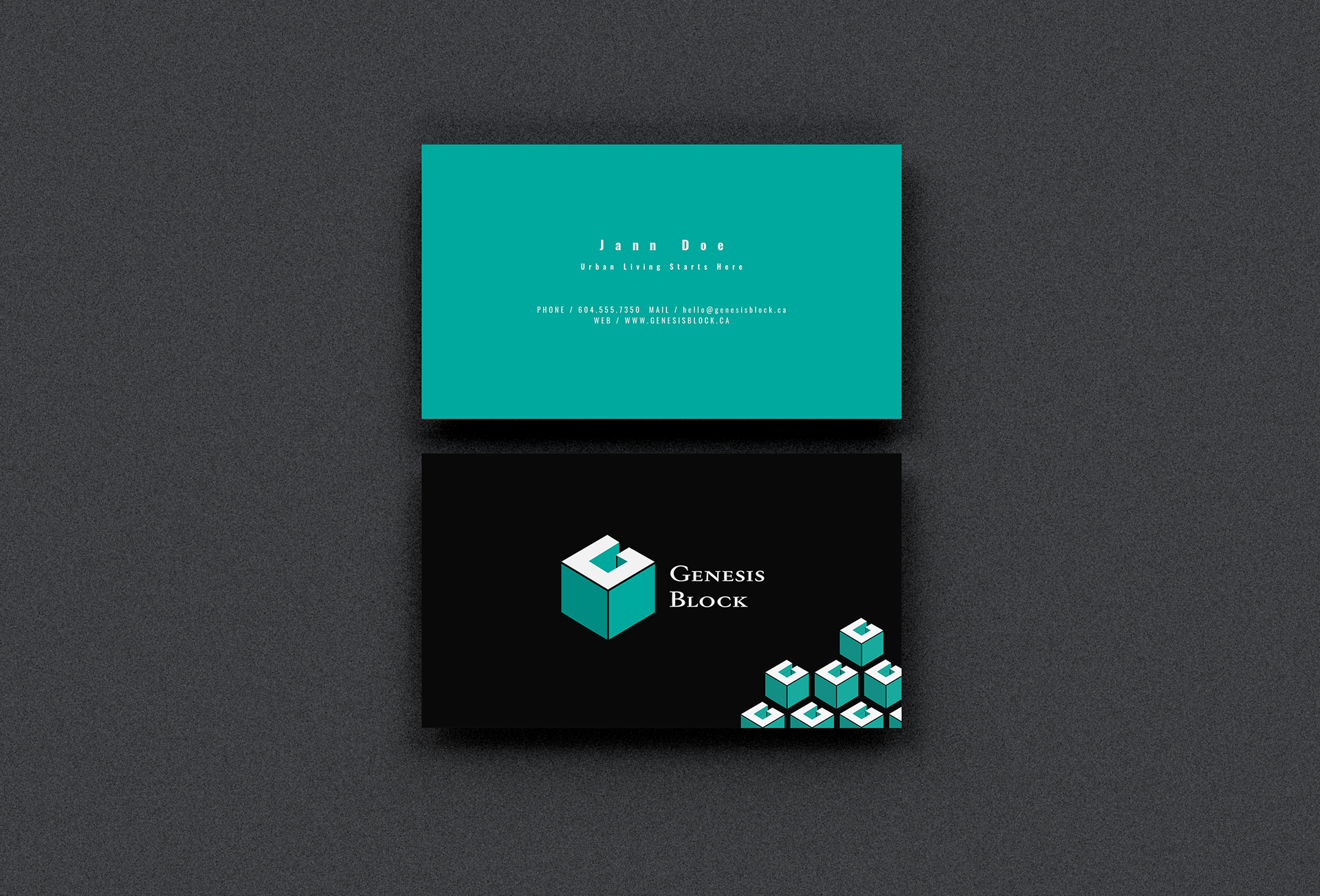
Business Card
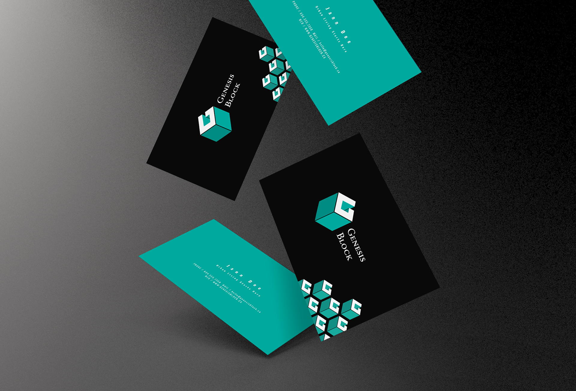
Business Card Mockup 2
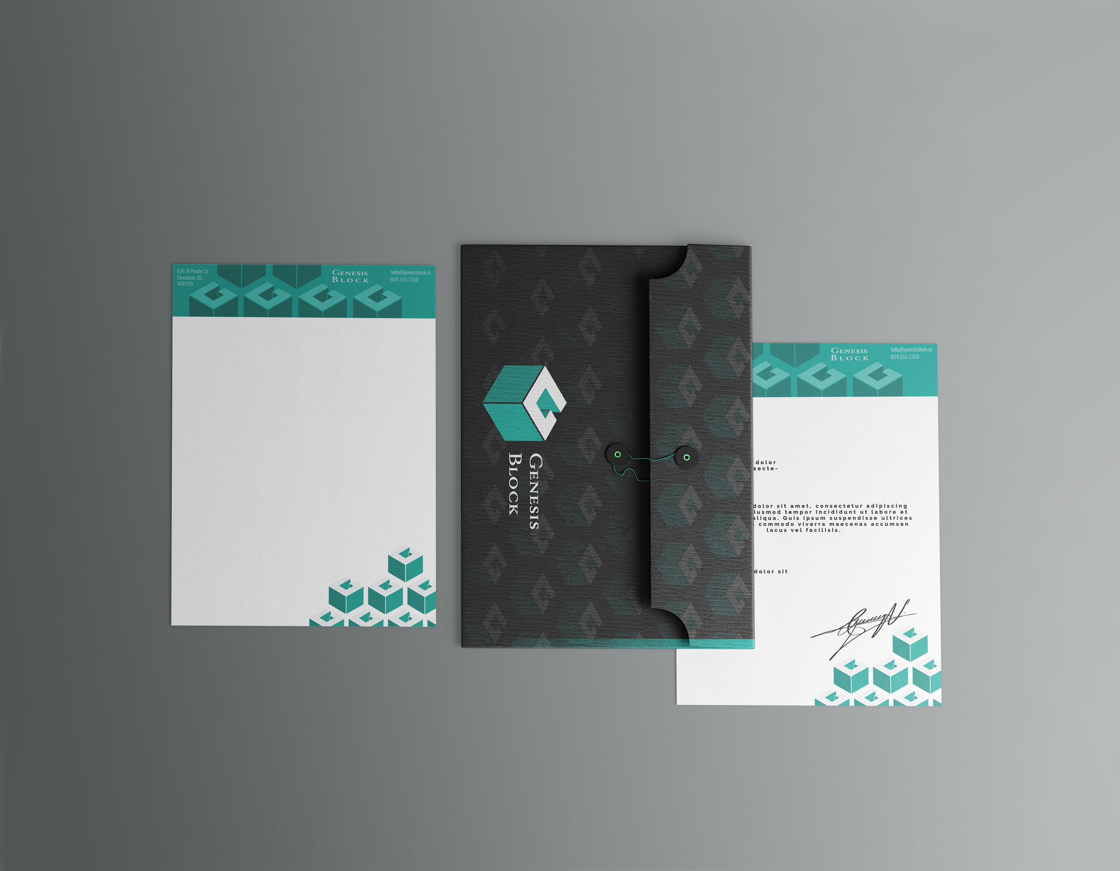
Stationary Mockup
Letterhead
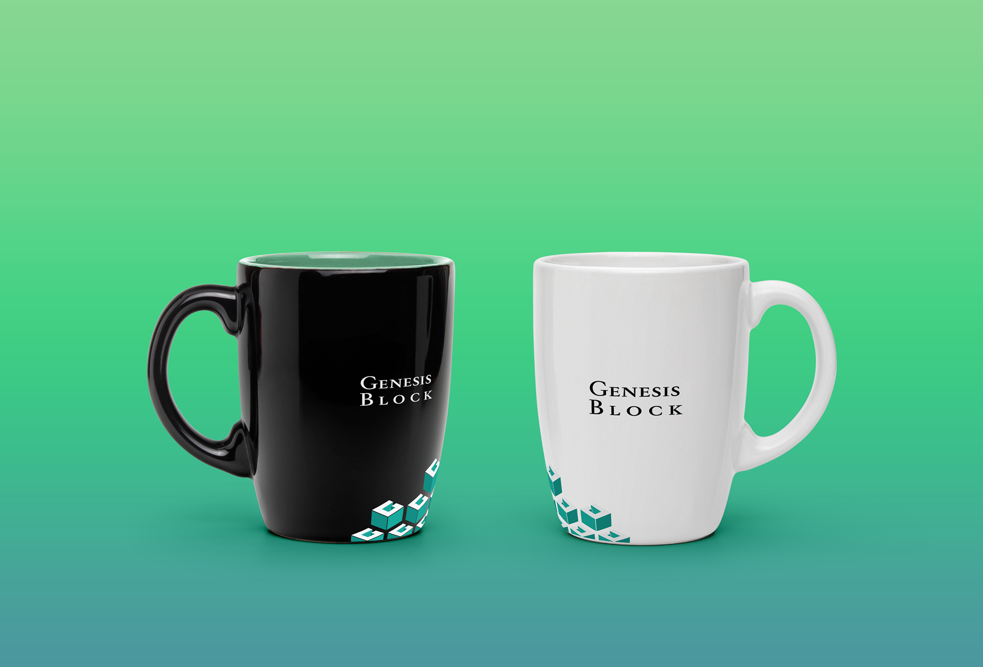
Promotional Mug Mockup
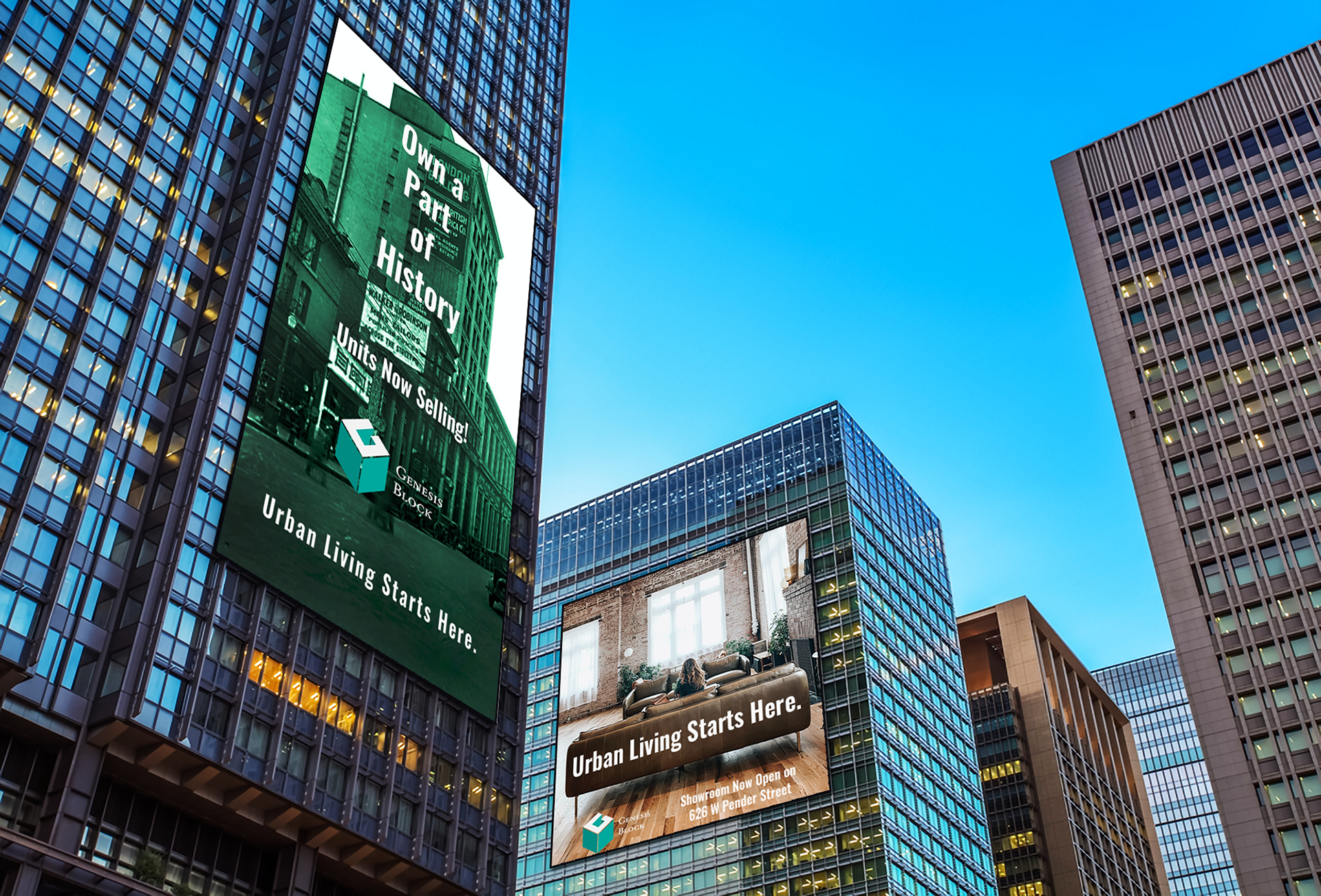
Oversized Billboard Ads
Print Ad 1
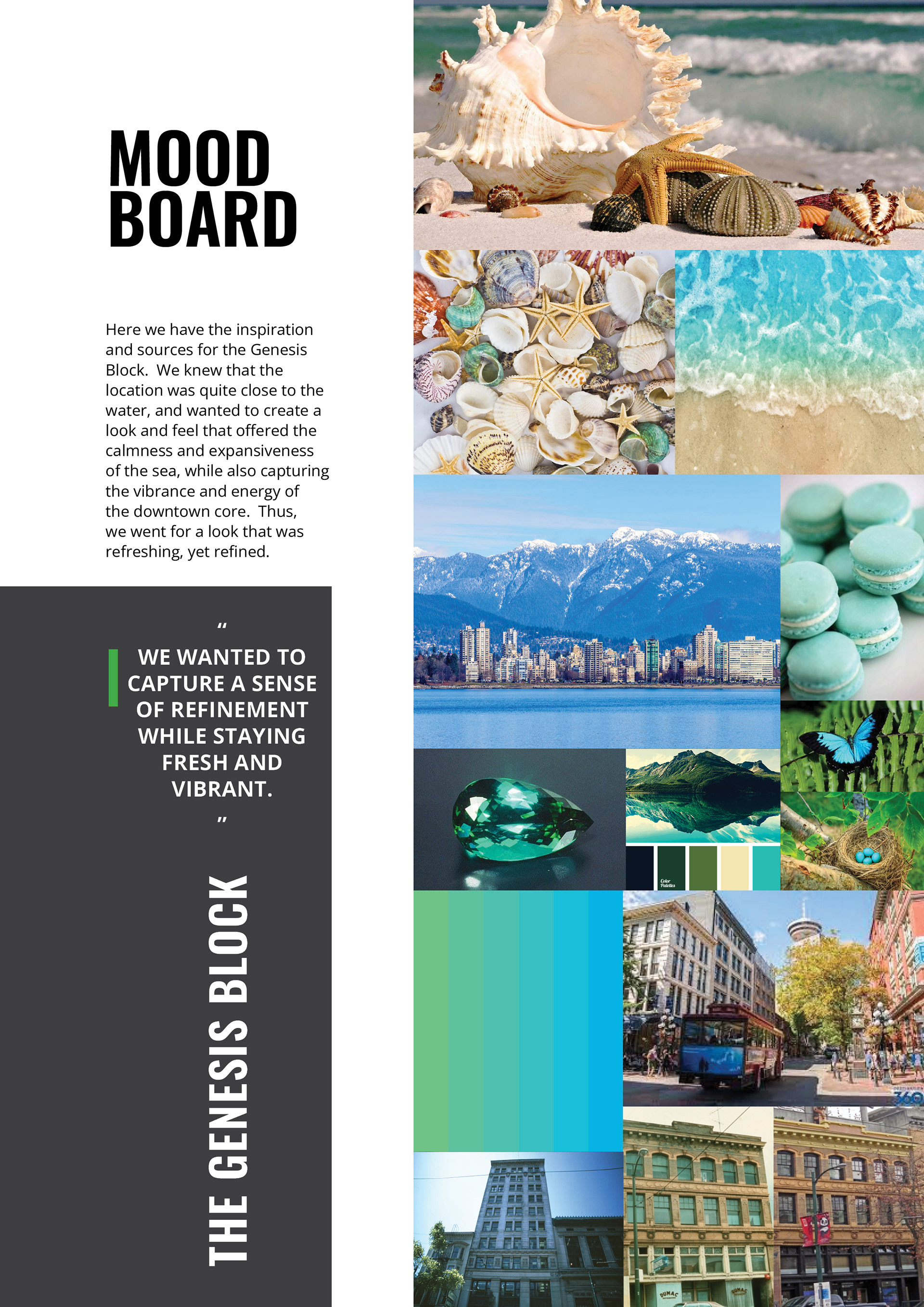
Moodboard
Print Ad 2