Here are examples of my website layouts, featuring real, working client websites
and some work done on behalf of agencies below.
and some work done on behalf of agencies below.
Babygourmet.com
Agency work
This site was to be developed as the new home on the web for Baby Gourmet Foods, Inc. Canada's leading organic food brand! They're a company that was started by two moms from Calgary, AB selling their organic baby food at the farmer's market, flash forward nearly 2 decades and they've since become a staple in every grocery store and online outlet across Canada and the United States.
At the time, they were undergoing a rebrand, and wanted a new website to match. While I did work with an agency contact as a liaison between myself and the client, that was for only communicating the broad desires and needs of the client. It was up to me solely to develop this website from scratch. I implemented the JS libraries necessary to pull off the fullpage scroll feature (fullpage.js), I conceptualized, designed and executed the signage dropdown menu, and implemented the JS library for the MixItUp.js product filter featured on the homepage. I also created the checkbox and searchable product filter for the 'All Food' and relevant products pages.
I used Webflow to create this website, and some custom CSS and JS, along with some 3rd Party plugins (reviews and newsletter autoresponder) to create this website experience. I coordinated with the agency and the client's internal marketing team to make their vision come to life, and utilized a variety of design skills such as Photoshop and Illustrator along the way, when relevant, to get the most out of the visual assets during implementation.
Through this process, I also assisted the internal marketing team's development of a corporate brand identity guide, and defined the styles for the website and digital asset portion of their brand identity.
Overall, we had created a fun, interactive, and highly functional website that delivers visual impact, and showcases their new brand in a modern and coherent way, while also delivering a truly custom web experience to it's users.
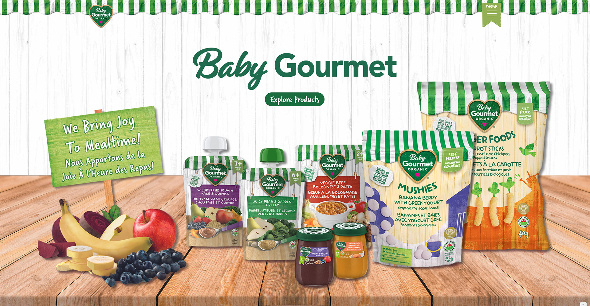
Homepage Hero
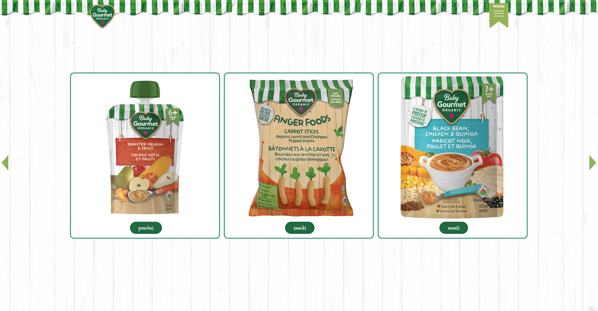
Homepage Horizontal Product Scroll
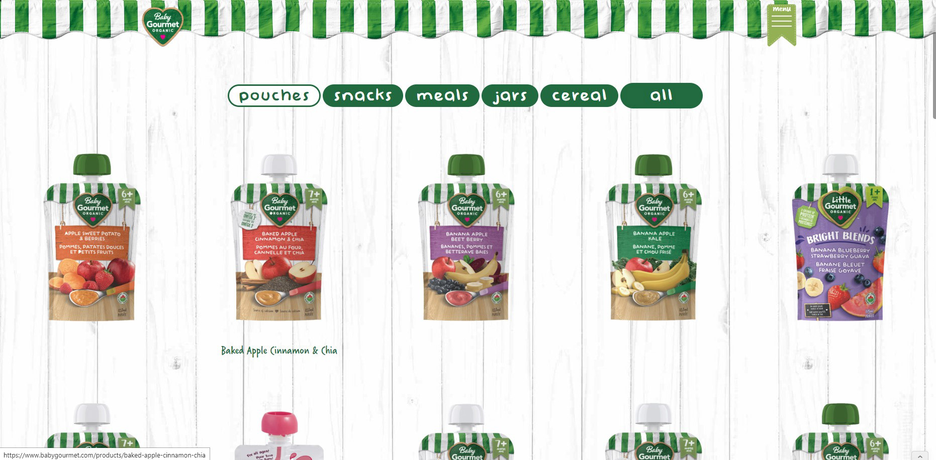
Product MixItUp Filter
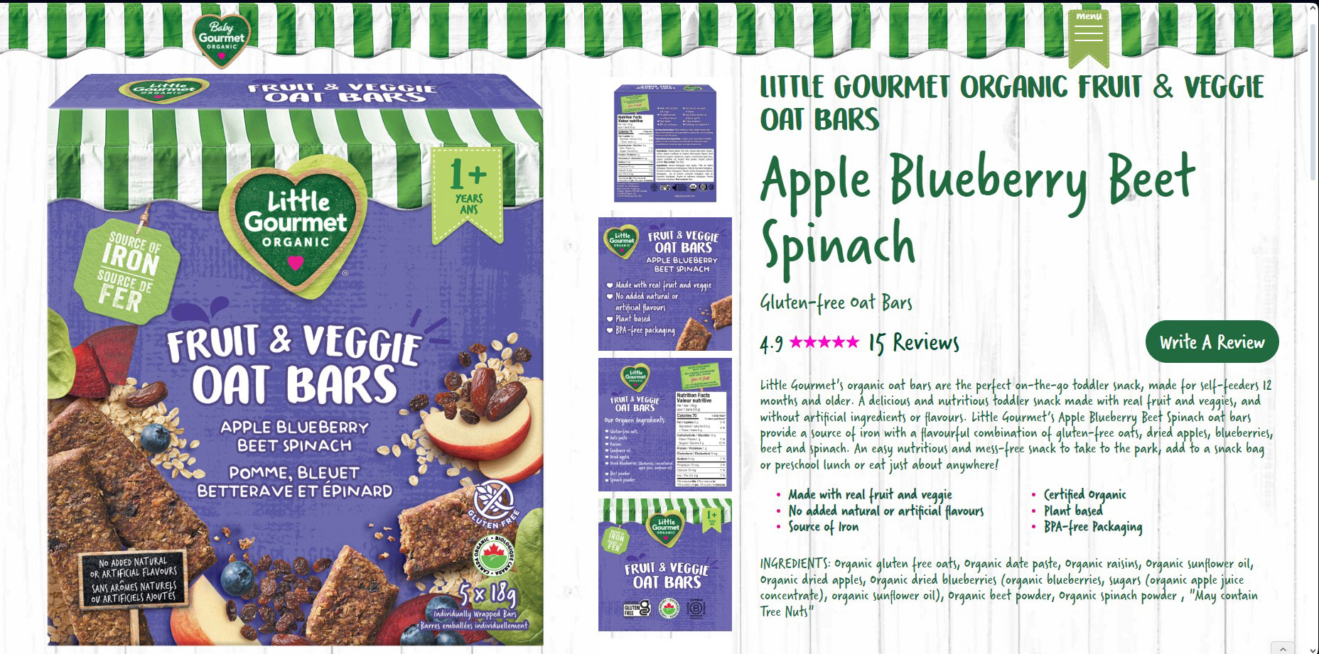
Product Page Hero
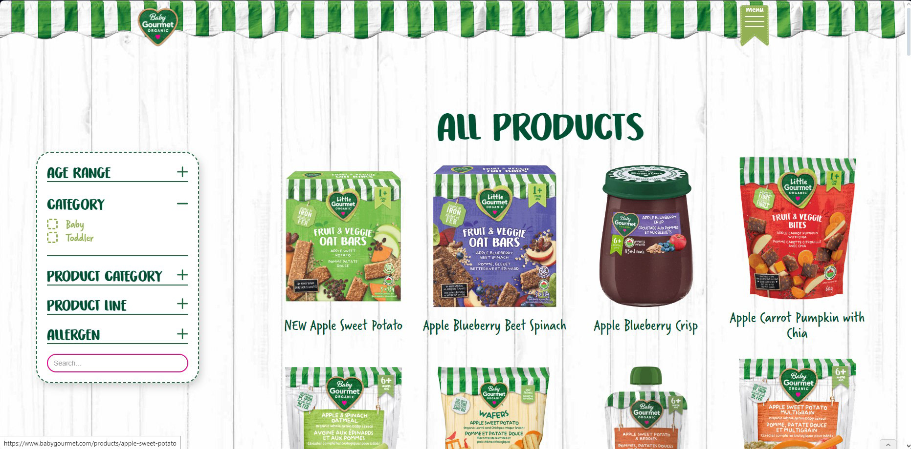
Interactive Product Checkbox and Search Filter
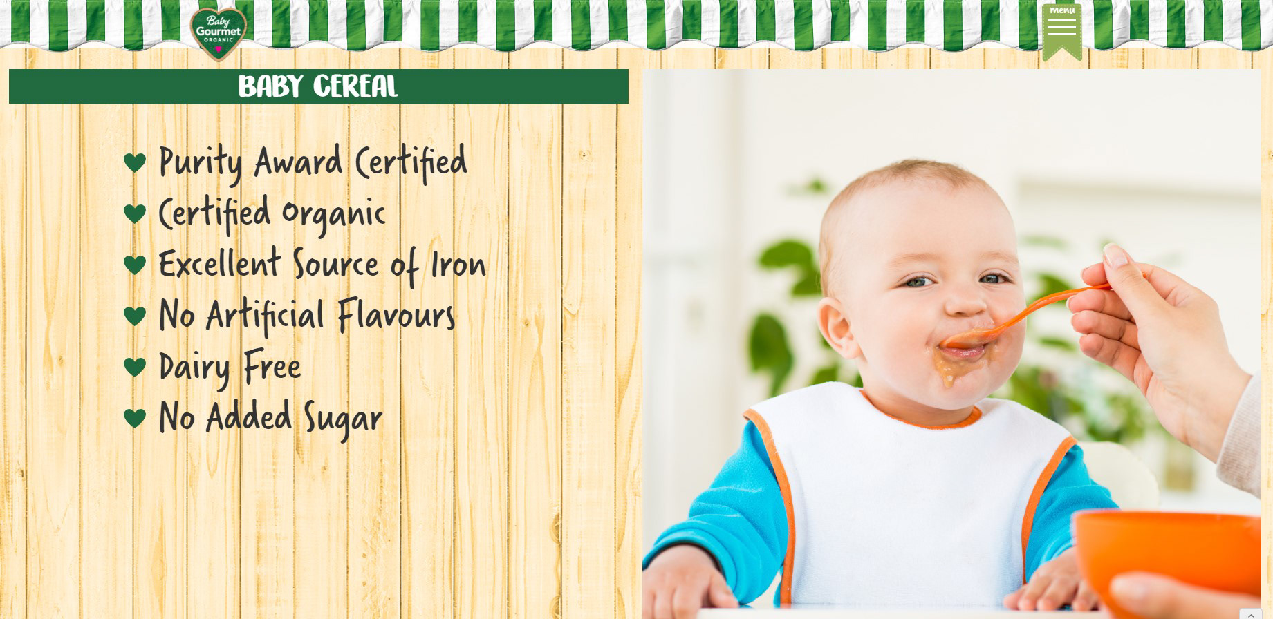
Our Difference Page Preview
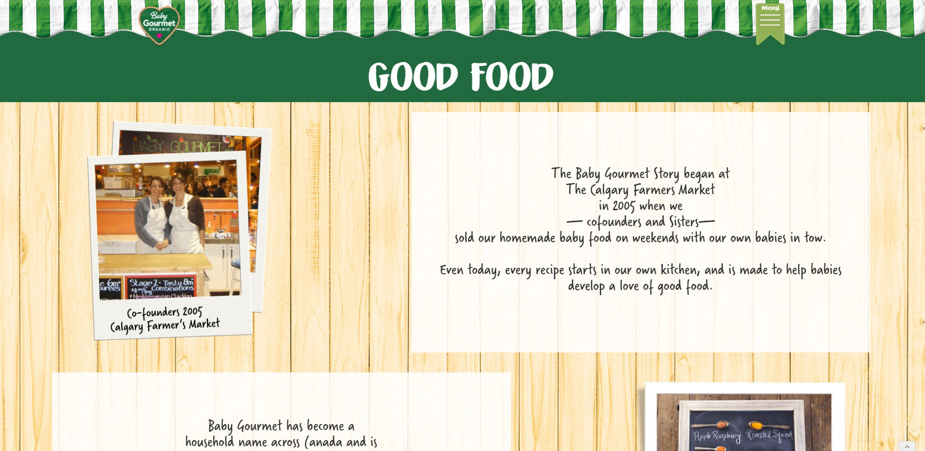
Our Story Page Preview
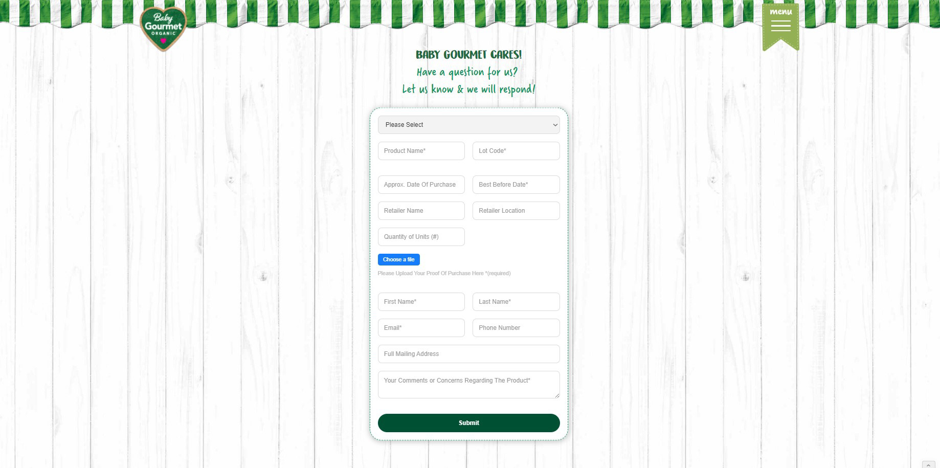
Contact Us Form w/ File Upload
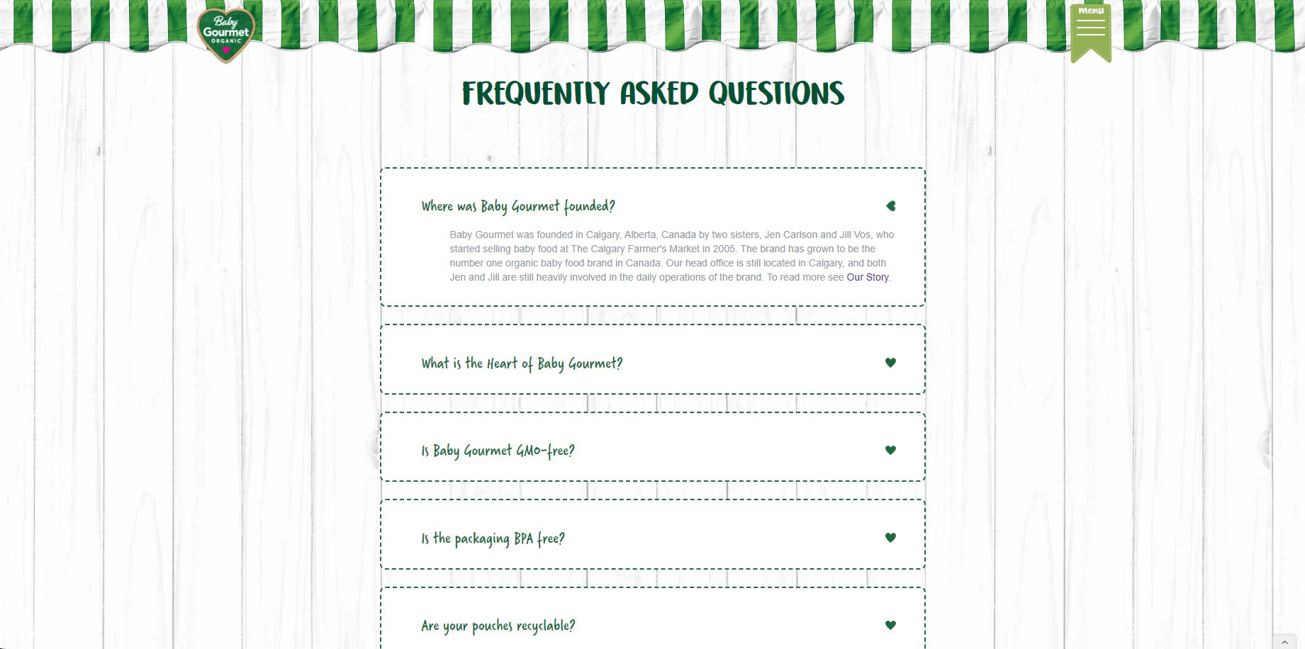
FAQ Interactive Dropdown
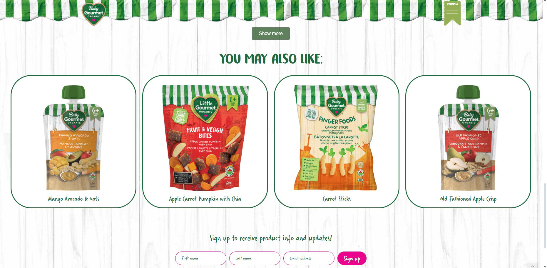
Related Products - Product Page
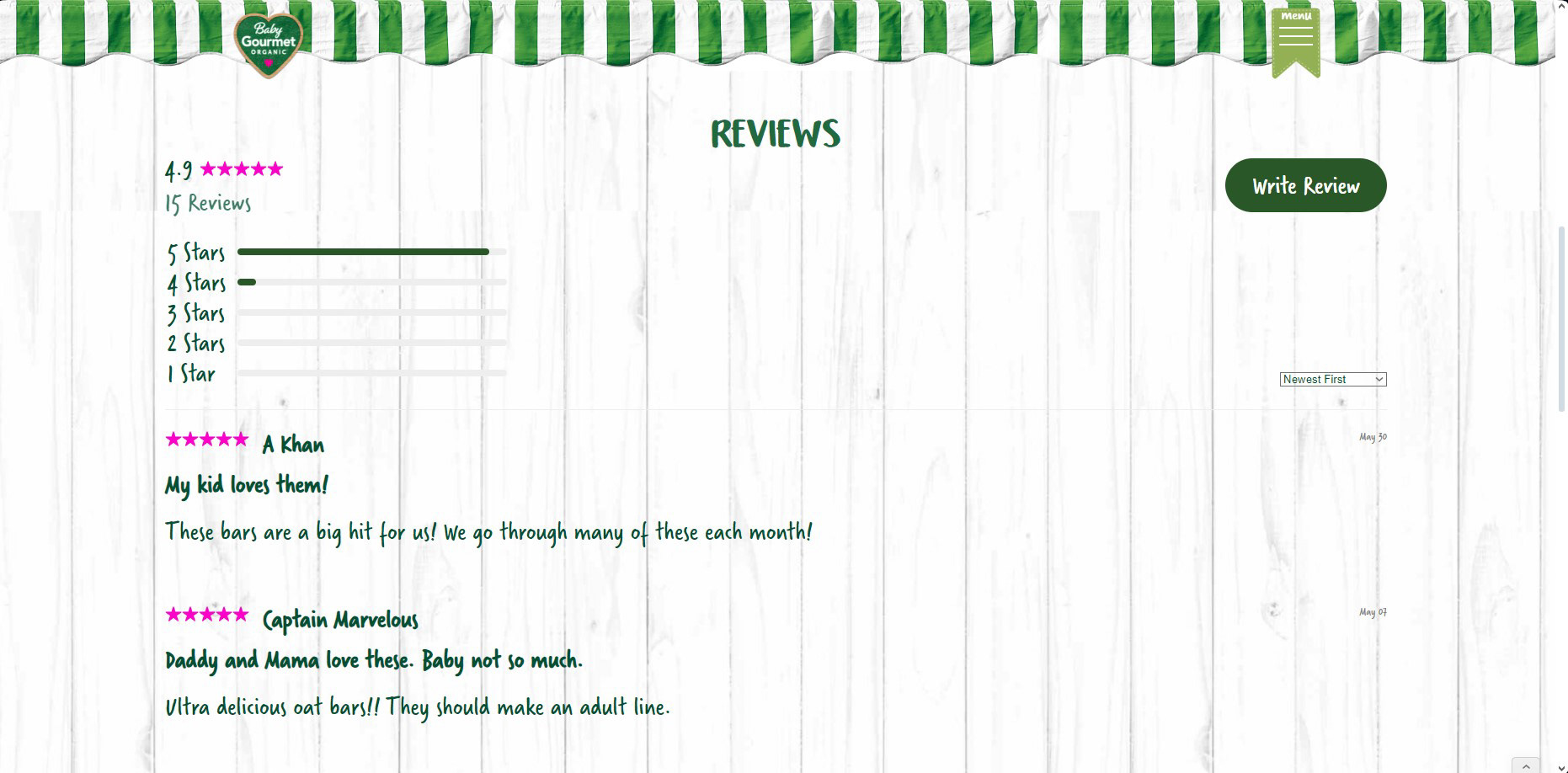
Leave Reviews On Product
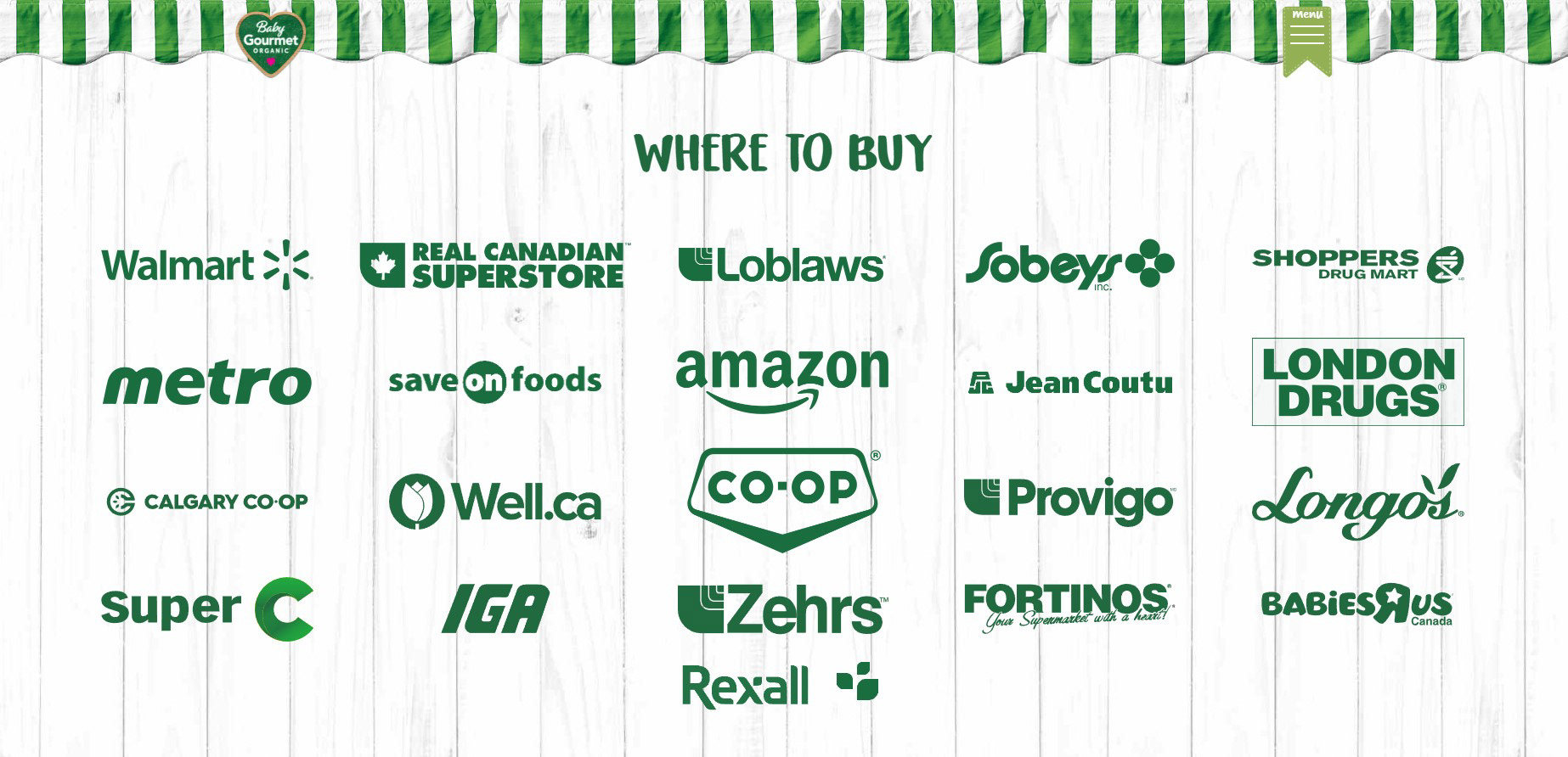
Where To Buy Page
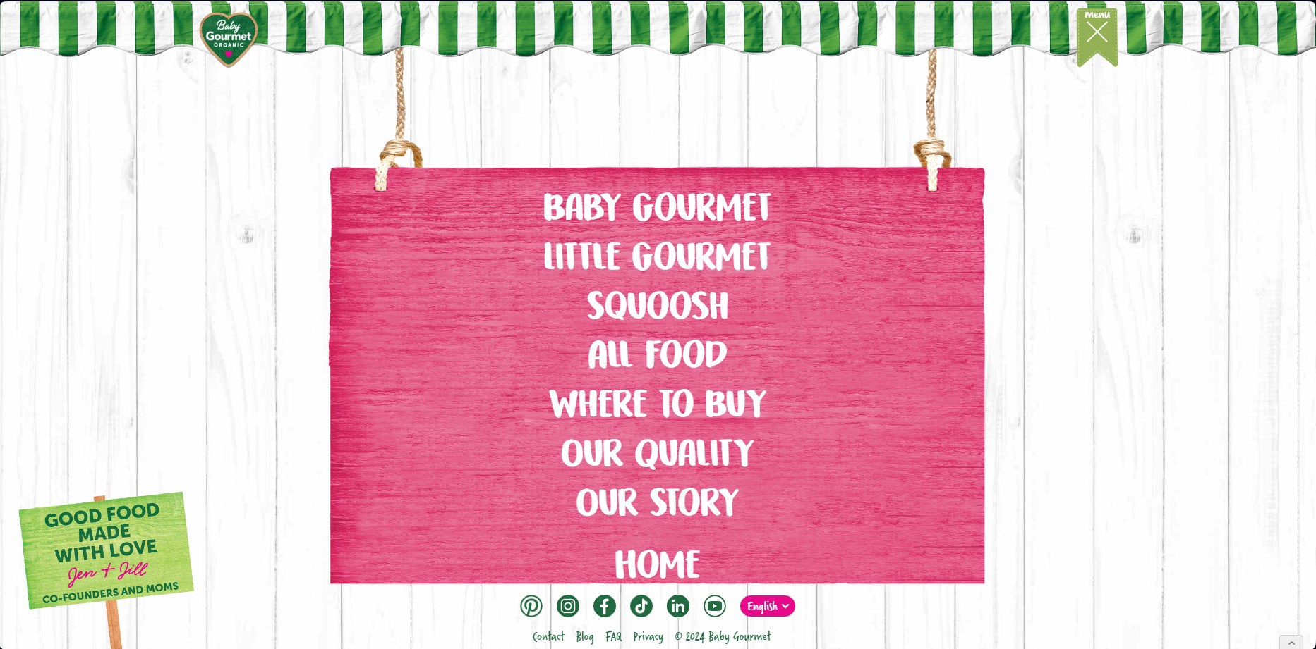
Interactive Dropdown Menu Navigation
Grenier Brothers Website, Logo and Photo
Client Work
Client Work
This was a client that followed up with me after having reached out in April '23 to this business. Their main hold up to this website was the copywriting. Copywriting is a "mutant X" power of mine, as I have freelanced as a copywriter prior to entering the design field. I took care of first prototyping this entire site in Figma, and then implementing it in Webflow. I used some custom JS to create the checkbox and search filter.
I also did a photoshoot on-site, of one of their machines in action, at the request of the client. I used photoshop and Lightroom to post-process the photos I had taken afterwards. I was also tasked with developing a logo and brand guidelines for their website and overall brand aesthetic. I came up with the colors, and ran through several concepts using an iterative design process that I then presented and pitched successfully to the client.
I also did a photoshoot on-site, of one of their machines in action, at the request of the client. I used photoshop and Lightroom to post-process the photos I had taken afterwards. I was also tasked with developing a logo and brand guidelines for their website and overall brand aesthetic. I came up with the colors, and ran through several concepts using an iterative design process that I then presented and pitched successfully to the client.
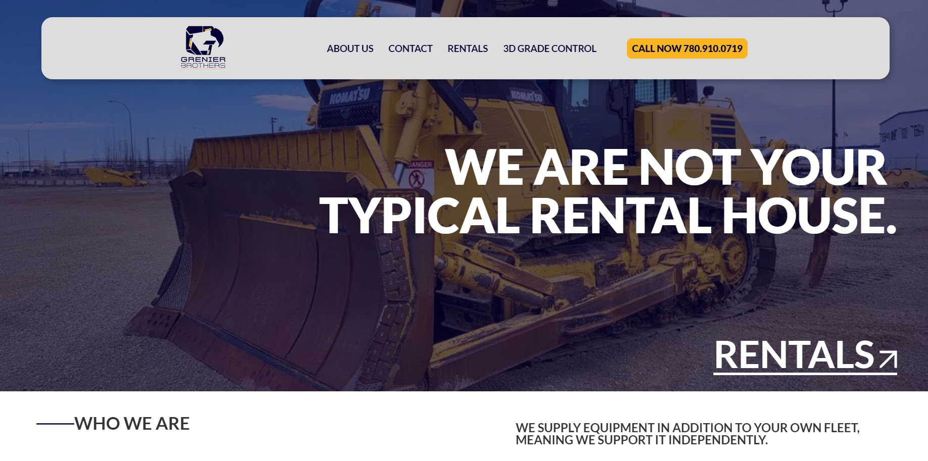
Homepage Hero
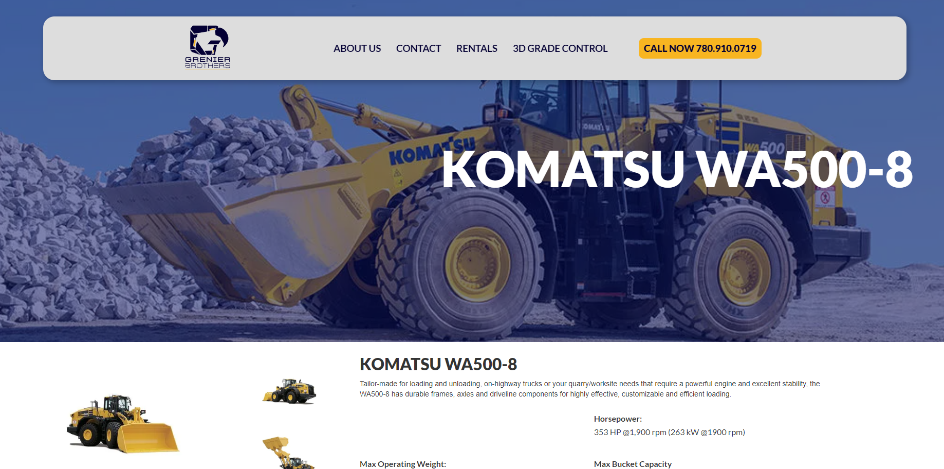
Product Page
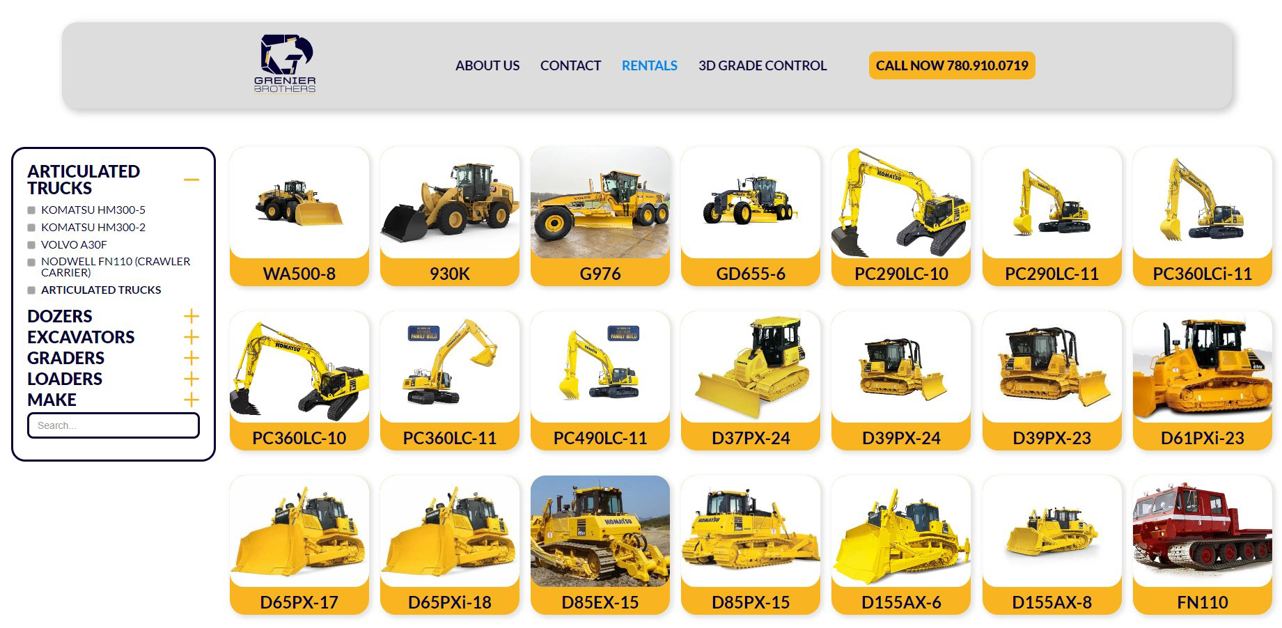
Fleet Page
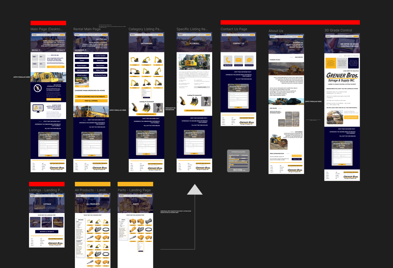
Figma Layout Prototype Example
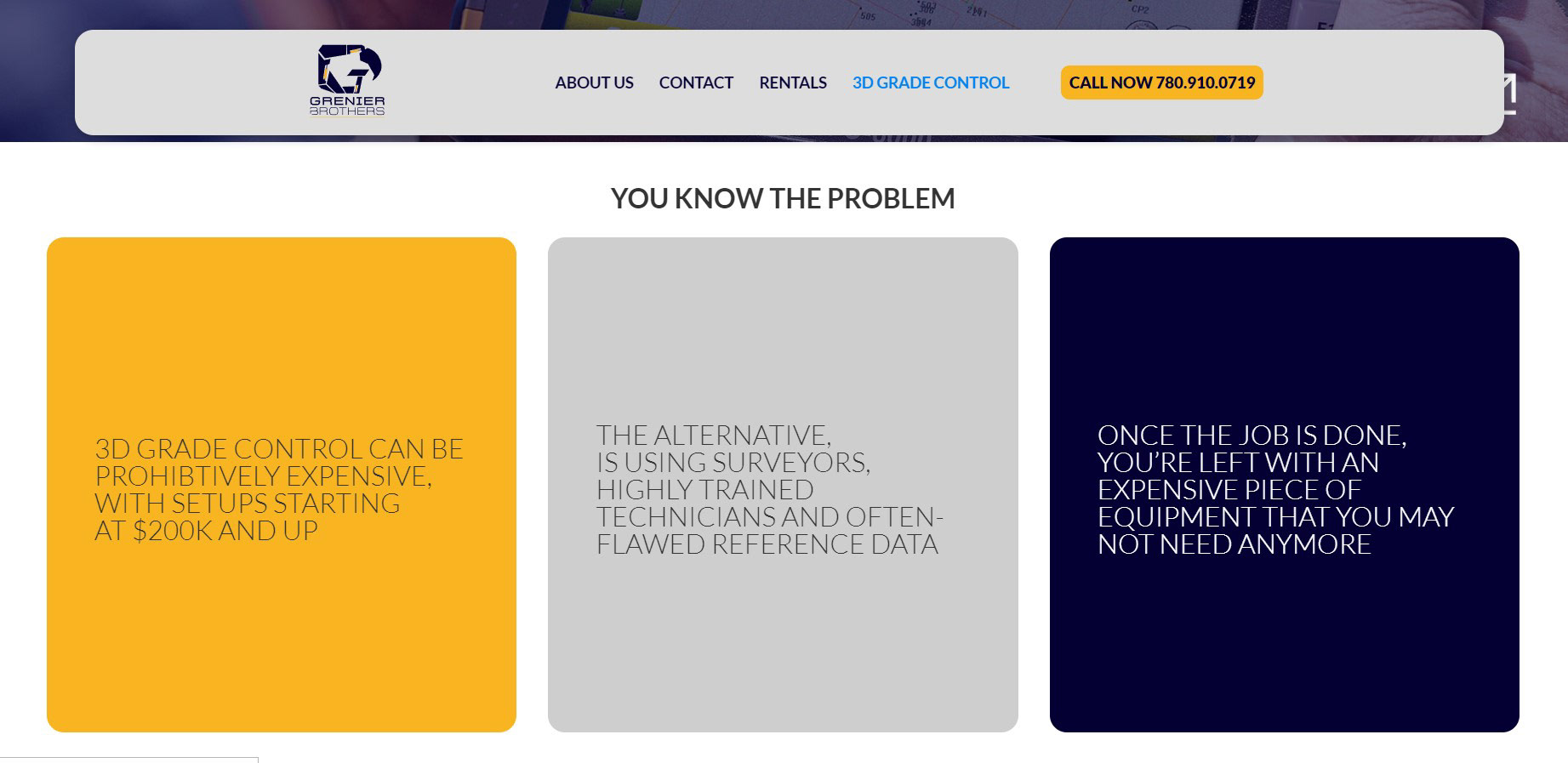
3D Grade Control Page
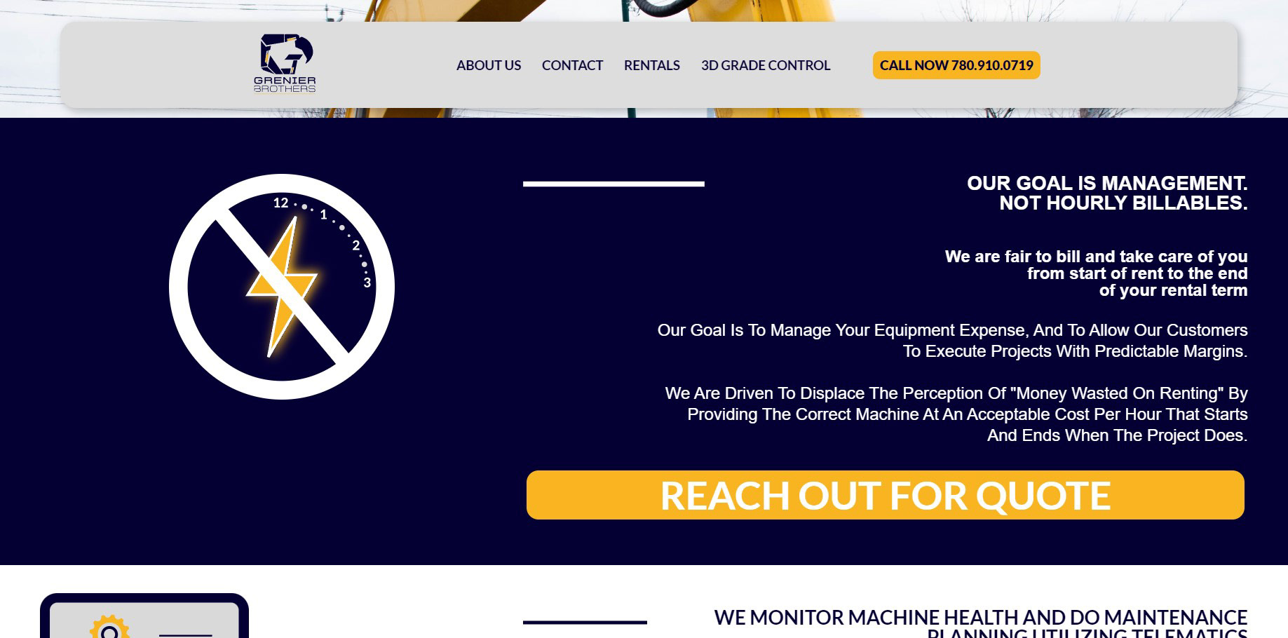
Homepage further down -- Custom Vectors Made
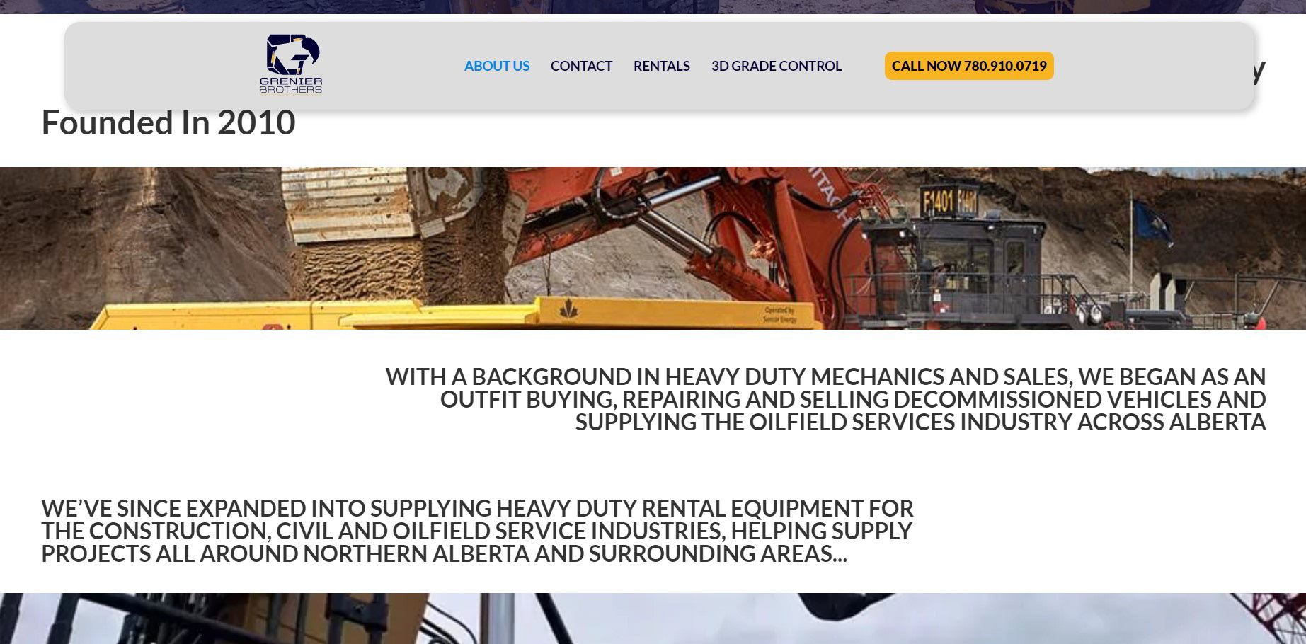
About Us Page
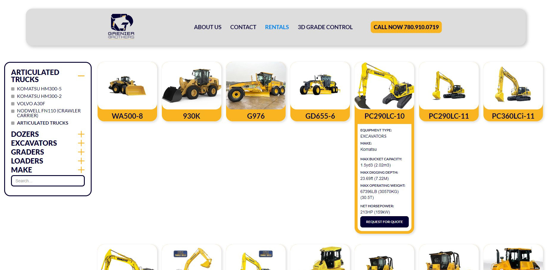
Check Box Filter, Dropdown Menu and Searchable Filter
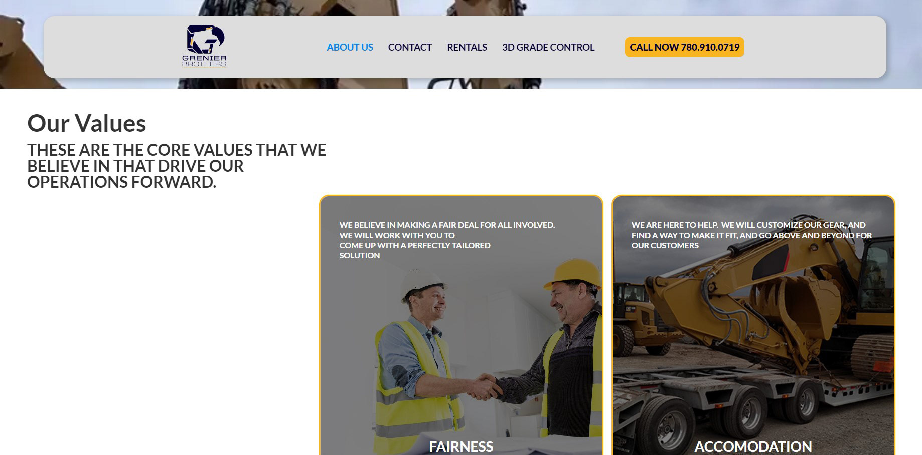
About Us Page, further down

Photoshoot of a large Backhoe

Photo of Backhoe in Operation

Photo used in Parallax Section on Homepage

Rear shot of backhoe, showcasing the primary brand Grenier Brothers works with
Tall Timber Marketing.ca
Client Work
Client Work
This client came to me via referral through one of my colleagues that approached them, and that designer felt I would be an overall better fit for them. The client was starting a new niche social media marketing agency, geared towards lawn care and small tractor dealerships across Central Alberta (what a niche!).
I was responsible in helping create and coordinate their brand identity guideline and coordinated their brand colours, alongside their regular designer (the aforementioned colleague), and then applied it to their website creation.
I first prototyped the website in Figma, and then after having ran through several design changes and tweaks, obtained final approval with my client, and created the website very quickly within Webflow. I only used native Webflow functionality to create the look and feel of the website, and added a 3rd-Party form, to enhance contact functionality to the customer's specifications.
The customer asked for a site that prioritized load speed, so minimal animations were used in the creation of website.
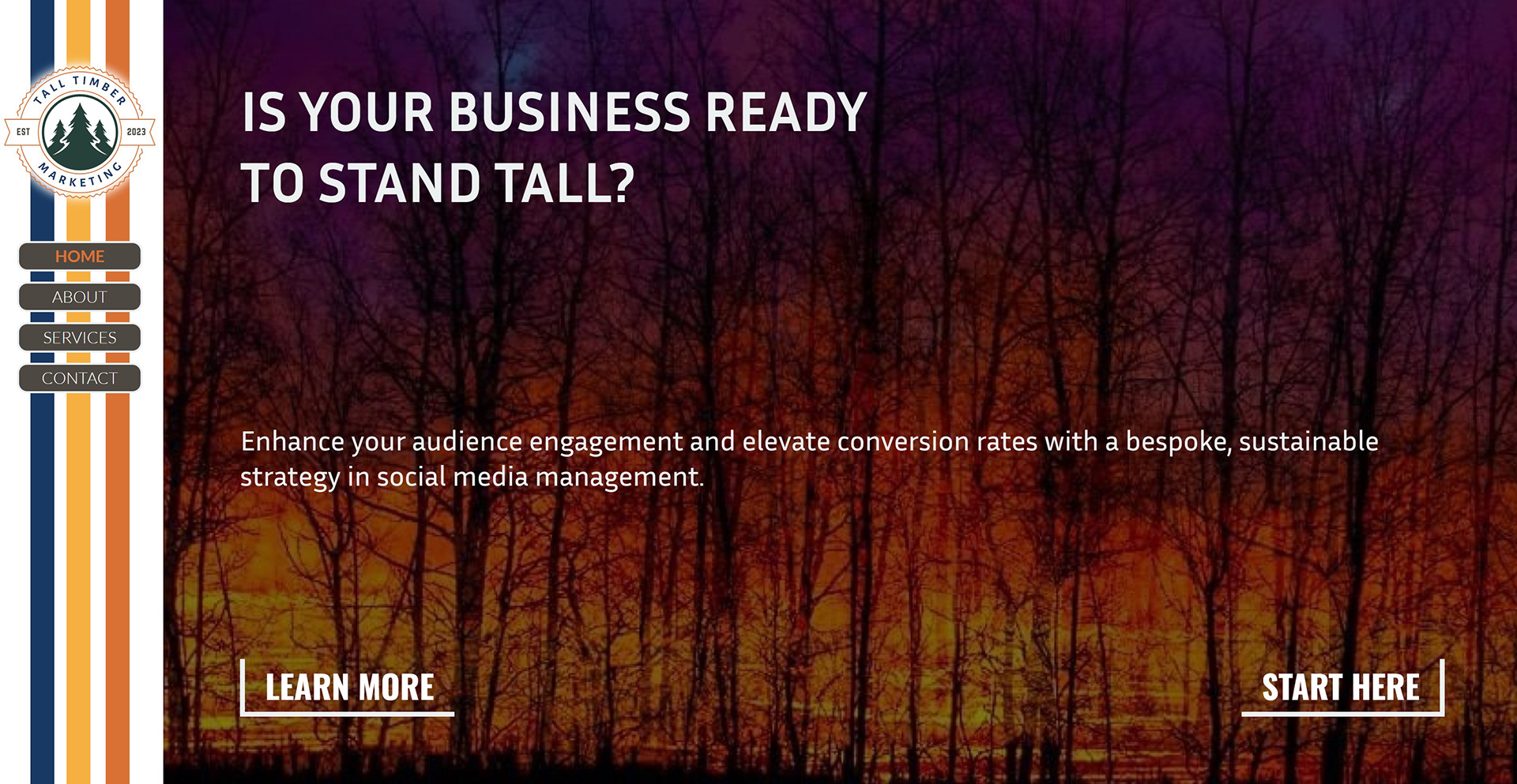
HomePage Hero
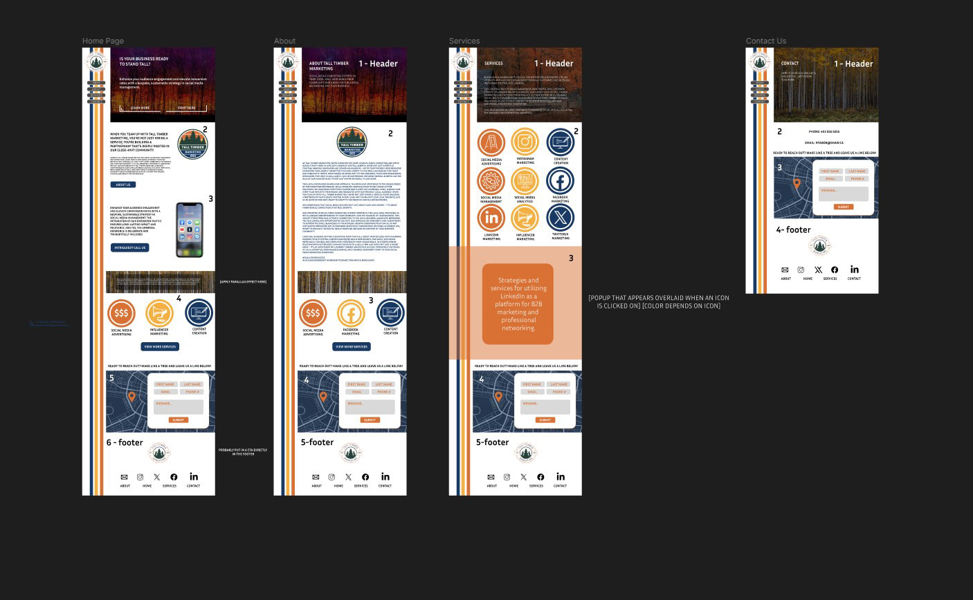
Approved Figma Prototype Layout
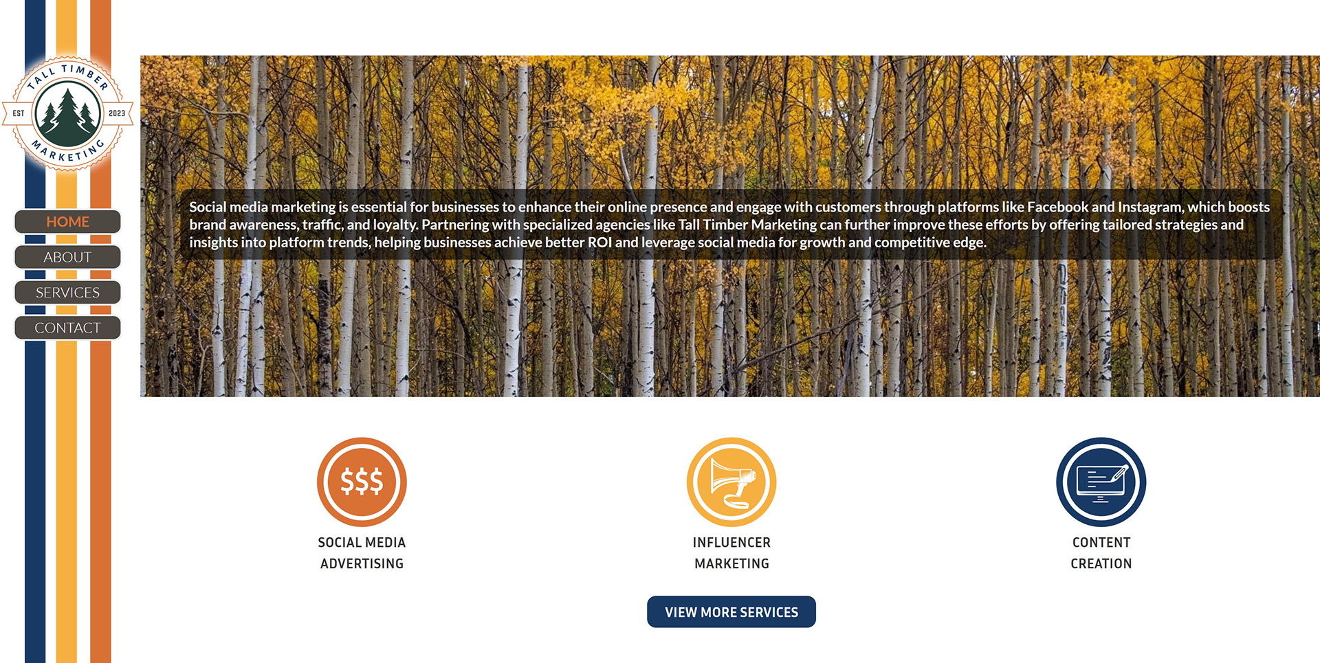
Homepage - Services Section
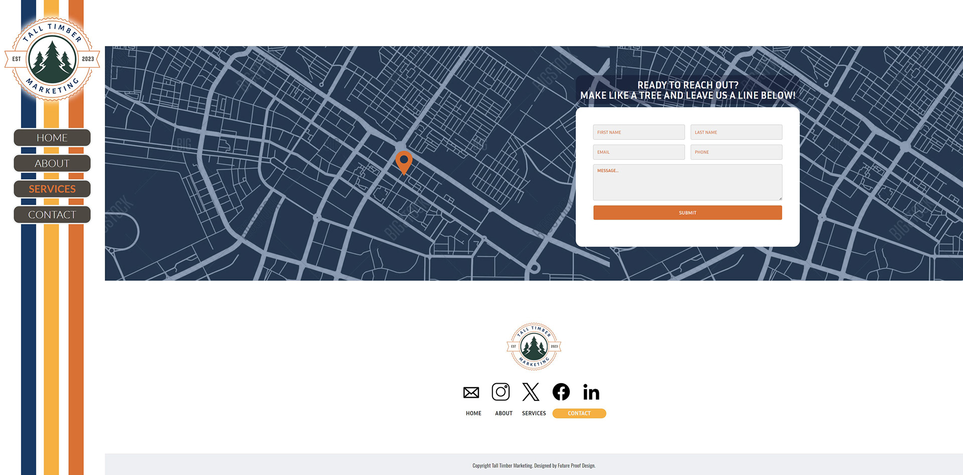
Contact Page - Footer
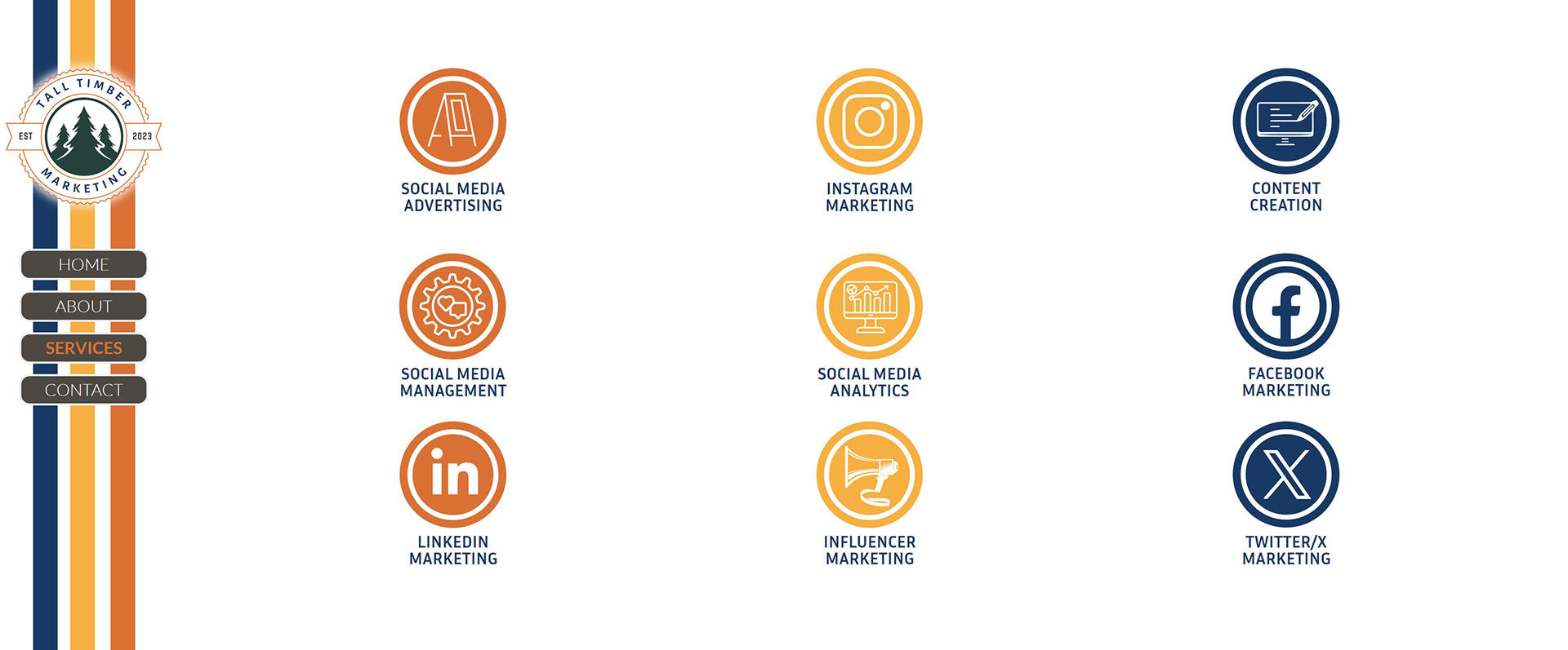
Services Grid
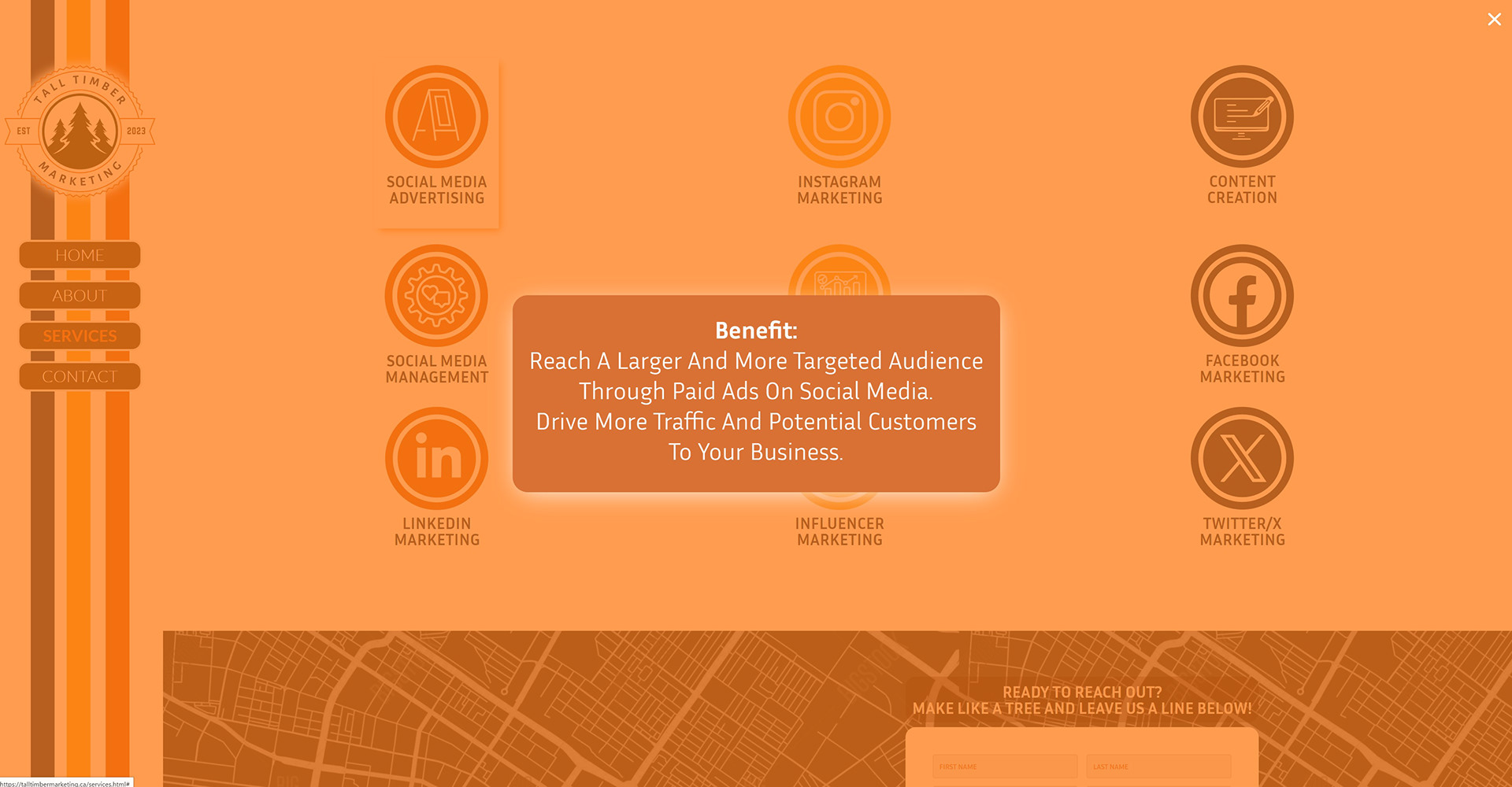
Popup On-Click for Individual Services
Demelco.com
Client work
Client work
This site was done as a massive update for a long-time established local electrician in St. Albert, AB, Canada. This was one of my earliest clients as freelancer and local website designer.
Demelco has been serving the Greater Edmonton Area (including St. Albert), since the early 1980's. Their last website had been developed and launched some time in 2001~ or so. We created a new site that had a much more advanced webform, that allowed the company to receive accurate and detailed specifications in order to provide a quote, sent to them directly from the website. We also created an employee-only access portal, where safety documents could be downloaded and filled out documentation could be uploaded in return, without allowing access to the general public. The navbar was built to reflect all of the services and specialties of Demelco, and create quick access to any page of the site.
Demelco has been serving the Greater Edmonton Area (including St. Albert), since the early 1980's. Their last website had been developed and launched some time in 2001~ or so. We created a new site that had a much more advanced webform, that allowed the company to receive accurate and detailed specifications in order to provide a quote, sent to them directly from the website. We also created an employee-only access portal, where safety documents could be downloaded and filled out documentation could be uploaded in return, without allowing access to the general public. The navbar was built to reflect all of the services and specialties of Demelco, and create quick access to any page of the site.
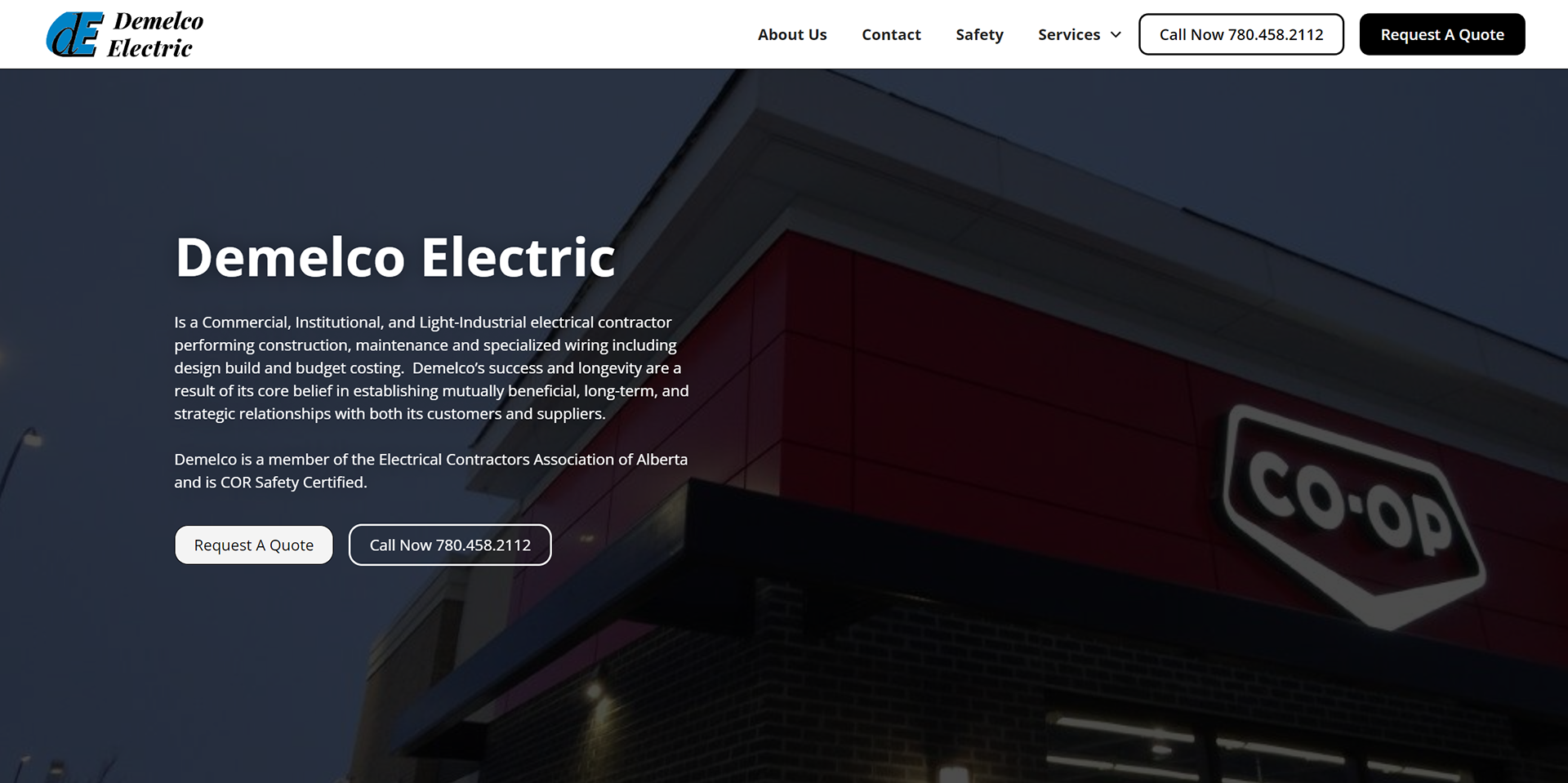
Hero
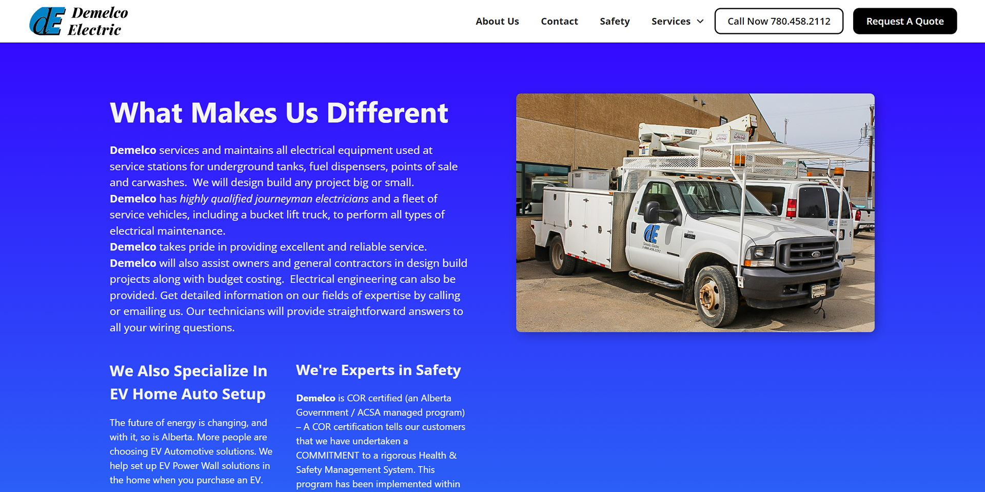
Front Page Descriptor
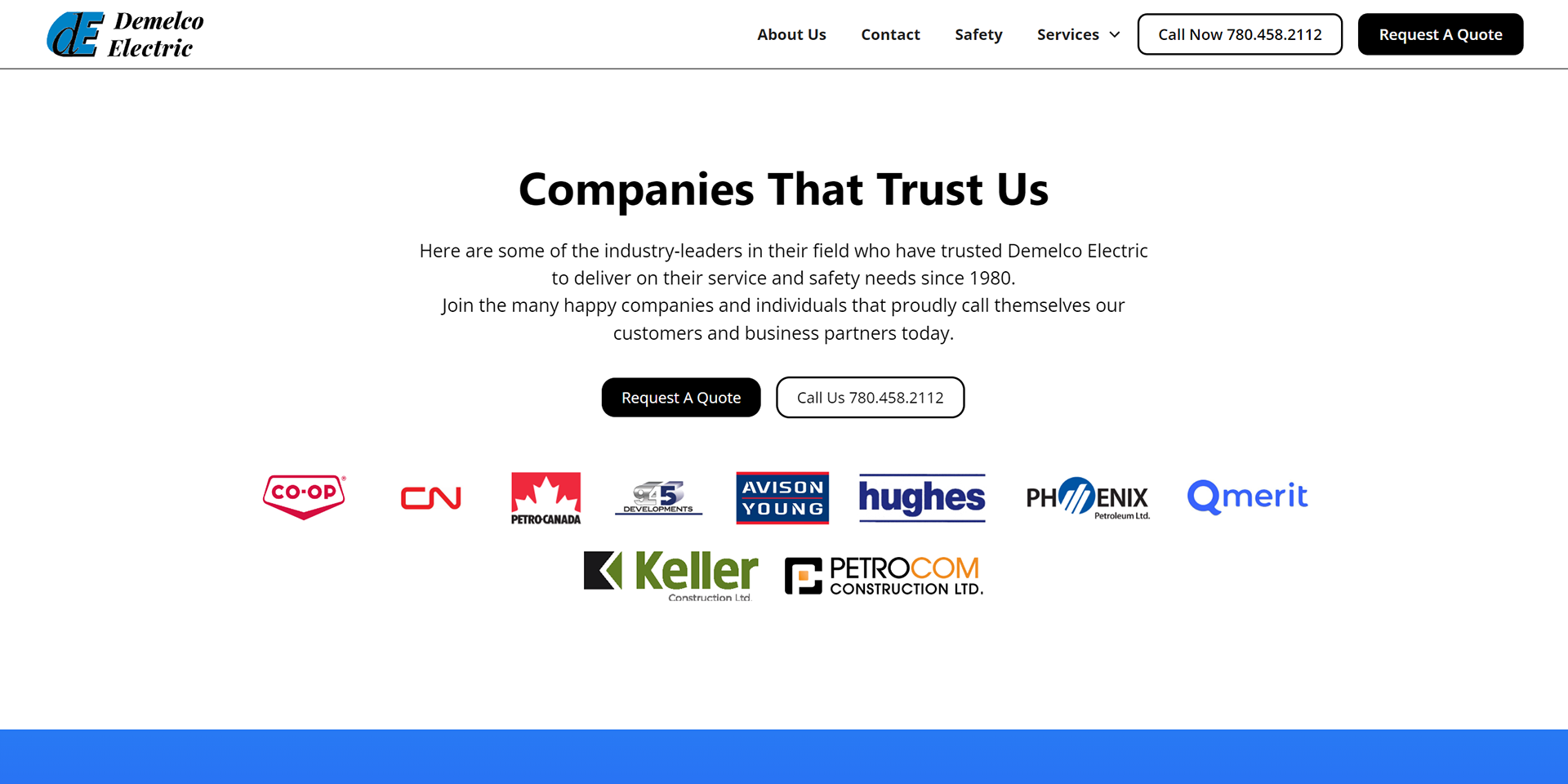
Social Proof
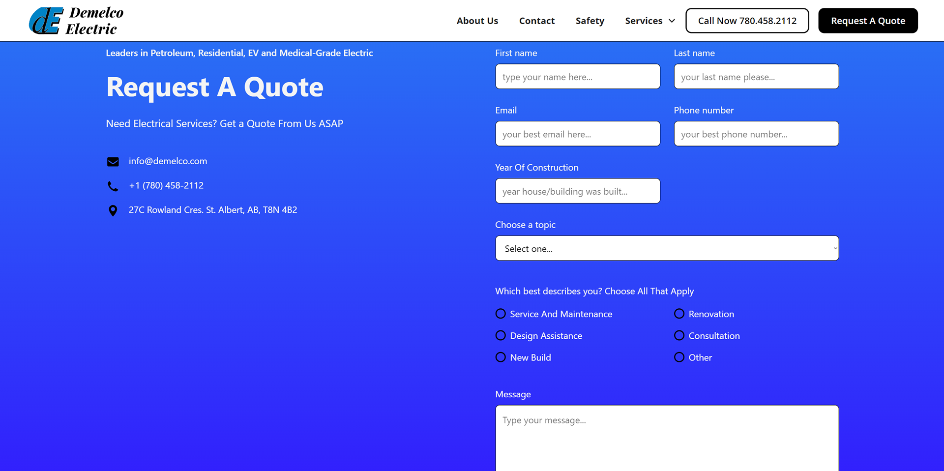
Advanced Webform
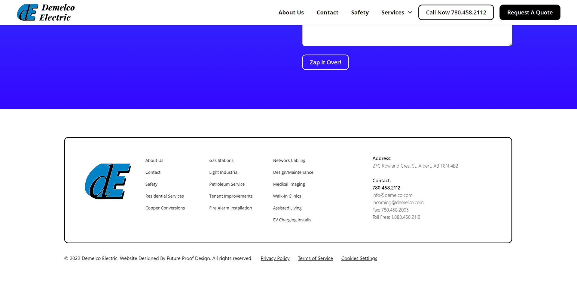
Footer
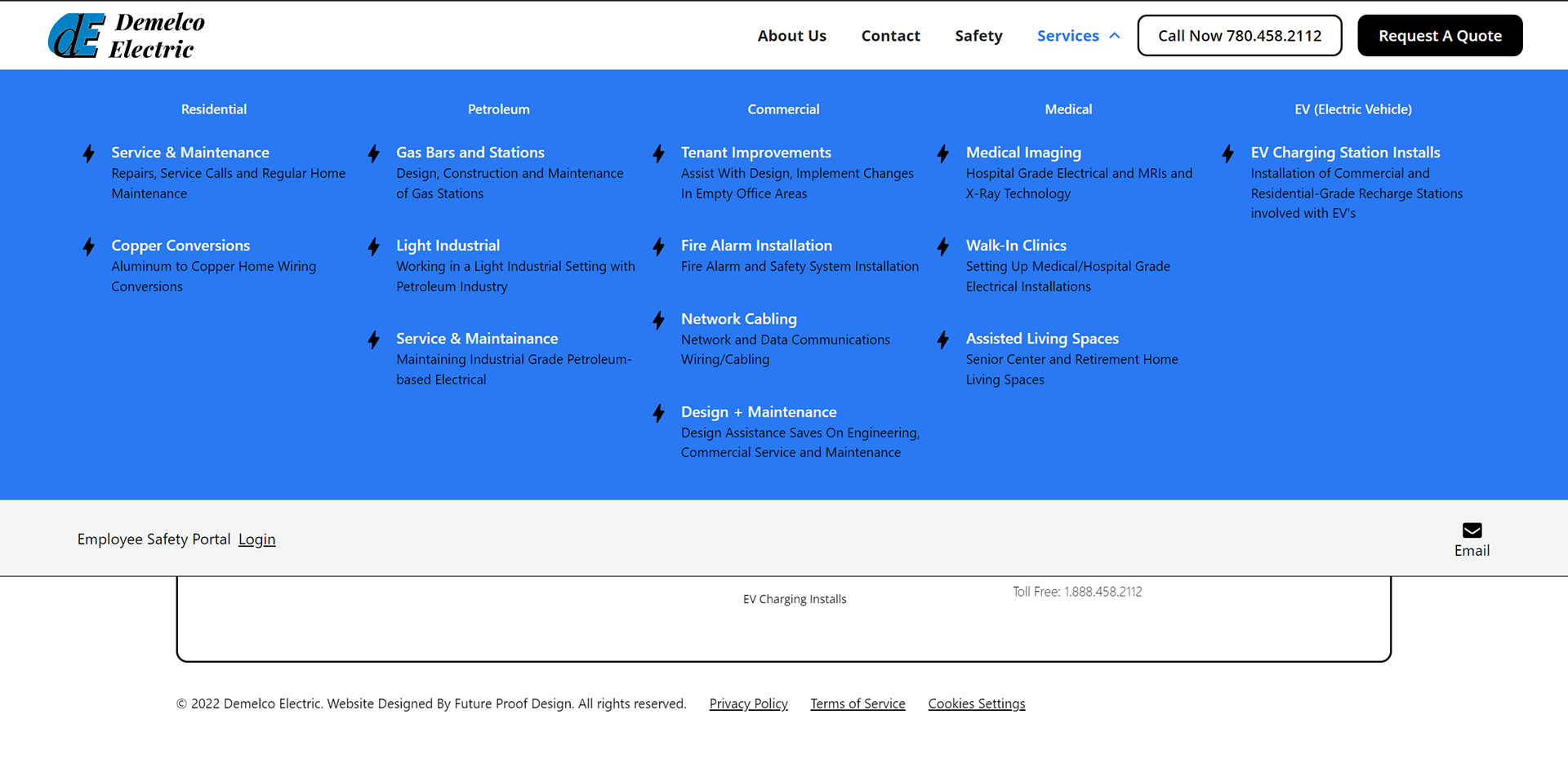
Navbar (Opens On Hover)
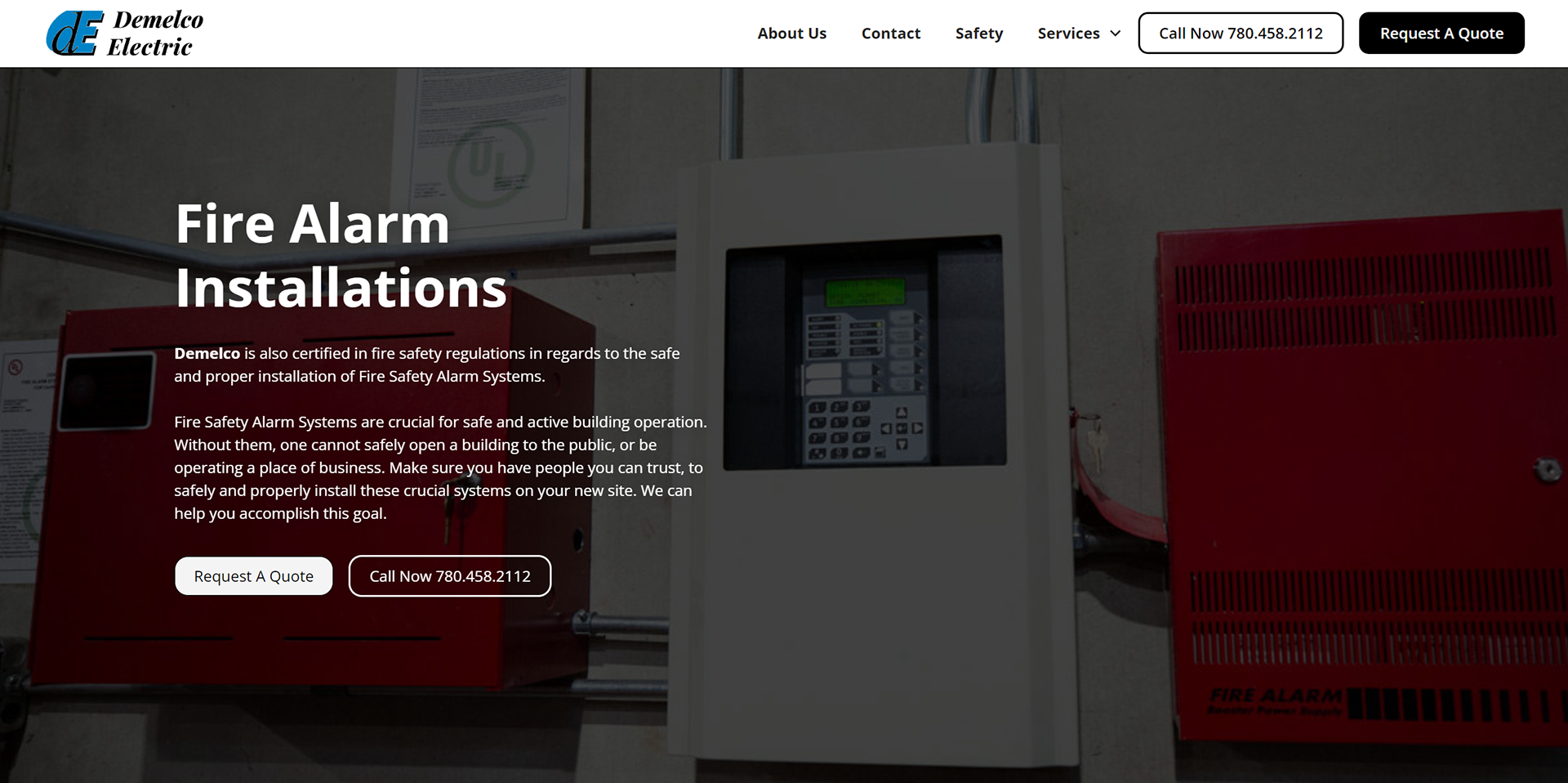
Service Page Example
These are but a few examples of the websites I've developed and designed, if you're curious to see more examples,
please feel free to reach out!
please feel free to reach out!
